
- Best for
- Textiles + wall art refresh that packs
- Time
- 2–4 hours
- Total cost
- $349
- Renter-safe
- Yes (no-drill styling)
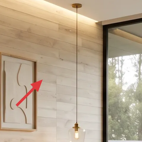
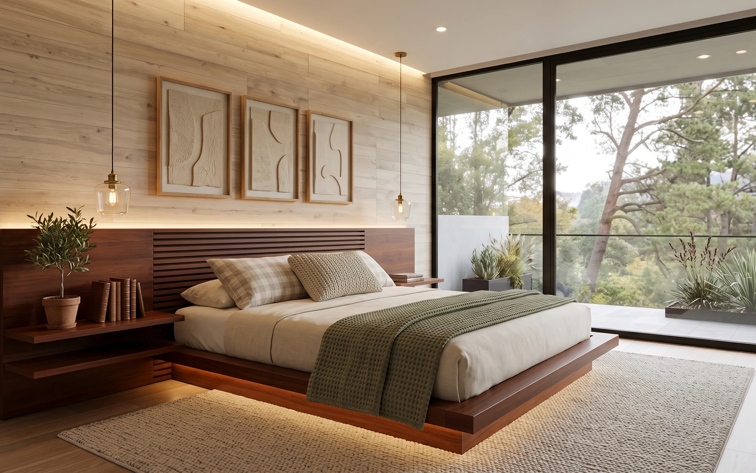
Why warm wood-and-olive textiles are the window-side bedroom of 2026
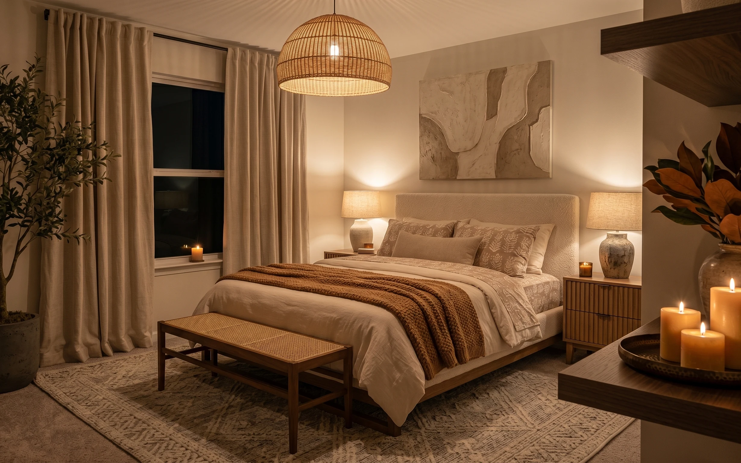
In the photo, the whole palette starts with warm light wood and cream linens, then gets grounded by an olive textured throw and rug. The three framed abstract prints give the wall a calm rhythm, while the glass pendant light adds that soft, amber “after-work” glow. Even if your landlord leaves the wall alone, you can still steer the mood with portable textiles and art you can take down the same day. For shared housing, the big win is choosing pieces that fold flat and carry well—like a rug you can roll and covers you can swap.
I almost overdid the “perfect match” thing once—same tone, same texture, same vibe—until the room looked like one big beige block. What finally worked here was adding one intentional dark element (the olive throw) and one grounded layer (the rug) so the cream can breathe. That’s the trick: let the wood and cream be the base, then use small, removable items to create contrast and clarity.
Layer 1 — area rug ($150) muted cream pile that makes the floor feel softer
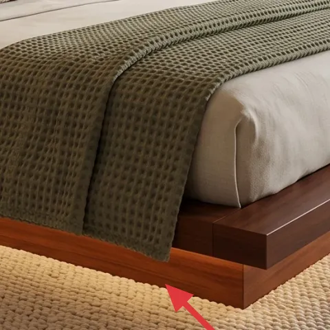
The rug is a short-pile, muted-cream grounding layer placed under the bed base and extending into the open floor area. In a room like this, a rug does two jobs: it makes bare tile feel less hard, and it gives the bed linens a visual “landing zone” so the whole setup reads intentional instead of accidental. The trade-off is that you have to roll it carefully for moving, but it beats trying to work with heavy furniture or permanent changes. This size also helps blur the hard lines of the tile.
Pick a short pile if you’ll roll it often
Short-pile rugs pack more neatly than shag and still hide small everyday scuffs from shared-house traffic.
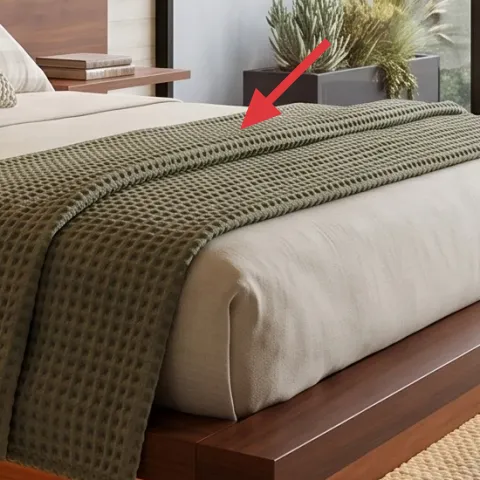
Layer 2 — olive textured throw blanket ($25) waffle-knit texture that adds the room’s contrast
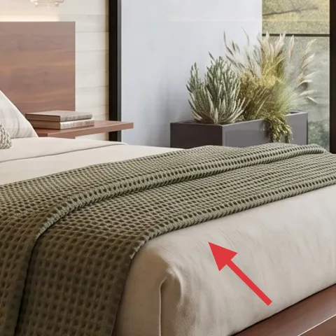
The olive throw blanket is draped across the bed edge, and it’s doing more than adding color. That woven texture catches light differently than the smooth cream bedding, so the bed looks styled even before you add pillows. If you pick an olive that’s too dark, it can feel heavy against the warm wood; if it’s too light, it disappears. This option keeps the palette calm but still gives the eye something tactile. The other benefit for renters is practicality: it folds down quickly and replaces easily if your next lease forces a new bed size.
Let texture do the “style work”
With warm wood walls already in the background, a textured throw gives definition without needing any wall changes.
Layer 3 — throw pillow covers ($24) dyed sand-and-olive covers that match your next room
Make it instead of buying it
DIY-dye basic cream pillow covers toward sand and olive so they echo the throw while staying budget-friendly for your next move.
Materials
- Fabric-dye kit — 1 kit — craft store — $12
- Salt or dye-fixer (included/required by kit) — 1 bag — grocery/craft — $8
- Plastic gloves — 1 pair — hardware/drugstore — $6
- Drop cloth or old towels — 1–2 — home linen bin — $0
- Disposable cups — 2–4 — pantry stash — $0
Steps
- Pre-wash the pillow covers so dye grabs evenly.
- Set up a covered work area with gloves on and plenty of ventilation.
- Dissolve dye (and any salt/fixer) to the kit’s instructions.
- Submerge or brush dye onto fabric to reach the sand base, then selectively deepen areas toward olive.
- Rinse until water runs mostly clear, then dry fully before reuse.
- Place dyed covers back on the pillows and spot-check color balance in daylight.
Total DIY cost: $26 — saves about -$2 over buying.
The key to this pillow moment is that it picks up the room’s two language cues—cream and olive—without demanding you match the wall exactly. The covers in the photo sit in front of the olive throw, so the bed reads “layered” instead of flat. If your covers are plain, dyeing lets you land on a softer sand tone and then pull one pillow closer to olive for contrast. The trade-off is one afternoon of hands-on work, but the payoff is that you can refresh the palette whenever your shared-house layout changes.
Rinse dye thoroughly to avoid transfer
Untreated dye can rub onto lighter bedding, so always rinse until the water clears and let covers dry completely.
Layer 4 — three framed abstract prints ($80) warm beige line art for a calm wall rhythm
The three framed abstract prints are the wall’s focal set, centered above the bed and repeated in a tidy row. Even though the wall is already wood-paneled, this trio matters because it adds “human-made” softness—curved lines and matte light beige that echo the textiles. When you’re moving within a year or two, framing can feel risky, but small framed prints are easy to pack in a hard-backed box. The trade-off is you’ll want to handle glass-front frames carefully during moves, but it’s still far more renter-friendly than any wall alteration. Stick to light neutrals so the wood stays the star.
Choose lightweight frames with stable backing
Look for frames that don’t wobble and pack flat enough for a small rental van.
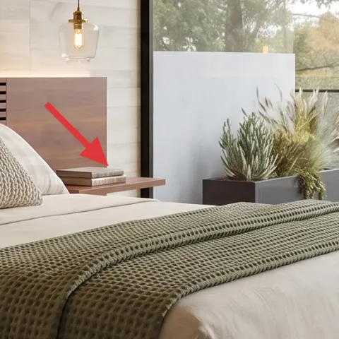
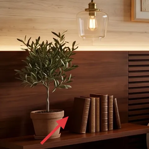
Layer 5 — decorative book stack ($15) spine color pop on the left shelf
The book stack on the left shelf is a simple styling layer that makes the whole setup feel lived-in. Because the shelf is wood and already visually strong, the books add vertical interest without needing extra objects. The best part for shared housing is flexibility: book stacks travel in the same box as your everyday belongings, and you can swap titles to match your next palette. The trade-off is choosing books with covers that don’t clash—neutral spines and warm browns work better here than bright patterns. In this room, the books also balance the visual weight of the plant.
Use color bands, not mixed chaos
Keeping the spine tones in the same warm family prevents the shelf from looking accidental.
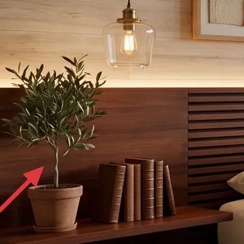
Layer 6 — terra-cotta planter pot ($15) grounded earthy detail on the shelf
The terra-cotta planter pot brings the room’s earthy thread all the way from the textiles into a real object. On the left shelf, its warm clay color repeats the wood tones, while the small green leaves soften the straight lines of the built-in ledge. This is the kind of styling that looks expensive because it adds scale and organic shape, not because it’s “more stuff.” The trade-off is keeping the pot stable during moves—use padding and a sealed liner if your plant soil spills. For renters, this stays a win because you can take the plant and pot together and keep the styling consistent in the next bedroom.
Choose a pot with a wide base
Wider bases reduce the chance of tipping when you’re carrying boxes through hallways.
Layer 7 — cream bed sheets ($40) smooth, drapey foundation that makes the olive read better
The cream bed sheets are the neutral canvas here—soft in color, smooth in texture, and aligned with the warm wood background. When you’re recreating this look, sheets matter because they control how the light bounces off the bed. Crisp white can feel too stark next to warm wood; overly gray can fight the olive throw. A cream tone keeps everything cohesive while still letting the olive texture and framed art stand out. The move-friendly part is simple: sheet sets fold into flat stacks and don’t require hardware or wall contact. If you’ve ever skipped this layer, you’ve probably seen the room feel “unfinished” even when the decor is on-point.
Match sheet warmth, not brightness
Aim for cream with yellow or beige undertones so it harmonizes with warm wood.
The cost, layer by layer
| Layer | Item | Cost |
|---|---|---|
| 1 | Area rug 8×10, cream short pile | $150 |
| 2 | Olive throw blanket | $25 |
| 3 | Throw pillow covers (DIY-ready) | $24 |
| 4 | Three framed abstract prints set | $80 |
| 5 | Decorative book stack | $15 |
| 6 | Terra-cotta planter pot (medium) | $15 |
| 7 | Cream sheet set | $40 |
| Total | $349 | |
If you want a cheaper version, swap the framed prints for a single framed abstract print and keep the rest of the palette the same. A smaller frame set costs less, and the olive throw plus cream sheets still carry the “finished” look.
What worked, what didn't (across the whole room)
The warm wood and cream baseline already does a lot of heavy lifting, so the best wins were the removable contrast layers: the olive throw, the grounded rug, and the framed art trio. What didn’t work as well was trying to force matching-by-tone only—when everything was the same level of lightness, the bed looked flat.
What worked
- The cream rug makes the tile floor feel softer underfoot and visually anchors the bed zone.
- The olive textured throw adds depth because its weave catches light differently than the linens.
- Framed beige line art brings calm structure above the bed without any wall changes.
- Earthy terra-cotta on the shelf repeats the wood warmth and keeps the palette cohesive.
- A tight, warm-toned book stack adds height while staying easy to pack and replace.
- Cream sheet tone controls how all the other accents read next to the wood paneling.
What didn't
- Skipping a texture element makes the bed feel like one continuous cream block.
- Buying multiple small wall items instead of a simple trio can make the wall look busy.
- Choosing an olive that’s too dark can overpower the warm wood rather than complement it.
- Overstyling the shelf with mixed colors makes the space look less intentional.
- Light-framed prints without careful packing risk scratches during moves.
What we'd skip if we did it again
Skip a big change to wall decor and start with textiles instead. In a window-side bedroom like this, the wood and light already shape the mood; pillows, throw, and sheets are the fastest way to steer the palette without any permanent installs.
Skip buying a bunch of matching small decor objects at once. A single book stack plus one terracotta planter gives you “styled” energy while keeping packing simple for shared housing moves.
Skip frames that feel heavy or fragile unless you have solid moving boxes. If the next lease forces a faster move, lighter framed abstract prints are the better long-game choice.
Frequently asked
How long does this refresh take in a shared bedroom?
Plan on 2–4 hours total. Rug unrolling and placement is quick, then you’re down to art alignment and bedding styling. If you’re DIY-ing pillow covers, add another 2–3 hours for the dye process and drying time. Most of the work is visual arranging—small changes add up fast when your palette is already warm wood and cream.
Will this work if I can’t change the wall or lighting?
Yes. This look relies mostly on removable textiles and portable wall art. The pendant light and wood paneling stay as-is, and the olive throw, cream sheets, rug, and framed prints create the contrast and finish. Even if your lighting bulbs are different, you’ll still get a similar mood because the textures and warm neutrals do most of the work.
What if my bedroom is smaller or the bed is a different size?
Keep the same layering rules: one large grounding rug, one textured dark accent (the olive throw), and a neutral bedding base. For rug size, go as wide as you can while still leaving comfortable walkway space. Pillow covers can scale down—use two pillows for a smaller bed and keep the same color family so the overall palette stays consistent.
Where should I shop if I want the same vibe on a budget?
Look for the rug and textiles at mainstream home stores or discount bedding retailers, then hunt framed art sets at online marketplaces with easy returns. For the terra-cotta pot and book stack styling, thrift is great because the color family is what matters. Choose neutral beige or warm brown frames, then match the olive accent through the throw blanket.
What’s the biggest mistake people make with this kind of palette?
The most common miss is buying everything in the same lightness value—lots of cream, no texture, and no darker accent. The room then reads flat, especially next to warm wood. Add contrast through one deeper element (olive throw) and one tactile texture (rug or woven blanket) so your eye has a place to land.
More in Bedroom
Under $400: window-side bedroom refresh with 7 move-ready swaps
A warm light-wood and olive bedroom look—made renter-friendly for shared housing. This $400 refresh uses 7 packable swaps (rug, textiles, f…
Under $400: warm rattan-and-linen bed nook refresh
A warm, move-friendly bed nook refresh built from seven renter-safe swaps—mostly textiles and a framed print. The look leans rattan-and-lin…
Under $400: olive-and-cream bedroom refresh with 7 renter swaps
A renter-friendly bedroom refresh built around soft taupe curtains, a grounded area rug, and warm framed art. This look uses 7 move-friendl…