- Best for
- moving-friendly living room corners
- Cost
- $573 total
- Difficulty
- Easy
- Time
- 2–4 hours
Why warm beige-and-rattan touches are the daybed corner of 2026
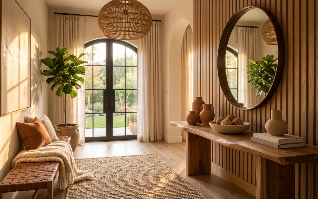
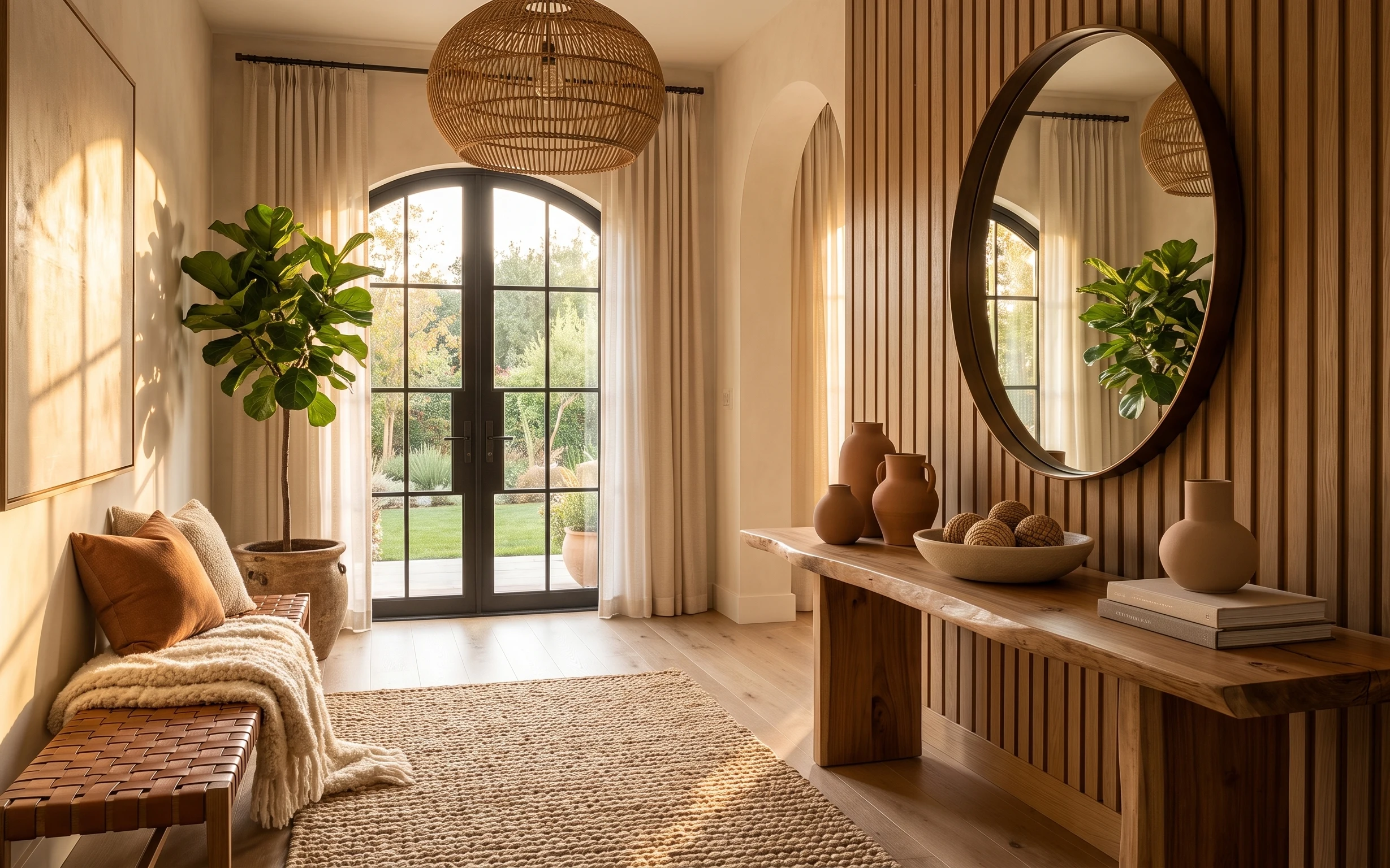
That woven rattan pendant glow and the slatted wood backdrop do a lot of heavy lifting here, but the parts that really read “finished” are softer and easier to move. A cream, tight-loop area rug anchors the whole corner, while off-white curtain panels create height without committing to wallpaper. The camel pillow and cream throw add texture in the exact color family the room already uses. Best of all for shared housing, the key styling pieces are textiles and freestanding decor that box neatly for the next lease.
I used to overthink this kind of corner and buy matching sets that looked great on day one and boring by month two. What finally clicked was repeating only two materials: woven fibers (like the rug) and warm terracotta tones (like the pillow and pots). Once I stopped chasing “perfect,” the room started looking lived-in even when everything was temporarily stored in moving boxes.
Layer 1 — Area rug with tight loop texture (cream/beige) ($200) Plush underfoot, hides scuffs
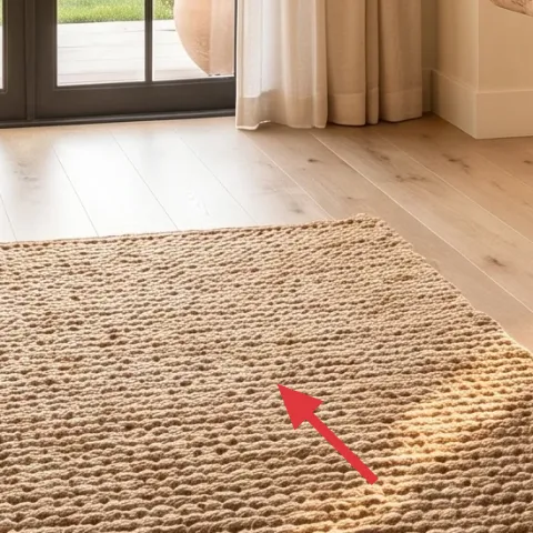
A cream rug with a tight loop texture gives you that soft, carpet-like look without going fully shag. In this photo, it sits in the open floor area in front of the daybed, so it’s doing both jobs: warming the walking path and making the whole corner feel intentional. Choosing a lighter neutral is a trade-off—yes, you’ll need to shake it—but the beige tone blends with the warm wall and keeps the space from feeling dark. If you’re choosing between low-pile and loop pile, go loop for the “cozy” surface and better visual forgiveness.
Anchor with the largest rug you can manage
If the rug reaches under the daybed edge, the corner reads styled instead of “half-furnished.”
Layer 2 — Curtain panels in off-white/cream ($80) More height, less visual clutter
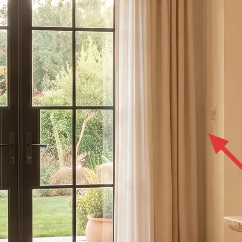
Off-white curtain panels frame the window and soften the vertical lines, which is exactly what this daybed corner needs. The panels here look lightweight enough to drape, not stiff, and that’s the key: look for a fabric that falls in gentle folds so the light stays flattering. The trade-off is that sheer-ish curtains don’t add privacy the way thicker drapes do, so consider layering later with a simple, removable curtain liner if your windows face the street. For a shared-housing setup, go for clip-in or easy hang options that dismantle without touching the window frame.
Keep the color close to the rug
Matching warmth (cream to beige to camel) makes the room feel cohesive even when you’re switching roommates’ stuff.
Layer 3 — Cream throw blanket ($35) Adds cozy texture on the daybed
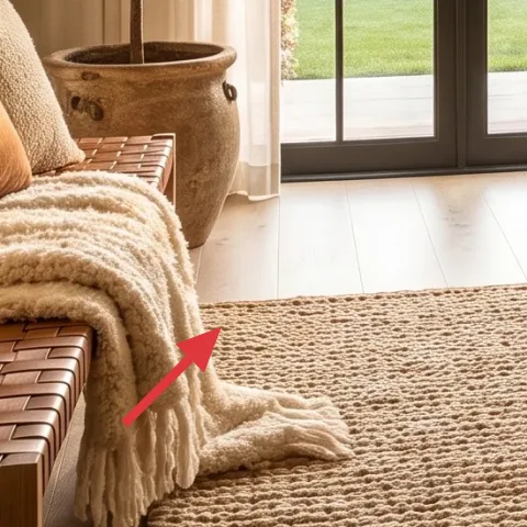
A cream throw blanket works because it repeats the rug’s light tone while adding a different texture you can feel from across the room. Here, it’s draped over the daybed edge, which makes it visible all day instead of only at bedtime. The trade-off with a lighter color is laundry frequency—throws show wear faster—but that’s also why they’re worth swapping seasonally. If you’re tempted to buy a patterned blanket to “hide dirt,” resist it; this corner already has pattern in the rug loops and wood slats, so keep the throw mostly solid.
Drape it where the light hits
When the throw sits near the window side, the fabric texture catches warm daylight.
Layer 4 — Camel/rust throw pillow ($18) Warm contrast against cream
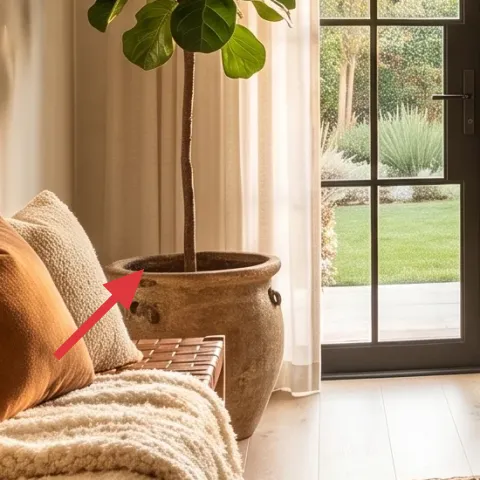
The camel/rust pillow is what pulls the whole corner into a cohesive palette instead of staying strictly neutral. In the photo, it pops against the cream throw and the off-white curtains, so the eye knows exactly where to rest. This is the moment to choose a color you’ll actually want to pack and unpack repeatedly—burnt orange and camel tones read warm year-round, especially with the terracotta ceramics. The trade-off is that a darker pillow can show lint and pet hair more obviously, so pick a fabric finish that hides fuzz (look for woven or suede-like microsuede).
Match undertones, not brightness
Camel and terracotta belong to the same warm family even if they’re not the exact same shade.
Layer 5 — Large framed wall art print on the left wall ($80) A calm focal point without drilling
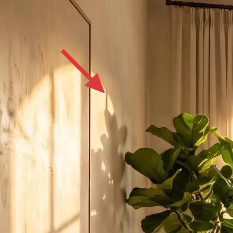
That large framed art print brings movement and helps balance the window and the wood slats on the right. For shared housing, a framed print is a smart choice because it’s lightweight, it’s easy to wrap, and it doesn’t require permanent changes to the wall. Keep the frame tone warm (wood or warm black) so it doesn’t fight the slatted wood. The trade-off: you lose some control over where the “perfect” center sits once you’re using removable hanging methods, so measure before you peel anything and keep your template tools for the next move.
Use foam-core mounting for plaster walls
If your wall finish is plaster, skip adhesive that can pull paint; choose removable foam-core picture mounts instead.
Layer 6 — Oval mirror leaned against the slatted wall ($120) Doubles light and makes the corner feel larger
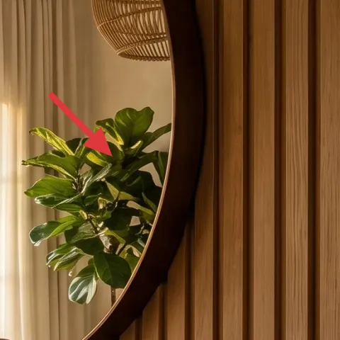
An oval mirror adds the kind of soft shape that rectangles can’t—especially in a corner with curved glass doors and organic textures like the rattan pendant. Here, it’s positioned near the slatted wall and reflects the window light, so the space feels brighter without any electrical upgrades. The trade-off is weight: mirrors are awkward to carry, so plan on moving it carefully and protecting corners with wrap. If your next place has different wall spacing, you can still reuse the mirror by leaning it in a similar “light-facing” spot or resting it on a freestanding surface.
Position it to catch daylight, not glare
Angle the mirror so it reflects the room tones, not straight reflections of the window.
Layer 7 — Terracotta plant pot on the console area ($40) Brings the earthy palette up close
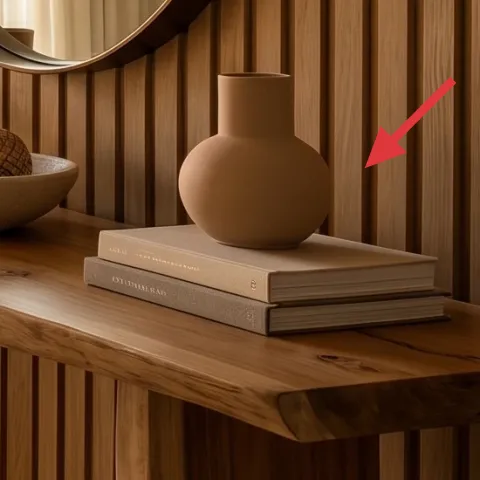
A terracotta plant pot (and the surrounding ceramics) is the easiest way to echo the room’s warm palette without buying a whole new set. In the photo, the pots sit near the console edge and visually connect the corner to the window side, so the plants don’t feel like afterthoughts—they feel composed. This is also a move-friendly styling win: you can swap plants, reuse the pot, and pack accessories in a few small boxes. The trade-off is that terracotta can be porous and chip if tossed, so plan on careful packing and slow handling.
Make it instead of buying it
Paint a plain terracotta pot set with warm acrylic colors so it matches the room’s camel-and-terracotta palette.
Materials
- Plain terracotta planter(s) (2 small pots) — home goods store — $15
- Acrylic craft paint (warm terracotta) — 1 bottle — $10
- Sponge brush set (small) — craft store — $5
- Painter’s tape (optional for clean edges) — already on hand — $0
- Newspaper/box liners — already on hand — $0
Steps
- Wash and fully dry terracotta so paint grips instead of beading.
- Mask any rim areas with painter’s tape for sharper color lines.
- Stipple or brush on the first thin coat of warm terracotta paint.
- Let the first coat dry completely before adding a second coat.
- Use a sponge brush to add a lighter highlight band if you want depth.
- Let the final coat cure overnight, then gently handle and pack.
Total DIY cost: $30 — saves about $10 over buying.
The cost, layer by layer
| Layer | Item | Cost |
|---|---|---|
| 1 | Area rug with tight loop texture (cream/beige) | $200 |
| 2 | Curtain panels in off-white/cream | $80 |
| 3 | Cream throw blanket | $35 |
| 4 | Camel/rust throw pillow cover | $18 |
| 5 | Large framed wall art print on the left wall | $80 |
| 6 | Oval mirror leaned against the slatted wall | $120 |
| 7 | Terracotta plant pot on console area (DIY priced) | $40 |
| Total | $573 | |
A cheaper variant is to size down the rug (or skip the larger format), choose a smaller framed art print, and pick one neutral pillow instead of two. That keeps the warm palette effect while cutting the cost fast.
What worked, what didn't (across the whole room)
Overall, the room looks cohesive because the palette repeats in materials: looped texture, off-white fabric, and terracotta ceramics. The biggest wins are the pieces that sit in public view—rug, curtains, and wall focal decor.
What worked
- The cream loop rug makes the daybed corner feel grounded and forgiving for shared-house foot traffic.
- Off-white curtain panels add vertical softness without changing anything fixed or permanent.
- Camel/rust pillow color ties the textiles to the terracotta ceramics on the console.
- The framed print balances the window area and gives the left wall a confident focal point.
- The oval mirror bounces daylight and makes the corner feel brighter in daytime and dusk.
- Terracotta planters and vases add an earthy “third material” beyond wood and fabric.
What didn't
- Very sheer curtains can look unfinished if the lighting is too dim at night.
- Light rugs show tracking sooner than darker ones, especially in shared entry routes.
- Mirrors are bulky to pack, so they need corner protection and careful carrying.
- Terracotta chips if moved too quickly, so it’s not a “grab-and-go” item during a move.
What we'd skip if we did it again
Skip buying a matching full “daybed set” that includes extra pieces you don’t actually need. In shared housing, the most valuable buys are swappable textiles (rug, throw, pillow) and a couple of focal wall items—everything else just becomes storage clutter.
Skip trend-heavy wall art with loud colors. The slatted wood and warm neutrals already set the tone, so a calm framed print keeps the corner looking intentional even after you rotate pillows or change plants.
Skip heavy mirror mounting solutions that require drilling. This corner already works with a leaned oval mirror look, and removable setups reduce stress when you move again in a year or two.
Frequently asked
How long does this refresh take for a shared housing room?
Plan on about 2–4 hours total. Rug + curtains are the biggest “layout” steps, while the wall pieces (framed art and mirror) take the least time once you’ve chosen placement. If you’re doing the planter DIY, budget an extra evening for drying and curing. Everything should dismantle quickly for the next move.
Is this renter-friendly if the wall is plaster or textured?
Yes—focus on freestanding decor and removable mounting methods. For the framed wall art, choose foam-core picture mounts or other removable supports that don’t rip paint off plaster. If you’re unsure what your landlord will tolerate, keep wall contact minimal and prioritize items like textiles, rugs, and leaned mirrors.
What if my daybed corner is smaller than in the photo?
Use the same palette and repeat the same materials, but scale down the rug and the framed art size. A smaller rug that still reaches under the daybed edge will look intentional. Curtains should still aim for height—choose panels that hang close to ceiling height if possible, then shorten only at the hem after hanging.
What if my room is bigger and needs more visual weight?
Go larger on the rug first, then choose a wider framed print or a slightly larger mirror. In a bigger corner, layering two pillow tones (camel and cream) helps the textiles look planned instead of sparse. Keep the terracotta planters in pairs to echo the “right and left” balance.
Where should I shop to keep it affordable?
For the rug and curtains, start with department stores or online retailers that offer neutral loops and off-white drapes. For the framed art and mirror, home decor chains and resale shops can be cheaper than buying new. The planters are easiest to find in garden centers or home goods aisles, then you can DIY-match the color.
Biggest mistake people make with this kind of daybed corner?
Overbuying “matching sets” instead of repeating only a few materials. If the room repeats cream-beige textiles, warm wood tones, and terracotta accents, it’ll feel cohesive even when everything isn’t identical. When you chase too many patterns at once, the corner ends up visually busy.
More in Living Room
Under $600: boho daybed corner refresh for shared housing
A warm boho daybed corner look—made move-friendly for roommates—using 7 swap-and-style layers under $600. The biggest lift comes from an ea…
Under $500: sunlit living room refresh with plant-and-textile swaps
A sunlit living room refresh for shared housing that focuses on move-ready swaps: rug, coffee table styling, one plug-in floor lamp, and pl…
Under $500: console entry corner refresh with warm neutrals
Warm up a console entry corner with renter-safe swaps: a soft rug, floor-length curtains, plug-in table lamps, and a round mirror—plus styl…