- Best for
- Easy dining styling you can pack
- Cost
- Under $500 total
- Difficulty
- Easy (mostly freestanding swaps)
- Time
- 2–3 hours for the refresh
Why beige-and-terracotta dining decor is the dining nook of 2026
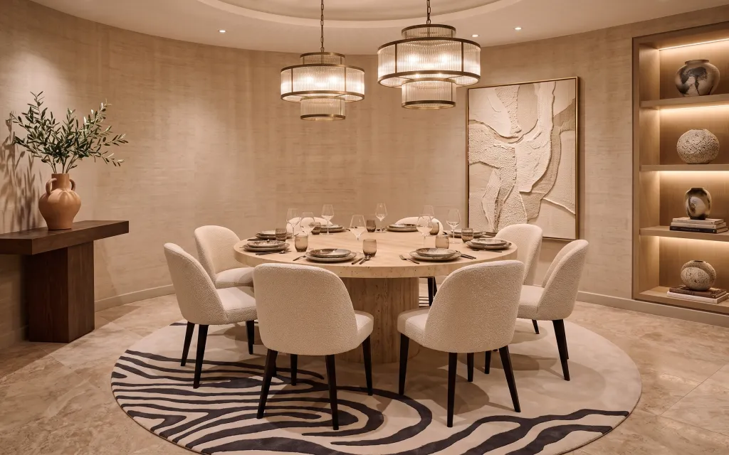
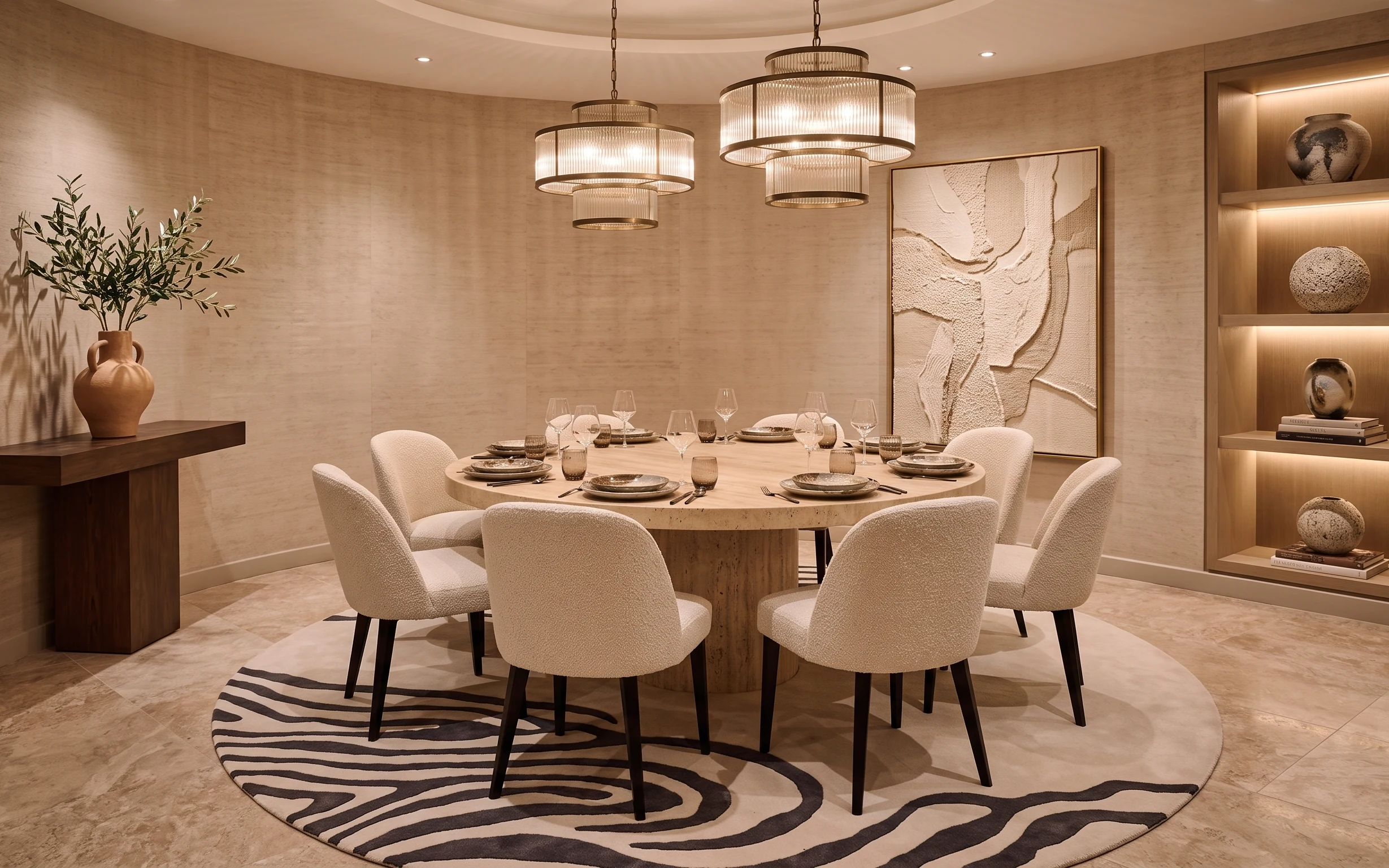
The hero photo leans on warm beige walls, creamy chair upholstery, and that bold zebra striped area rug under the round table. The terracotta vase and potted plant add an earthy note, while the large framed abstract artwork keeps the whole look from feeling too “plain.” Even with hard-to-change landlord basics, the styling is very achievable in shared housing because the main pieces are soft goods and lightweight swaps that pack flat or stack in boxes. Everything here is about texture, contrast, and scale, not permanent changes.
My own mistake in a past shared house was trying to match every color with accessories and ending up with a room that felt busy instead of intentional. What fixed it was choosing one repeatable pattern (in this case, black-and-cream stripes), then limiting the rest to warm neutrals and small sculptural objects. The framed artwork gives structure, but the rug and tabletop seating do most of the visual “work” day to day—so they’re the best first buys for anyone who knows they’ll move again soon.
Layer 1 — zebra striped area rug ($150) pattern underfoot
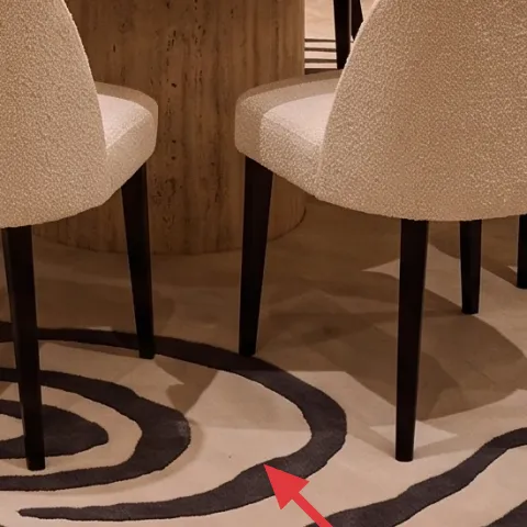
This zebra striped area rug anchors the round dining table and gives the whole nook a graphic rhythm against the warm beige tile and walls. The pattern reads modern because it’s high-contrast black on a light base, and the scale feels right for dining—big enough to hold chair legs without looking like a tiny accent. The trade-off is practical: stripes can show dust, so a vacuum pass is part of the routine. The big win is portability: a rug rolls tightly and fits in a rental van much easier than any fixed “makeover” that requires installation.
Why stripes work here
On warm-neutral walls, the rug creates contrast that the framed artwork and lighting can build on, without needing new paint or wall changes.
Layer 2 — dining chair ($100) keeps the seat tone soft
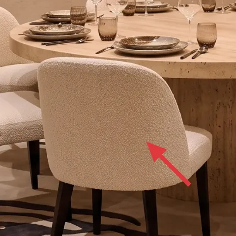
When dining chairs are this light and upholstered, they visually “lift” the room and keep the look from feeling heavy next to the black patterning. Choosing chairs in a creamy beige/ivory fabric tone is a smart move for shared housing because it hides minor mess better than stark white and it pairs naturally with terracotta and warm wood. The alternative would be going darker for drama, but then the rug and wall art have to do even more work to prevent everything from feeling tight. If the chairs aren’t identical to the photo, aim for the same rounded silhouette and neutral upholstery color.
Choose fabric that packs
Look for chairs you can wrap in a moving blanket and stack without stressing frames or crushing fabric edges.
Layer 3 — wood console table ($80) for a landlord-friendly styling zone
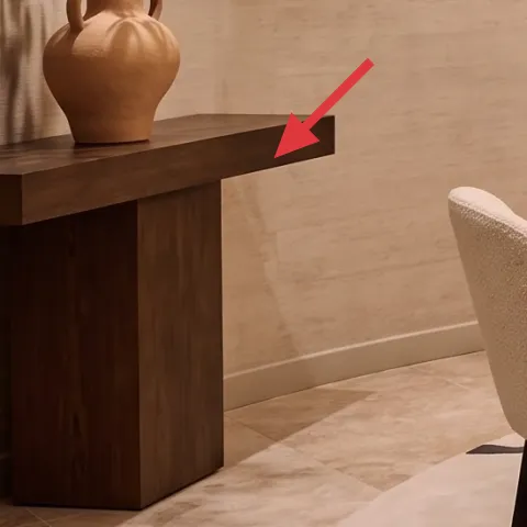
The wood console table on the left side creates a dedicated “styling shelf” without touching the walls. That matters in shared housing because anything freestanding survives the next lease transition. This piece also balances the room: warm wood against warm beige walls keeps the palette from going monochrome. The trade-off versus an actual built-in shelf is that the console doesn’t automatically align to the wall, so placement has to be intentional. In the photo, it sits where you can see it immediately, so in a smaller layout it’s worth placing it near the dining flow path.
Don’t over-pile
If the console looks crowded, the whole room starts to feel “decorated,” not lived-in. Keep it to one vase grouping plus a small extra object.
Layer 4 — terracotta vase ($25) warm-earth contrast
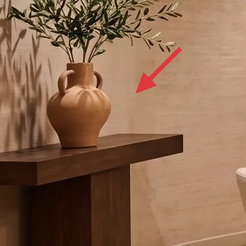
The terracotta vase is doing more than holding the plant—it introduces a second warmth so the room doesn’t read as beige-on-beige. A matte clay look plays well with the black-and-cream rug because it brings texture that doesn’t compete with the stripes. The practical advantage for moving is that vases travel well with bubble wrap, and you can swap stems seasonally without changing the core styling. The trade-off is that terracotta can chip if packed carelessly, so wrap the base and keep it from banging other boxes. In this nook, the size is big enough to be a focal point.
Use one height, not three
Stick to one vase height and keep the rest of your objects lower so the plant doesn’t feel visually “flooded.”
Layer 5 — large framed abstract artwork ($80) replaces the wall focal point with DIY
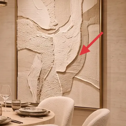
The framed abstract artwork gives the room structure—especially because the walls are plain and the lighting is statement-level already. For renters, the move-friendly version is to swap the exact look rather than trying to paint the wall or drill in anything new. The trade-off is that a DIY piece won’t match the factory texture of the original artwork, but “close enough” works because the palette is neutral and the shapes are soft, not graphic. In this nook, the frame size matters more than the specific art content, so copy the scale and keep the tones in the same beige/cream family.
Make it instead of buying it
This hand-painted cardstock abstract stands in for the framed artwork and can lean on a console or be supported without drilling.
Materials
- Cardstock or poster board — 2 sheets — craft store — $8
- Acrylic paint set (neutral/beige tones) — 1 small set — craft store — $12
- Small paintbrush — 1 — craft store — $5
- Black fine-tip marker — 1 — craft store — $3
- Painter’s tape — 1 roll — hardware store — $5
Steps
- Cut cardstock to the same general height/width ratio as the artwork.
- Lightly tape off a few organic shapes (curves and patches) so the abstract stays intentional.
- Paint large beige/cream blocks first, then let them dry fully.
- Add a thin layer of darker neutral patches and blend at the edges with the brush tip.
- Once dry, draw a couple of subtle contour lines with the black marker.
- Remove tape, then let everything dry completely before placing.
Total DIY cost: $33 — saves about $47 over buying.
Layer 6 — stacked books ($5) adds lived-in height
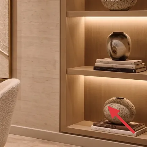
Those stacked books on the shelf are an easy way to make the nook feel styled without introducing new colors. A small stack also acts like a “platform” for whatever decorative object sits nearby, which is exactly what the photo is doing. The reason this works for shared housing is that books travel well—wrap them, box them, then rebuild the stack in the next place. The trade-off is timing: book stacks need a little straightening when you move them, but they’re quick to reset. Thrift finds help keep the look budget-friendly while staying visually grounded.
Match the vibe, not the titles
Look for similar cover tones (cream, neutral, low-contrast patterns) so the stack reads cohesive next to the ceramics.
Layer 7 — decorative ceramic spheres ($30) a sculptural accent for the shelf
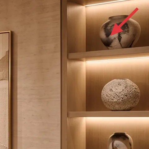
Decorative ceramic spheres give the shelf a gallery-like feel without feeling precious. They echo the soft curves already present in the chair silhouettes and keep the neutral palette from feeling flat after dark. In the photo, these objects sit on the right shelving unit, but the important part is how the shapes bounce light—matte surfaces catch warm illumination differently than glossy decor. The trade-off is that ceramic pieces are easy to break if packed loosely, so wrap each sphere and keep them separated with paper. Still, compared to wall-mounted art, they’re far more move-friendly.
Pick matte over shiny
Matte ceramics look more like the photo’s soft lighting and hide minor scuffs better.
The cost, layer by layer
| Layer | Item | Cost |
|---|---|---|
| 1 | Zebra striped area rug | $150 |
| 2 | Dining chair | $100 |
| 3 | Wood console table | $80 |
| 4 | Terracotta vase | $25 |
| 5 | Hand-painted abstract on cardstock (retail-equivalent framed artwork) | $80 |
| 6 | Decorative book stack | $5 |
| 7 | Decorative ceramic spheres | $30 |
| Total | $470 | |
A cheaper variant keeps the same layout plan but swaps the rug to a smaller-format zebra runner or a budget neutral rug and chooses secondhand chairs. Console table can be an inexpensive wood sideboard from a thrift drop, and ceramics can be one sphere set instead of multiple pieces.
What worked, what didn't (across the whole room)
The biggest overall win is how the look layers contrast without fighting the warm neutrals—zebra stripes on the floor plus terracotta texture give instant interest. The second win is portability: the console styling, book stack, and ceramic objects are all easy to box and rebuild. The only part that’s genuinely “not movable” in the photo is the hanging drum pendant lighting and the existing framed artwork scale, which is why the DIY substitute matters.
What worked
- The zebra striped area rug anchors the dining zone and makes the round table feel intentional.
- Cream chair upholstery keeps the space bright next to black-and-cream patterning.
- A freestanding wood console table creates a shelf-like styling surface without touching walls.
- Terracotta vase texture adds warm-earth depth against the beige tile and light walls.
- A large abstract art focal point prevents the nook from reading too “accessories-only.”
- Stacked books and ceramic spheres add height and shape so the shelf doesn’t look bare.
What didn't
- If the rug pattern is too small, chairs crowd the floor and the dining layout looks off.
- Matching every decor item to the exact beige tone makes the room feel flat.
- Too many shelf objects around the books creates clutter in a narrow dining flow.
- Buying shiny ceramic pieces can fight the warm lighting and look less soft in photos.
What we'd skip if we did it again
Skip swapping the wall color or doing any permanent changes. The photo’s warmth comes from materials and lighting direction, not paint, so renters and shared housing get more payoff by buying textiles and decor you can take with you.
Skip going oversized on the shelf decor. One terracotta vase, one book stack, and a pair of ceramic spheres are enough—any more and the dining nook feels crowded, especially with strong statement lighting overhead.
Skip buying a rug in the same pattern but the wrong scale. With dining chairs in front, the zebra stripes need to be broad and graphic so the floor reads like an anchor, not a small accent that disappears.
Frequently asked
How long does a move-ready dining nook refresh like this usually take?
Plan for about 2–3 hours if everything is already in hand: lay down the zebra striped area rug, set the chairs and table, then build the console and shelf styling. The DIY hand-painted abstract on cardstock takes most of the time, but active work is short. If you want it to look extra crisp, do the painting while you’re waiting on final dry time before assembling the rest.
Can I do this in a rental without drilling or painting?
Yes. The core upgrades here are textiles (the rug), lightweight furniture choices (chairs and a console table), and freestanding decor (terracotta vase, stacked books, ceramic spheres). For the wall-art look, the DIY cardstock piece can lean or be supported without attaching to the wall. Permanent changes aren’t necessary to get the same warm-neutral structure.
What if my dining area is smaller than the photo?
Keep the same “one anchor pattern” rule. If the rug feels too big, drop to a smaller zebra rug that still captures the chair legs when pulled out. For chairs, choose the same creamy upholstery tone but slightly slimmer silhouettes if needed. On the console/shelf, use one ceramic sphere and one book stack instead of multiple objects to avoid crowding.
What if my space has darker walls or less warm light?
Lean harder into the warm neutrals already present here: choose beige/ivory upholstery and a warm terracotta vase. If the room reads cool, keep the abstract art in beige/cream tones with minimal black lines so it doesn’t feel stark. The zebra rug still works, but avoid adding extra black decor elsewhere beyond the framed-art palette.
Where should I shop for the rug, chairs, and console on a student budget?
For the rug, look for budget-friendly 8×10 or comparable sizes at discount home stores or online marketplaces with easy returns. Chairs and consoles are often best at thrift or resale sites—search for neutral upholstery tones and simple wood forms. For decor objects like the terracotta vase and ceramic spheres, thrift shops and craft stores usually have the right textures without needing exact matches.
What’s the biggest mistake people make in dining nook styling?
Buying everything in the same exact beige shade. When beige matches everything, you lose the contrast that makes the rug and artwork feel intentional. Instead, repeat one pattern (the zebra stripes), keep chairs neutral, and add only one warm texture moment with terracotta plus sculptural ceramics.
More in Living Room
Under $500: dining nook refresh with 7 move-ready swaps
A warm-neutral dining nook refresh built from 7 move-ready swaps that pack into a few boxes. Total look costs under $500, with a DIY hand-p…
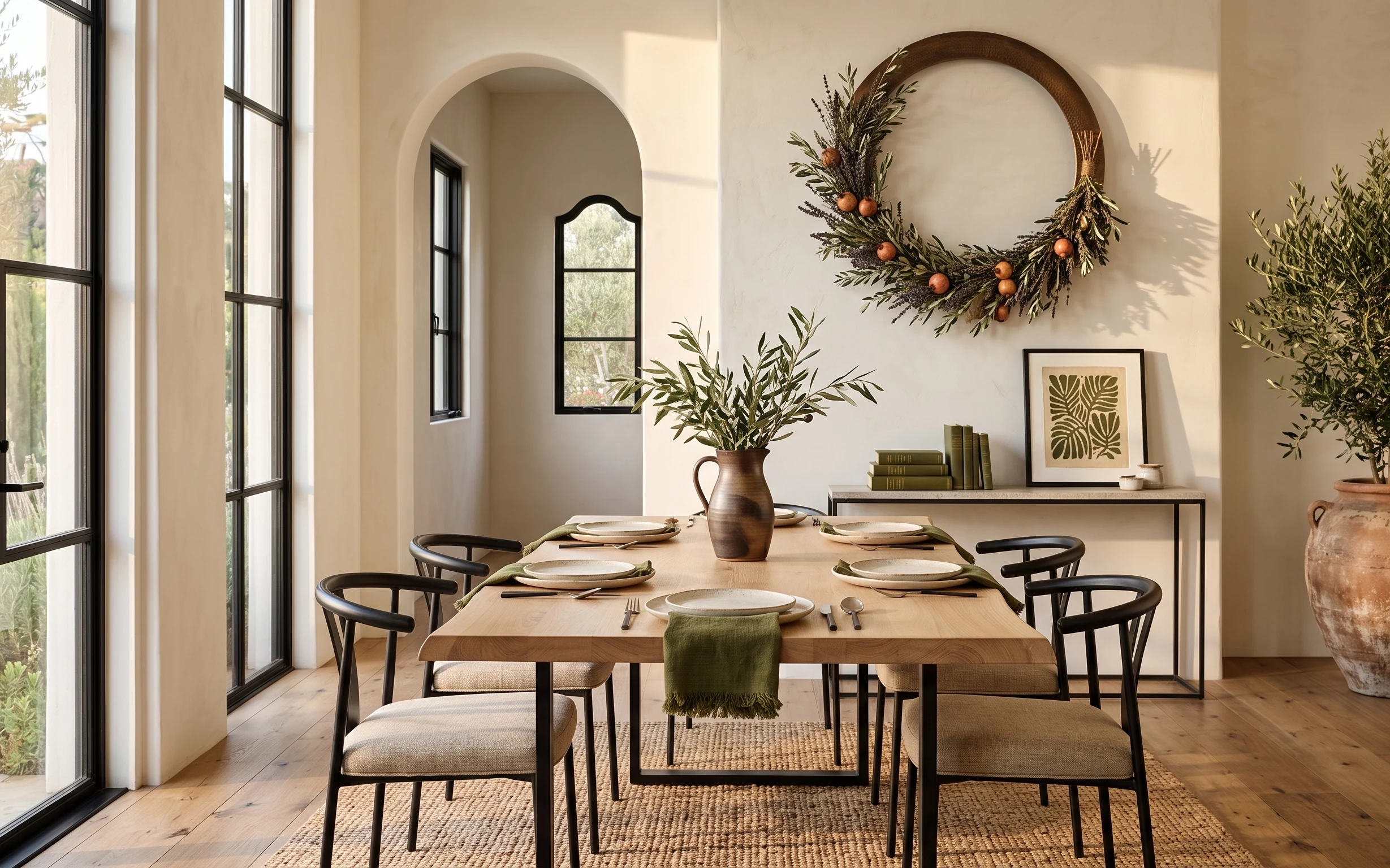
Under $400: move-ready dining table nook refresh
A bright dining table nook makeover built from 7 move-friendly swaps under $400. Focus areas: a woven area rug, a framed botanical print, a…
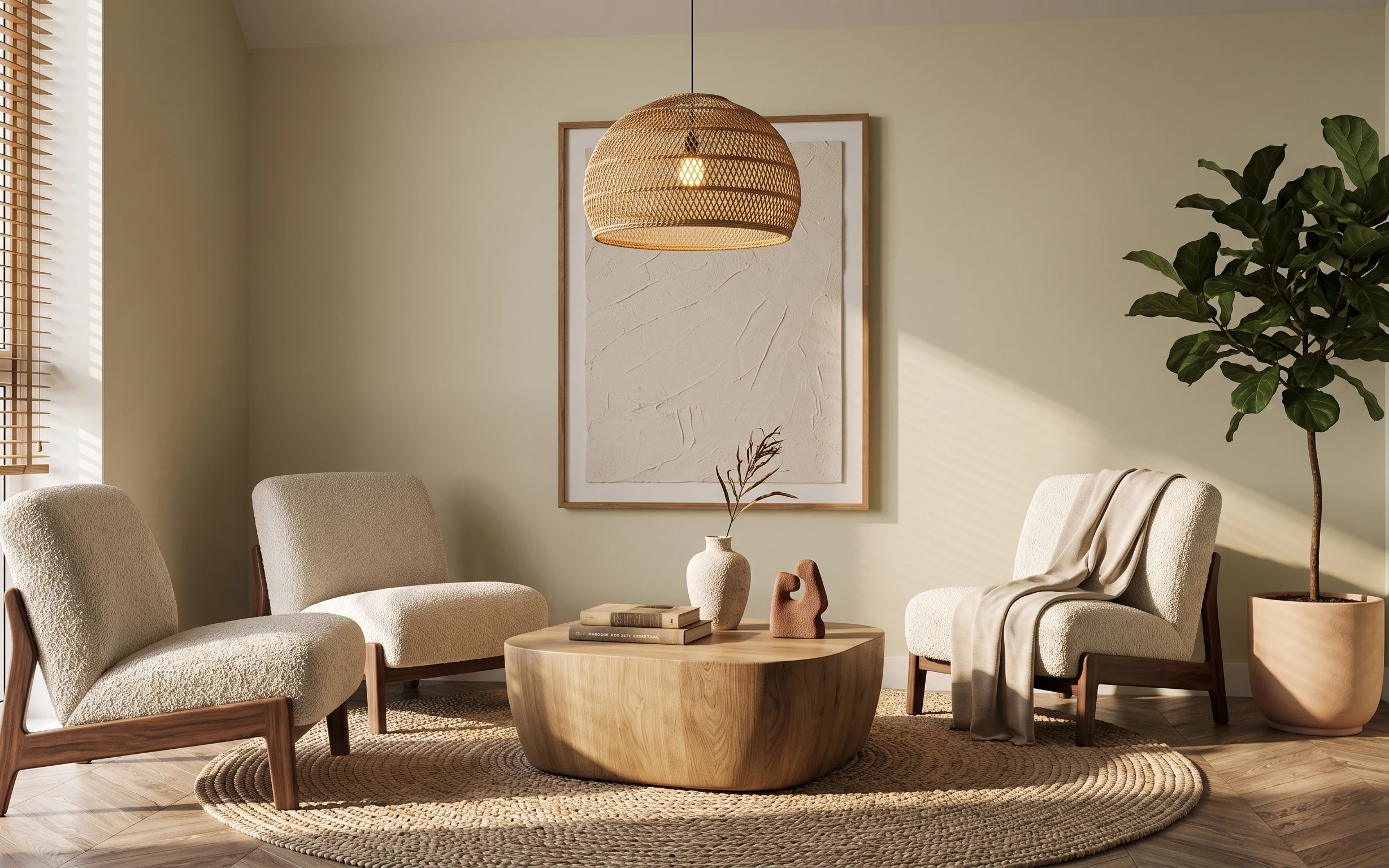
Under $600: renter-friendly cozy living room refresh
A renter-friendly cozy living room refresh with 7 move-ready swaps, all doable without drilling. The look leans creamy neutrals, light wood…