- Best for
- Move-ready living room refresh
- Cost
- Under $600
- Difficulty
- Easy (no-drill swaps + DIY print)
- Time
- 1 weekend
Why creamy-beige botanicals are the cozy living room of 2026
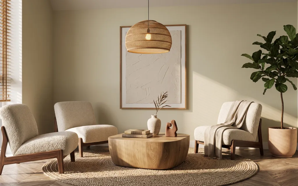
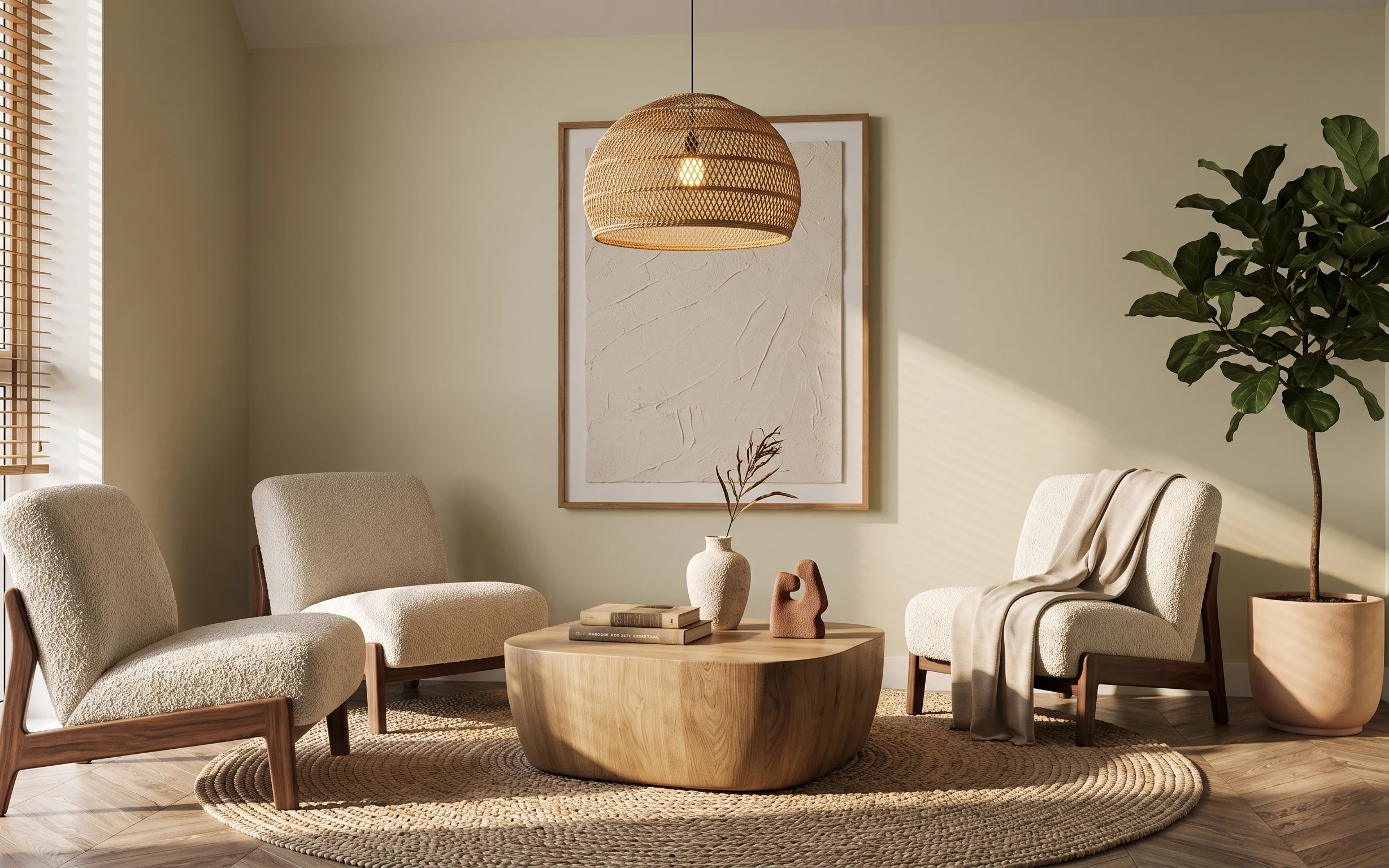
Start with the big tactile pieces you already have in the photo: a jute-style rug underfoot, plush cream upholstery, and that soft olive-green plant that keeps the palette from going flat. The framed botanical line-art adds a calm, graphic “breathing room” against the light wall. I’ve always loved how this look borrows from japandi styling—simple shapes, natural texture, and warm light sources. The best part for renters: everything here can be swapped, packed up, and recreated without permission.
I used to overthink wall art size and end up with prints that were either too small or too crowded above furniture. What finally clicked for me was treating the wall as a single focal “panel,” then matching the visual weight with one grounding rug and one medium-sized coffee table. After that, I stopped chasing perfection and started chasing balance—warm wood on one side, greenery on the other, and soft textiles draped where your eye naturally lands.
Layer 1 — woven jute-style rug ($200) jute texture that hides footprints
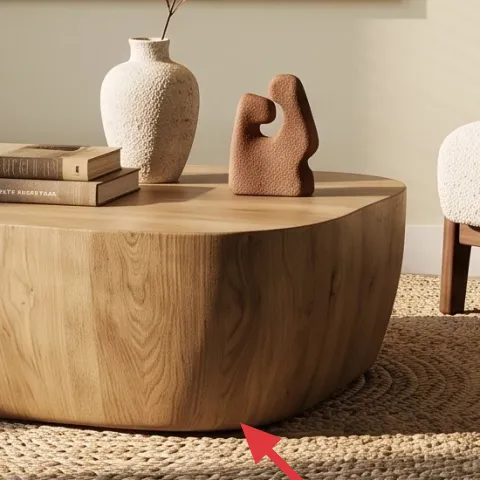
This woven jute-style rug anchors the whole room and gives you that laid-back, organic texture you see across the floor in the hero. Because it reads warm and neutral, it keeps the space from feeling too “matched set” when you’re mixing chairs, coffee table, and wall art. If you go with a flatweave look, it also makes the rug feel lighter than a thick shag, which matters in rentals where you’re not changing the lighting or walls. The trade-off: jute-style fibers aren’t the easiest to deep-clean, so use a vacuum with a brush-free setting and quick blotting for spills.
Rug rule for renters
Choose a 5×8-ish size that tucks under the front legs of both chairs—no measuring panic, just a consistent “footprint.”
Layer 2 — round light-wood coffee table ($180) soft edges for small styling zones
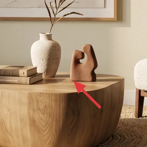
The round light-wood coffee table works because it mirrors the room’s softness: curved chair arms, plush throw texture, and that botanical print’s organic lines. A round top also makes styling feel intentional—your vase and book stack land in the center without looking crowded, and it visually reduces the “blocky” feeling of rectangular furniture. I usually pick light wood when the walls are already cream, because it makes the room feel brighter without adding more color. Trade-off: round tables can feel like they have less flat surface, so keep your decor to 2–3 items and use a tray to group the rest.
Go for lighter wood tones
In this palette, honey oak and natural birch-like finishes photograph closest to the hero, especially in daylight.
Layer 3 — framed botanical line-art print ($80) DIYable wall art with clean botanical lines
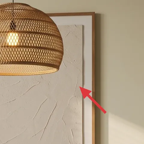
The framed botanical line-art print is the focal point that makes the room feel “styled,” not just furnished. Look at how the artwork sits centered on the wall, with its botanical lines echoed by the plant on the right—your eye connects the two without needing more accessories. A line-art piece also lets your rug’s texture and your chairs’ cream upholstery stay the stars. The trade-off with line art: it can look too minimal if the frame is wrong, so keep the frame warm-toned wood like the hero rather than a glossy black or cool silver.
Make it instead of buying it
DIY a botanical-style abstract on cardstock, then slide it into a simple light wood frame for the same calm focal-point effect.
Materials
- Cardstock sheet (8×10 or similar) — 1 — craft store — $8
- Set of acrylic paints (earthy neutrals) — 1 — art store — $12
- Fine detail paintbrush — 1 — art store — $10
- Painter’s tape — 1 roll — hardware store — $6
- Light wood frame (fits 8×10) — 1 — home goods — $14
Steps
- Tear off a rough “botanical” silhouette plan with painter’s tape to guide the shapes—no sketching pressure.
- Paint a soft off-white background wash and let it dry fully.
- Use the fine brush to add thin stem-like lines and small leaf marks in 2–3 earthy tones.
- Remove tape and touch up edges with the same line color.
- Let the artwork dry until matte (no tackiness).
- Slide the paper into the frame and center it behind the mat (if your frame has one).
Total DIY cost: $50 — saves about $30 over buying.
Layer 4 — tall leafy plant ($80) vertical greenery to balance the wall art
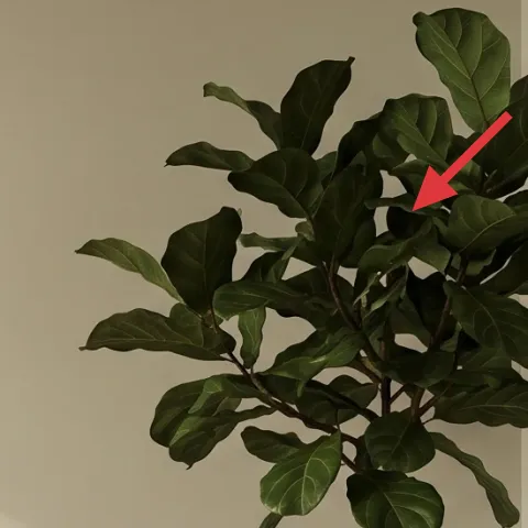
The tall leafy plant on the right adds height and visual movement, which is exactly what you need when the artwork is centered and the chairs are low. In the hero, the plant’s olive-green leaves warm up the cream walls and make the whole palette feel lived-in instead of staged. It also creates a natural “second focal point,” so you’re not relying on only the framed print. The trade-off is choosing a plant that survives real life: a faux plant looks good in photos, but the realism depends on leaf texture and scale, so don’t pick something too small for the wall height.
Skip tiny plants in big corners
If the plant reads like a desk decoration, the balance collapses—choose something tall enough to reach above your chair backs.
Layer 5 — cream throw blanket ($30) drape texture that makes seating feel softer
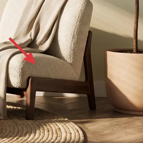
The cream throw blanket draped over the right chair does more than add softness—it gives your eye a “landing spot” that’s warmer than the wall and rug alone. It also repeats the room’s light color family without adding new patterns, which keeps the overall look calm. I like choosing a throw with a woven or lightly textured surface, since it shows up against boucle upholstery and doesn’t blend into the rug. Trade-off: if the blanket is too thin, it won’t look intentional when casually draped, so pick one with enough body to hold a fold.
Drape, don’t fold-flat
Let the throw slump slightly at the front edge so it looks styled by use, not by a showroom.
Layer 6 — white ceramic vase ($20) clean negative space for stems
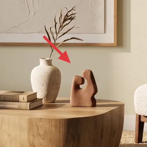
The white ceramic vase brings that crisp, creamy “breathing room” next to the coffee table’s light wood. In the hero, it’s placed near the center cluster, which helps it read as part of the styling, not random kitchen-cabinet clutter. A simple white ceramic also makes your decor flexible—you can switch stems, leave it empty, or swap in a small dried arrangement later without repainting anything. Trade-off: ceramic looks delicate, so if you’re clumsy during moves, keep the vase in a padded box and avoid placing it where it’s likely to be bumped.
Match the vase to the room temperature
Warm-white ceramics look best with jute textures and light wood; cool bright whites can feel too sterile.
Layer 7 — decorative book stack ($30) stacked spines for instant height
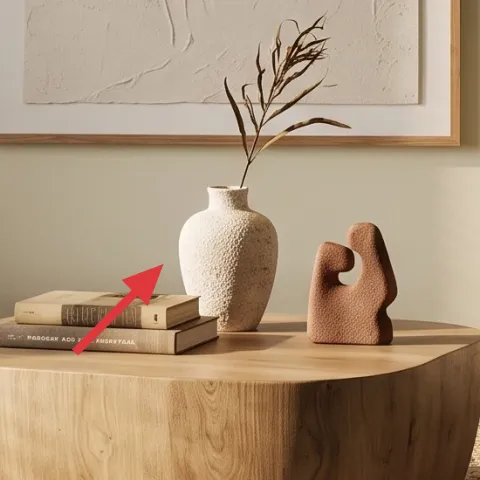
The decorative book stack adds a practical styling height that helps everything else look intentional. On the coffee table, a few stacked books give you a base for the small decor pieces, so the arrangement doesn’t sink visually into the round tabletop. I also like book stacks because they’re renter-friendly: they’re already moveable, they don’t require wall attachments, and you can swap the covers to match seasons. Trade-off: if the stack is too tall or too narrow, it looks top-heavy, so keep it compact and pair it with a tray if you want cleaner edges.
Keep the stack centered
Place the stack under the tallest item in your grouping so the composition stays balanced.
The cost, layer by layer
| Layer | Item | Cost |
|---|---|---|
| 1 | Woven jute-style rug | $200 |
| 2 | Round light-wood coffee table | $180 |
| 3 | Framed botanical line-art print (DIY-ready) | $80 |
| 4 | Tall leafy plant | $80 |
| 5 | Cream throw blanket | $30 |
| 6 | White ceramic vase | $20 |
| 7 | Decorative book stack | $30 |
| Total | $520 | |
If you want a cheaper version, swap the coffee table for a thrifted light-wood or laminate round table ($80–$120 range) and pick a smaller rug size that still tucks under chair fronts. Keep the plant and wall art as the “must-do” focal pieces.
What worked, what didn't (across the whole room)
The overall formula works because every element repeats the same “warm cream + light wood + olive-green” temperature, so the room reads cohesive even with minimal pattern. The most reliable win was the wall-art focal point paired with a tall plant that balances height. The main miss would be over-styling the coffee table—when there are too many objects, the round surface starts to look cluttered instead of curated.
What worked
- The woven rug adds texture without competing with chair upholstery or wall art.
- The round coffee table makes the decor arrangement look centered, not chaotic.
- The framed botanical print gives a calm focal point and ties into the greenery.
- The tall leafy plant adds height so the room doesn’t feel too horizontal.
- The cream throw blanket softens seating and repeats the room’s neutral palette.
- The white ceramic vase creates clean negative space for stems and small decor.
What didn't
- Too many small items on the coffee table makes the round top look busy.
- A plant that’s too short reads like table decor instead of a room-balancing element.
- Cool-toned whites in ceramics can clash with jute and light wood warmth.
- A very thin throw won’t hold a draped shape and can look accidental.
- Skipping a tray (or a natural grouping) can make the styling feel scattered.
What we'd skip if we did it again
Skip replacing the whole wall with trendy “feature” wallpaper. In a renter setup, you get more long-term mileage from one move-ready framed print and a tall plant that adds color through foliage.
Skip a rug that’s too small. If the rug doesn’t visually tuck under the front legs of both chairs, the room loses cohesion fast—especially with round furniture that already takes up visual space.
Skip over-styling the coffee table. Keep to one vase, one small height element (like the book stack), and one extra decor object—then let texture from the rug and throw do the rest.
Frequently asked
Can I recreate this look in a rental without drilling into the wall?
Yes—this room’s structure comes from movable pieces and wall-hanging art, not hardware. Use a lightweight framed print and hang it with Command Strips (or a similar removable method) sized for the frame weight. The rest of the look is pure styling: a textured rug, a light-wood coffee table, a draped cream throw, and a tall plant that adds height without changing anything permanent.
How long does the DIY botanical-style art take?
Plan for about 1–2 hours total hands-on, plus drying time between layers. The easiest version is a soft off-white background wash, then thin stem-like lines with a fine brush. Acrylic dries quickly, but you’ll still want it fully dry before framing. After that, the frame swap is instant and the finished piece looks cohesive with the room’s warm neutrals.
What if my living room is smaller than the photo?
Go smaller on the coffee table footprint only if it’s the only thing you can change—don’t shrink everything. Keep the round table feel and center the framed art as a single focal panel. For the rug, choose the largest size that still leaves comfortable walking paths. If you can’t go tall with the plant, use a shorter plant plus a stack of books, but keep the overall height balance.
What if I have a bigger living room?
Lean into scale. Use a larger rug and keep the framed botanical print wide enough to read from the seating area. For the plant, choose something that reaches visually above chair backs so it fills the vertical space near the right side. You can also add one more warm-texture element (like a second throw or a second ceramic accent), but keep the coffee table edit tight.
Where should I shop for these pieces without overpaying?
Start with the rug and coffee table because those set the tone. Look for light-wood round coffee tables and jute-style rugs at home goods, big-box stores, and resale apps—then decide the framed print and vase based on the palette you find. For the plant, search for a tall faux option that’s leaf-textured and scale-correct, or buy a live plant if you know you can keep it watered.
What’s the biggest mistake people make with this palette?
They mix warm and cool neutrals without realizing it. If your cream upholstery reads warm, keep your ceramics warm-white and choose light-wood finishes that don’t lean gray. The second most common mistake is going too busy on the coffee table—round surfaces can look cluttered quickly. Stick to a small grouping and let texture do the work.
More in Living Room
Under $600: renter-friendly cozy living room refresh
A renter-friendly cozy living room refresh with 7 move-ready swaps, all doable without drilling. The look leans creamy neutrals, light wood…
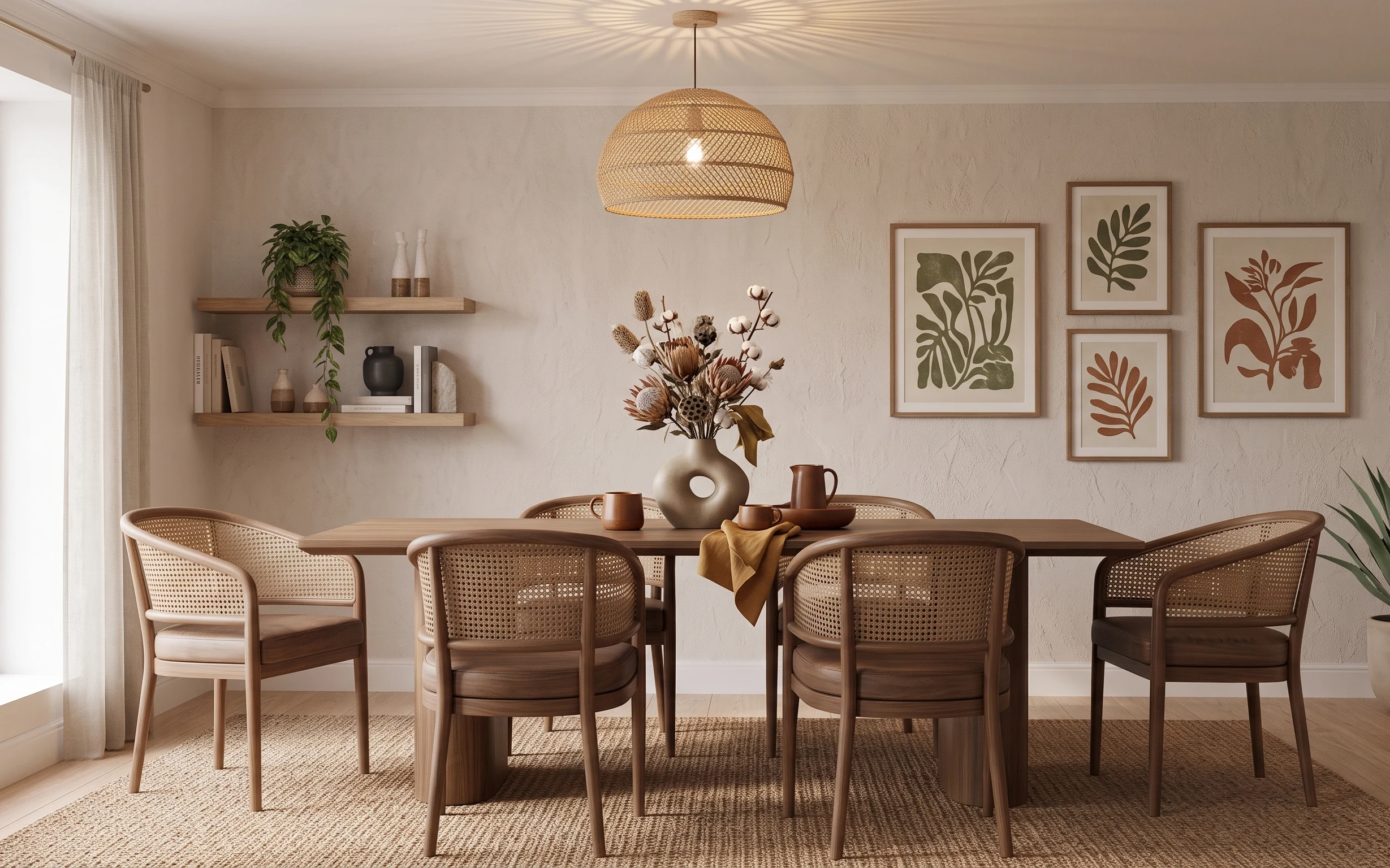
Under $1000: cream-and-rattan dining nook refresh
A cream-and-rattan dining nook makeover with seven weekend upgrades, priced to stay under $1000. The biggest wins are a woven rug, soft cur…
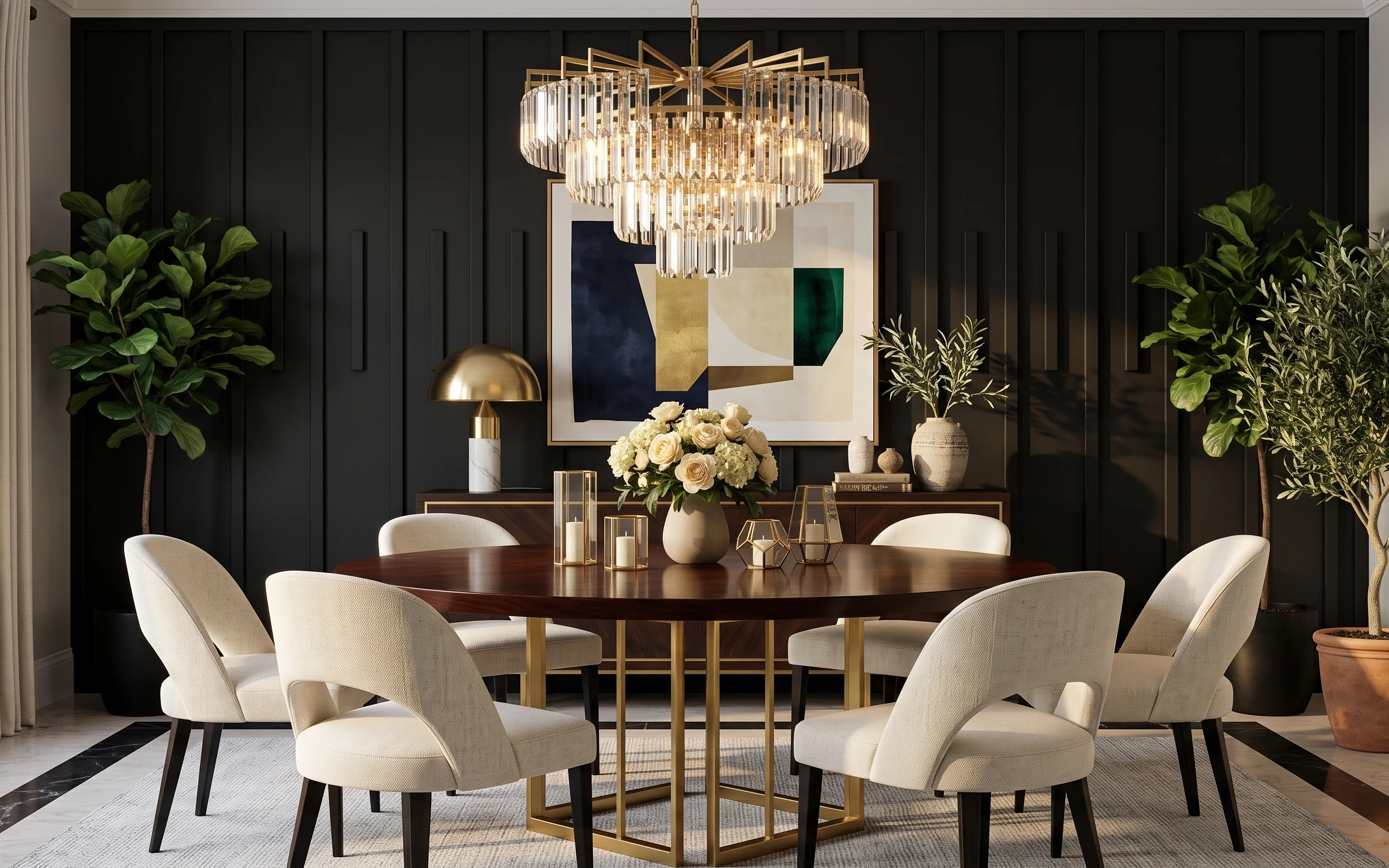
Under $700: modern glam dining room refresh with 7 upgrades
Turn a dark-paneled dining space into a modern glam moment with 7 budget-friendly upgrades, totaling $700 or less. This plan leans on warm …