
- Best for
- earthy neutrals and renter-friendly styling
- Cost
- Under $500
- Time
- 1 weekend
- Renter-safe
- Yes (no painting or drilling)
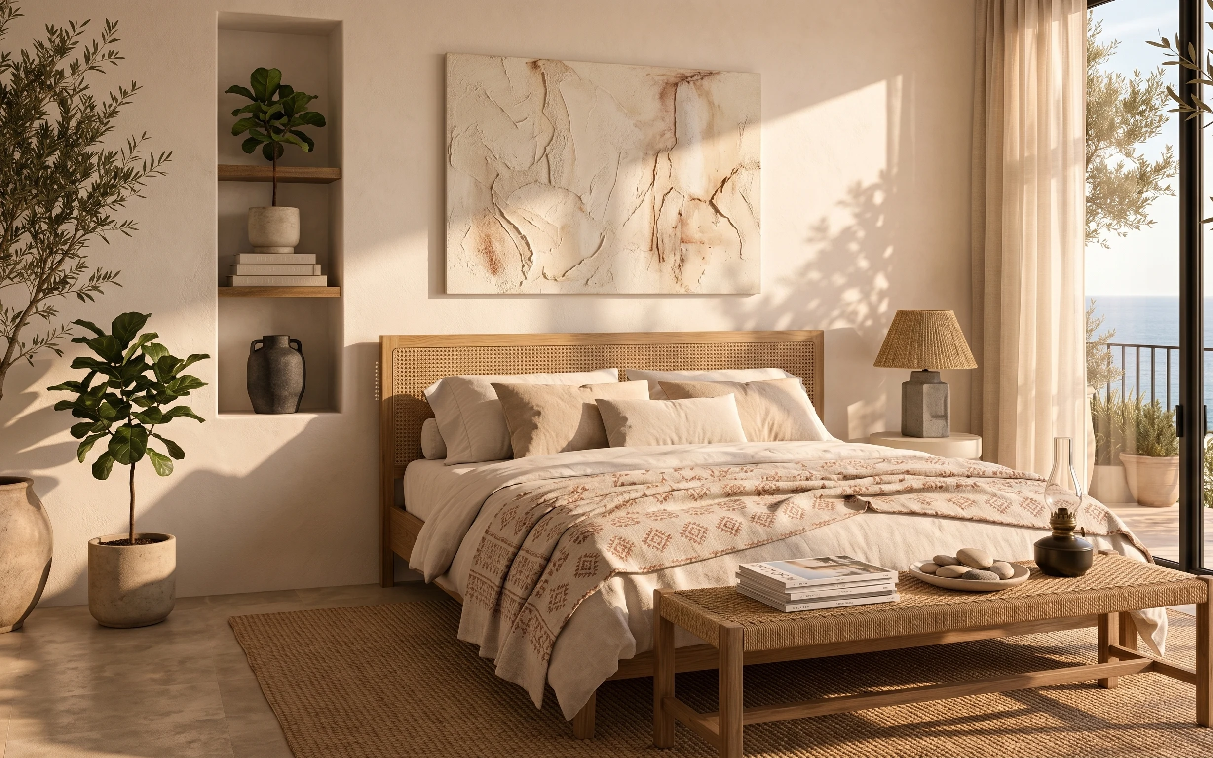
Why warm wood-and-gray textiles are the bedroom of 2026
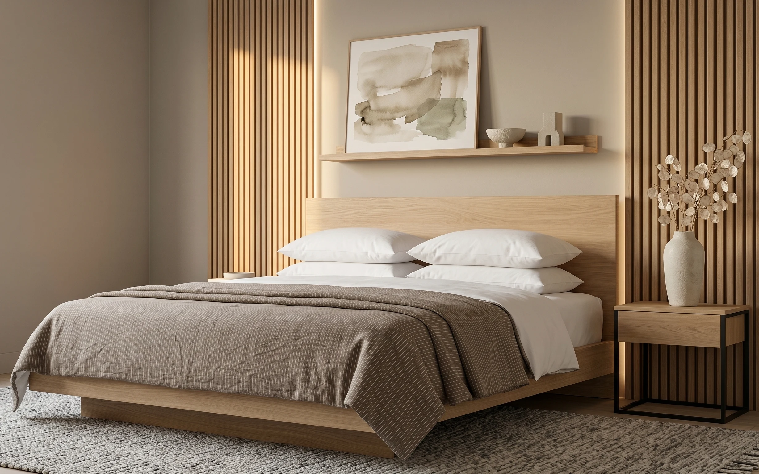
What I love about this setup is how the warmth comes from the materials, not from any heavy color decision. You’re looking at light wood paneling, crisp white pillow covers, and a taupe striped throw that adds movement without getting loud. The gray area rug grounds everything so the bed feels intentional instead of floating. Even the framed abstract art uses soft shapes and a light palette, so it reads calm rather than “busy.” For renters, this is doable because every layer is either a removable soft good or a freestanding styling piece.
I used to overdo neutral bedrooms by adding too many “statement” accents at once—usually a second patterned throw and a second wall print—then wondered why everything felt flat. Here, the rule is fewer, bigger moves: one framed abstract, one striped blanket, and then styling that repeats shapes (rounded ceramics on the shelf, rounded vase on the table). I’d also rather buy a rug that carries the whole palette than chase matching tiny accessories. Once I matched the textures first, the rest of the look fell into place.
Layer 1 — large gray area rug ($150) Softens the wood and hides everyday scuffs
A large gray area rug is the anchor in this photo: it fills the open floor space around the bed and makes the whole palette feel cohesive. The best part of choosing a soft medium-gray is that it supports the warm wood tones without looking dirty—especially in a rental where you can’t control foot traffic. A runner won’t do the same job; this look needs a “floor foundation” scale that reaches close to the bed edges. The trade-off is cost, but for a bedroom refresh, a true 8×10-size rug is the one item that changes the room’s feel more than any single decorative accessory.
Start with size, not pattern
If the rug doesn’t extend past the bed’s sides, the bed looks like it’s floating on bare flooring.
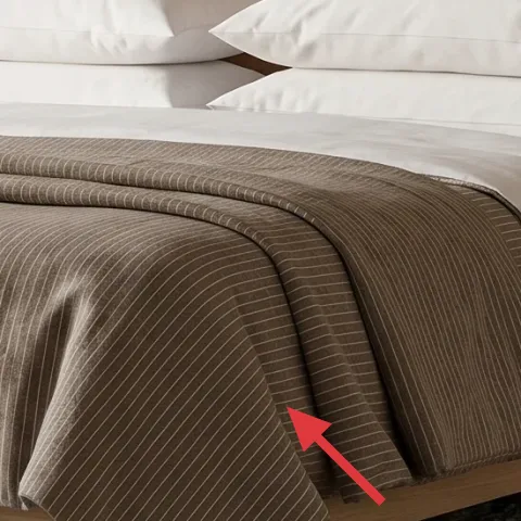
Layer 2 — taupe striped throw blanket ($30) Adds line-and-shape texture across the bed
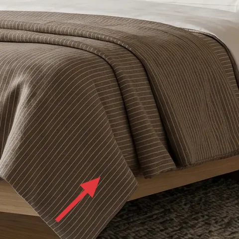
The taupe striped throw draped across the bed front brings the only “graphic” moment in the room, and it works because the stripes are subtle, not high-contrast. Visually, it ties into the gray rug while also echoing the warm neutrals in the wood. If you only add solid blankets, the bed can read a little too smooth and staged; stripes give that lived-in texture without adding another color family. The trade-off is that stripes will show wrinkles—so plan to fix the fold once it’s styled. A throw like this is also easy to repack for move-out day.
Why stripes feel calmer here
Thin lines in taupe and gray create movement without pulling focus from the artwork.
Layer 3 — white throw pillow covers ($24) Keeps the top layer crisp and bright
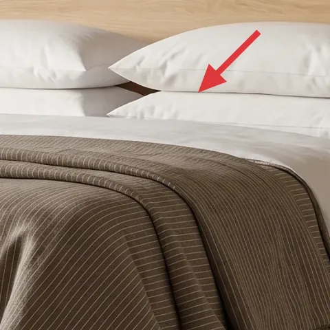
White throw pillow covers are doing quiet heavy lifting: they reflect light, soften the wood tone, and give the bed a clean “reset” feeling. In the hero image, the pillows aren’t the same size as the throw, so they create a layered stack—soft square shapes on top, then stripes and a heavier fold across the front. The trade-off with white is that it shows lint and darker smudges faster, but it’s still renter-friendly because pillow covers are washable and replaceable. I’d rather refresh covers than try to repaint or cover a landlord wall.
Pick covers, not complicated inserts
Choose removable, machine-washable covers so your look stays sharp between seasons.
Layer 4 — framed abstract wall art ($80) Brings soft “gallery” energy without changing walls
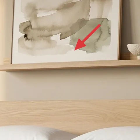
The framed abstract wall art is the visual countertop of the room—above the bed, it balances the horizontal shelf line and keeps the palette airy. Because the art is light in tone and built on soft blocks, it complements the japandi vibe instead of fighting it. If you go too dark or too busy, you’ll compete with the wood paneling and the striped throw. The trade-off: real framed art takes up wall space, so measure your target area and choose a size that feels similar to the hero’s proportions. In a rental, you can hang using damage-free methods like picture-rail hooks if available, or Command Strips rated for framed items.
Don’t pair two big wall moments
If the wall already has a strong feature, keep art to one main frame so the room stays calm.
Layer 5 — wood side table ($80) Gives you a styling surface at night
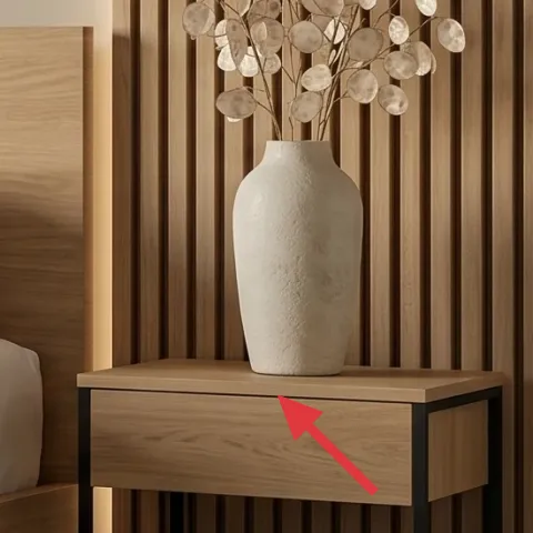
A wood side table turns the far-right corner into a usable “scene,” and it’s why the styling doesn’t feel accidental. In the hero image, the table top holds the vase and also visually connects to the warm wood tones in the headboard area, so the bed looks grounded on both sides. The best alternative—if you can’t match the exact wood—still needs warmth (oak, walnut, or bamboo) rather than cool white-painted finishes. The trade-off is that table width affects how much negative space you keep beside the bed. Choose a size that lets the vase breathe instead of crowding the corner.
Balance matters
One side surface plus the bed’s “main” styling reads intentional; two tiny surfaces often look messy.
Layer 6 — ceramic vase with dried stems ($40) Adds height and movement with zero fuss
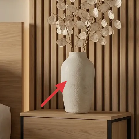
This ceramic vase with dried stems gives the room vertical rhythm—tall enough to stand out against the wall paneling, but not tall enough to overpower the framed art. It also echoes the rounded shapes you see on the shelf styling: smooth ceramics soften the linear look of the striped throw. In a renter setup, dried stems are a smart choice because you’re not relying on watering schedules, and you can refresh the stems later without major changes. The trade-off is that stems can shed slightly, so keep the vase on a stable surface and handle gently when moving.
Make it instead of buying it
DIY foraged dried-stem arrangement in a store-bought vase so you get the same height and texture for less.
Materials
- Ceramic vase (medium height) — 1 — thrift/discount — $20
- Foraged dried stems (sprigs/branches) — as needed — foraged — $0
- Floral tape — 1 roll — craft store — $4
- Twine — 1 spool — craft store — $3
- Small scissors/hand pruner — 1 — around the house — $2
Steps
- Sort stems by thickness and pick 5–7 “main” pieces plus a few small fillers.
- Trim each stem to create a natural height range (tall center, shorter sides).
- Bundle the thickest stems first and wrap floral tape around the stems’ bases.
- Add thinner filler stems around the bundle and secure with more tape.
- Tuck and adjust until the silhouette looks airy instead of clustered.
- Tie a light twine loop at the base if you want extra stability in the vase.
Total DIY cost: $29 — saves about $11 over buying.
Layer 7 — decorative bowl and bottle on shelf ($30) Makes the shelf feel styled, not empty
The shelf styling in this photo is small but deliberate: a decorative bowl and a ceramic bottle create a “soft + structured” pair that matches the room’s materials. The bowl adds a curved, light-catching surface; the bottle adds a narrow shape that keeps the shelf from looking flat. If you use only one item, the shelf can feel like a temporary landing spot; grouping two pieces lets the shelf read like part of the design. The trade-off is staying minimal—too many small objects will fight the framed art and the wood paneling behind. Keep your palette to off-white and warm ceramic tones for the same effect.
Use odd numbers only when you add more
For two objects, vary height (one taller bottle, one flatter bowl) and let negative space do the rest.
The cost, layer by layer
| Layer | Item | Cost |
|---|---|---|
| 1 | Area rug 8×10 (gray) + rug pad | $150 |
| 2 | Throw blanket (taupe striped) | $30 |
| 3 | White throw pillow covers (set of 2) | $24 |
| 4 | Framed abstract art print (one) | $80 |
| 5 | Wood side table | $80 |
| 6 | Ceramic vase + dried stems arrangement | $40 |
| 7 | Decorative bowl + ceramic bottle for shelf | $30 |
| Total | $434 | |
If you want a cheaper version, size down one element: pick a smaller rug (5×7) and swap the framed print for a single ready-to-hang framed abstract at a lower price point. Keep the striped throw and white pillow covers—they’re doing the most work visually per dollar.
What worked, what didn't (across the whole room)
The overall verdict: the look holds together because the palette is limited and the textures do the heavy lifting—rug, stripes, and ceramics. The room also stays renter-friendly since every change is either soft goods or freestanding styling.
What worked
- The large gray rug grounds the bed and makes the warm wood paneling feel intentional.
- The taupe striped throw adds texture and movement without adding a new color family.
- White pillow covers keep the top layer bright and prevent the room from reading too heavy.
- The framed abstract art gives “designed” energy while staying neutral and easy to move.
- The wood side table creates a consistent styling surface on the right side.
- The tall ceramic vase with dried stems adds height and balances the shelf’s horizontal line.
What didn't
- Too-small rugs make the bed look cut out of the room instead of placed on a foundation.
- Overstuffing the shelf with multiple tiny decor pieces makes the wall feel busy fast.
- Choosing a high-contrast striped throw can clash with the soft abstract art palette.
- Skipping the white pillow layer makes the bed look darker and less airy against wood tones.
What we'd skip if we did it again
Skip adding multiple patterned textiles at once. This photo works because there’s one “graphic” element (the taupe stripes) and everything else stays soft and neutral.
Skip buying a tiny rug. Pay for enough rug coverage that the bed reads placed on the floor, not set on a border of bare space.
Skip over-styling the shelf. Two ceramic pieces at different heights match the hero’s calm vibe, while too many objects fight the framed abstract art.
Frequently asked
How long does this bedroom refresh take?
Most of the time goes to sourcing the rug and getting the framed abstract placed correctly. Budget about 3–5 hours for shopping and setup, plus one extra hour for styling the shelf and draping the throw. If you DIY the dried-stem vase, add 30–60 minutes for trimming and bundling.
Will this work in a rental with limited wall access?
Yes—everything here is either a removable soft good (rug, throw, pillow covers) or freestanding styling (side table, vase, shelf decor). For the framed abstract, use damage-free hanging methods like Command Strips or picture-rail hooks if that feature already exists.
My room is smaller than the photo. What should I adjust first?
Reduce scale in the rug and pillow choices first. If you can’t fit an 8×10, a 5×7 can still work as long as it reaches far enough under the bed area. Keep the framed abstract as the main wall piece—don’t add a second print just because you have less floor space.
If my room is larger, how do I keep the look from feeling flat?
Go bigger with the rug and keep the throw drape generous. In a larger room, a single rug that visually touches the bed edges prevents “floating furniture” and helps your ceramics (vase and shelf bowl) feel more intentional. You can also add a second white pillow cover for extra fullness while staying in the same palette.
Where should I shop for these items if I want the japandi palette?
For neutrals, prioritize home goods stores and online retailers with Scandinavian or minimalist categories—look for gray rugs, off-white pillow covers, and warm wood side tables. For the framed abstract, search for light neutral prints with soft shapes. For the vase and stems, browse thrift shops or craft stores first, then DIY the stems.
What’s the biggest styling mistake people make with neutral bedrooms?
They add too many competing textures at once. If you’re using stripes on the throw, keep the pillows and rug quieter and let the framed abstract stay minimal. Another common miss is under-sizing the rug—without enough coverage, even the perfect decor looks unfinished.
More in Bedroom
Under $500: japandi bedroom refresh with 7 renter-friendly swaps
A japandi-inspired bedroom refresh you can pull off without painting or drilling, using seven renter-friendly swaps. See the exact pieces (…
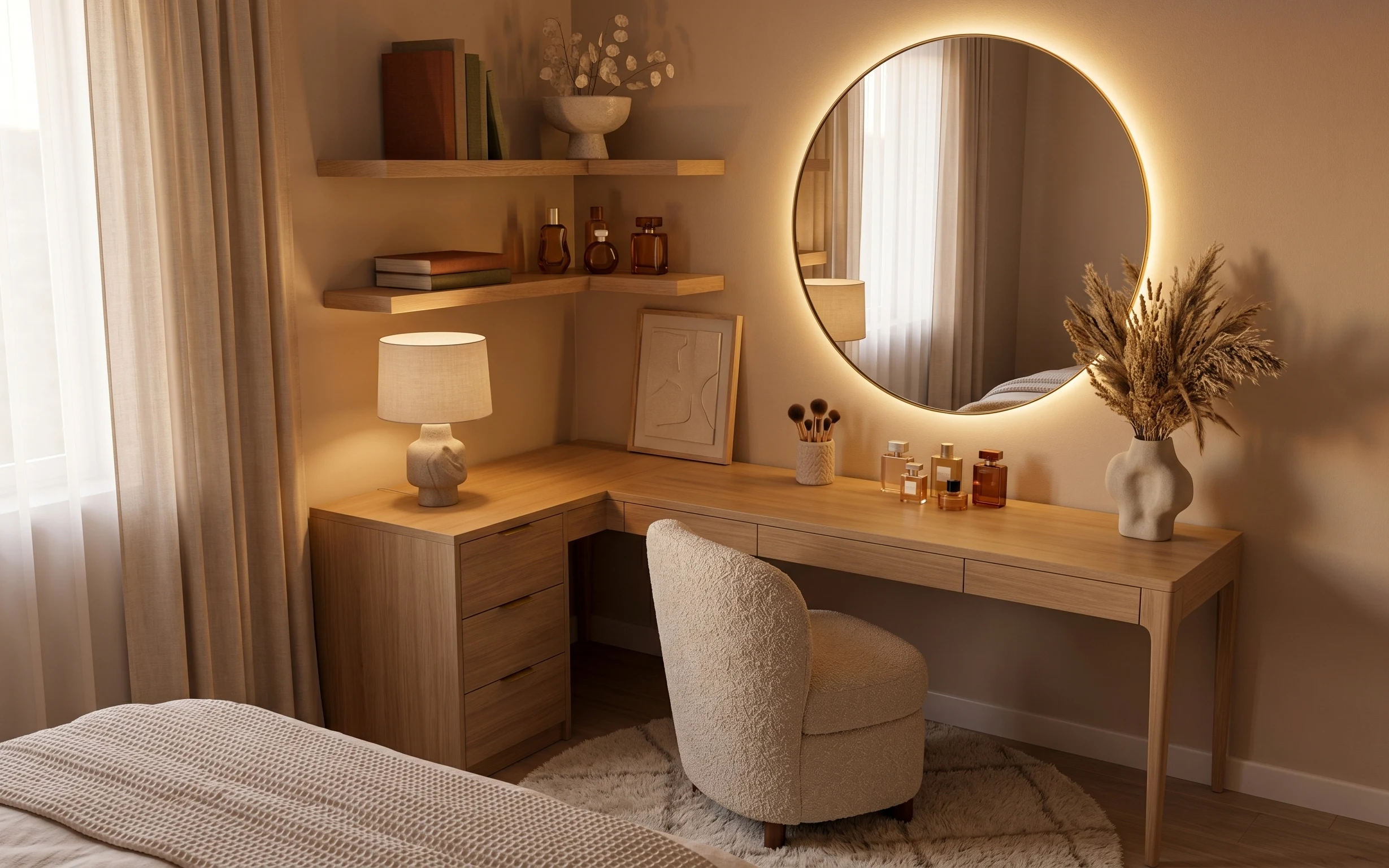
Under $700: warm oak dressing table nook refresh
A warm oak-and-cream dressing table nook can look intentional on a weekend. With $700 worth of swaps (rug, lamp, round mirror, shelves, cha…
Under $400: sunlit bedroom corner refresh with 7 move-ready swaps
A sunlit bedroom corner starts with warm neutrals, then gets its “done” look using 7 move-ready swaps. This refresh keeps everything renter…