- Square footage
- staircase entries and other small landings (≈ 60–120 sq ft of visible area)
- Cost
- about $450 total for the layered look
- Difficulty
- easy (styling + one DIY framed insert)
- Renter-safe
- Yes—no drilling; freestanding decor and removable art
Why warm blush-and-walnut styling is the staircase entry of 2026
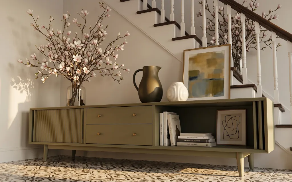
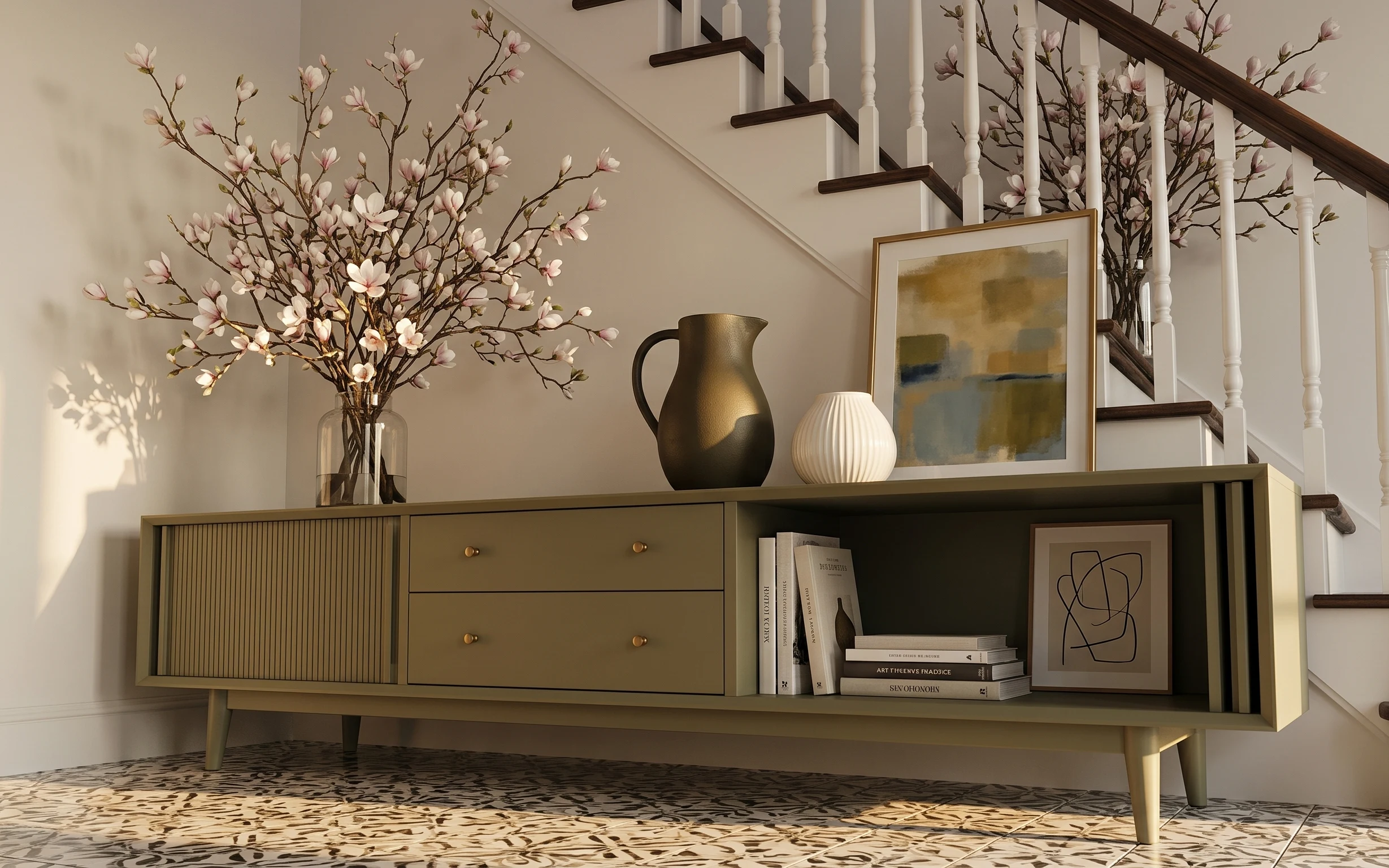
When you’re working with an entry that’s always “seen,” styling has to do two jobs: look intentional up close and still read calm from the stairs. In this setup, the patterned area rug anchors the floor, while the long low credenza adds clean storage lines you can organize before guests arrive. The gold-framed abstract print brings warmer contrast against the white walls, and the glass vase with pink blossoms adds the only softness in the palette. A look like this is achievable on a renter budget because every piece here is either freestanding or swap-in art.
I used to overdo entries with matching sets—same height, same color, same vibe—and it always looked like I’d copied a showroom photo instead of lived there. The mistake I caught in my own place: I added a vase and then left the shelf basically empty, which made the art feel random. What changed my mind was building a “stack” of objects: tall branches in the vase, then two ceramics, then books and a framed piece at the lower shelf. That layered rhythm is what makes the staircase entry feel finished.
Layer 1 — patterned area rug ($120) Patterned enough to hide scuffs
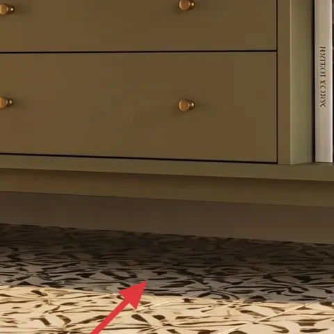
The patterned area rug is what turns a plain tile floor into a landing. The design reads grounded instead of loud because it mixes light sand tones with darker speckles, so it works even if you catch daily foot traffic (or a dropped bag). I’d choose pattern over a solid flat-weave here because the stair-adjacent zone gets more contrast—shadows and glare make solids look patchy fast. The trade-off is that patterns can feel busy if the rest of the styling is too colorful, so the credenza decor stays in warm neutrals and blush accents.
Use the rug to set the “height” for everything else
Once the rug is down, place taller decor first (vase, framed art), then use smaller objects to fill the remaining shelf zones.
Layer 2 — long low credenza with drawers ($180) Storage lines keep the entry from looking crowded
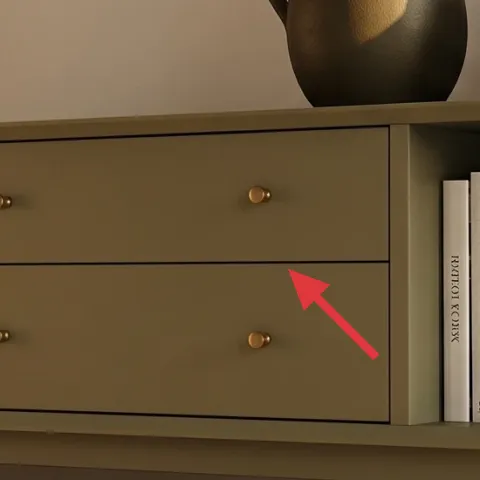
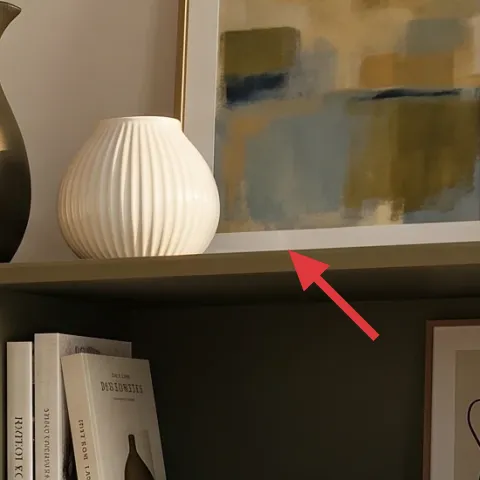
This long low credenza is the visual anchor: it gives you horizontal lines to balance the vertical stair banister and white spindles. The drawer fronts also help the space stay move-in ready—entry styling looks good longer when you can hide clutter. I’m choosing a freestanding credenza over floating options because renters need something that survives a move and doesn’t rely on drilling. The color sits in that warm walnut lane, which makes the gold accents feel intentional instead of mismatched. Trade-off: a larger piece is harder to fit in tight layouts, so measuring the entry opening matters.
Drawers matter more than you think in entries
If you can close it, you can style it—then keep your daily stuff out of sight until you want a cleaner look.
Layer 3 — framed abstract print in gold frame ($45) Warm metal frame for a softer focal point
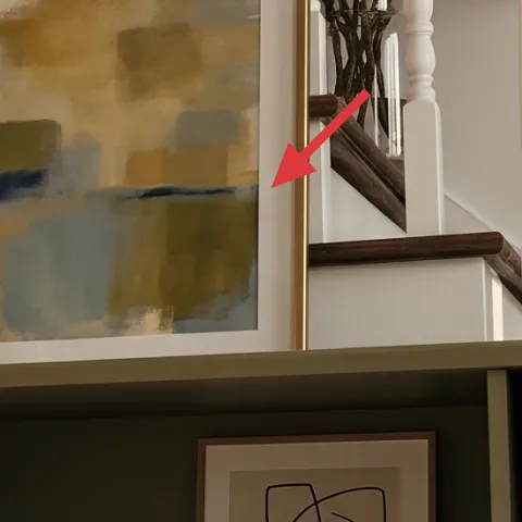
The gold-framed abstract print is the “pause button” between the staircase rail and the ceramics on top. It’s scaled to feel like wall art, but it still reads like part of the credenza display because the warm frame tone repeats the gold ceramic pitcher. I like choosing abstract over text art for entries because it doesn’t compete with the floral branches—there’s already movement in the blossoms. The trade-off with abstract: you need the color palette to stay restrained, so this DIY leans into muted tans and soft blue-gray rather than bold primary colors.
Make it instead of buying it
This DIY hand-painted abstract on cardstock gives you a custom print that matches the warm neutrals and soft blue-gray tones in the gold frame.
Materials
- Cardstock sheets — 2 pieces — craft store — $8
- Acrylic paint set (starter colors) — 1 set — craft store — $12
- Painter’s tape — 1 roll — hardware store — $7
- Frame (same size as the gold frame insert) — 1 — thrift store — $8
Steps
- Lightly tape a simple grid or block shapes on the cardstock to guide your layout.
- Paint the largest shape first using a tan or warm beige base layer.
- Add a couple of medium blocks with soft blue-gray for contrast, leaving some negative space.
- Use a smaller brush to layer thin strokes over the edges for a subtle “brush texture.”
- Let the paint dry fully, then gently remove tape.
- Trim the cardstock insert to fit your frame opening and secure it in place.
Total DIY cost: $35 — saves about $10 over buying.
Layer 4 — white ribbed ceramic vase ($15) Texture that looks good from every angle
The white ribbed ceramic vase adds a different texture than the smooth glass vase and the matte florals. Because it’s ribbed, it picks up highlights as light moves across the staircase entry, which keeps the shelf from looking flat. I’d rather use a textured white vessel than another gold-toned object because the gold already appears in the frame and pitcher—white gives the eye a reset. This one also sits at a medium height, so it fills the “middle zone” on the credenza where tall items and low books would otherwise fight. Trade-off: ribbed ceramics show dust faster, so wipe it quickly during styling before guests arrive.
Don’t place it too close to the edge
With entries, objects get bumped during shoe changes—leave a little breathing space so the vase stays centered.
Layer 5 — gold ceramic pitcher ($25) A second gold note to make the frame feel intentional
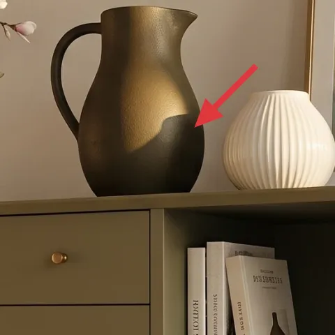
The gold ceramic pitcher is doing subtle work: it repeats the warm metal tone from the gold-framed print and ties the top shelf together. I’m choosing it instead of a second picture because entries look best when you create a mix of “flat” (art) and “round” (ceramics). Its matte finish makes it feel calmer than a high-gloss decorative bottle, and the rounded silhouette echoes the curve of the ribbed vase. The trade-off is that gold can read brassy if the rest of the palette is too cool, so the rest of the styling stays warm—think cream, tan, and blush rather than stark gray.
Match materials, not exact colors
Gold ceramics and a gold frame don’t need identical gold tones as long as they share the same warm undertone.
Layer 6 — framed minimalist line art print in white frame ($35) Downshift the brightness on the lower shelf
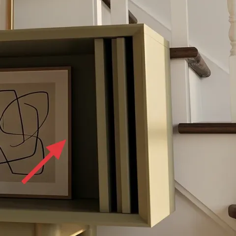
The minimalist line art print in the white frame balances the bolder blossoms and the abstract artwork above. Because it’s lines instead of color blocks, it reads airy—perfect for a staircase entry where the eye moves constantly between levels. I’d choose line art over a busy photo print here to keep the lower shelf from feeling cluttered next to books and ceramics. The white frame also connects visually to the painted walls, which prevents the lower shelf from turning too dark. Trade-off: line art is less forgiving if the shelf is messy, so hiding spines and keeping the book stack tidy helps a lot.
Let the line art “float” with negative space
Keep a little open area around the frame so the lines don’t get swallowed by stacked objects.
Layer 7 — large glass vase with flowering branch arrangement ($30) Blush branches for that “always in bloom” feeling
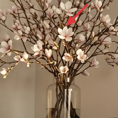
The large glass vase with flowering branches brings the softest color into the palette: blush pink and pale cream blossoms against warm neutrals. It’s a better move than using multiple small plants in this spot because the vase creates one clear vertical shape that mirrors the staircase spindles. The glass also reflects light, which helps the entry feel brighter even when the space is shadowed by the stairs. Trade-off: branch arrangements look best when the stems aren’t crowded—trim or remove a few ends so the silhouette stays airy, not bushy.
Keep one “hero height” and repeat smaller shapes
Let the branches be tallest, then echo the curves with the pitcher and the ribbed vase.
The cost, layer by layer
| Layer | Item | Cost |
|---|---|---|
| 1 | patterned area rug | $120 |
| 2 | long low credenza with drawers | $180 |
| 3 | framed abstract print in gold frame (DIY insert) | $45 |
| 4 | white ribbed ceramic vase | $15 |
| 5 | gold ceramic pitcher | $25 |
| 6 | framed minimalist line art print in white frame | $35 |
| 7 | large glass vase with flowering branch arrangement | $30 |
| Total | $450 | |
If you want a cheaper variant, swap the gold-framed abstract print for a smaller thrifted frame and DIY a smaller insert. For the credenza, look for a used console or low dresser with similar drawer lines; keeping the rug pattern and the blush branches makes the overall look hold together.
What worked, what didn't (across the whole room)
Layering warm metals, white texture, and blush florals makes the staircase entry feel styled even when it’s just a quick glance. The rug also does a lot of heavy lifting for hiding scuffs and making the floor feel intentional.
What worked
- The patterned rug grounds the tile and keeps the entry from looking like an empty walkway.
- The long credenza drawer layout hides the everyday clutter that usually accumulates in entries.
- The gold-framed abstract print connects to the gold ceramic pitcher for a cohesive warm accent.
- The ribbed white vase adds highlight-catching texture that reads well from the stairs.
- The minimalist line art keeps the lower shelf airy next to books and small ceramics.
- Blush branches create one clear vertical silhouette that balances the staircase’s height.
What didn't
- Too many small decor objects on the credenza top made the space feel crowded fast.
- Skipping negative space around the lower frame made the books look disorganized.
- Using a second gold item without adding white texture made the palette feel heavy.
- A crowded branch arrangement read messy instead of airy against the white walls.
What we'd skip if we did it again
Skip a second matching framed print set. In a staircase entry, repeating the same style twice makes the shelves feel like a store display instead of a lived-in landing.
Skip plain flat accessories with no texture. A smooth vase plus smooth pitcher can look dull under warm light, so ribbing and glass bring the movement you need.
Skip overloading the credenza with both tall and chunky decor at the same height. Choose one hero height (the blush branches), then keep the rest smaller so the eye can rest between stair levels.
Frequently asked
How long does this kind of staircase entry refresh take?
Plan on 2–3 hours total. The rug and credenza are quick if you already have them delivered, and the styling comes down to placing the tallest item first (the glass vase) and then building down to ceramics and framed art. The DIY framed abstract insert is the only variable—once the paint is dry, assembling it in the frame is usually fast.
Is this renter-friendly if I have to pack up at lease end?
Yes. Everything in the look is freestanding or swap-able: the credenza sits on its own feet, the rug is move-in/move-out friendly, and the framed art can come with you. The ceramics and books are also easy to relocate, and the DIY insert can be updated later if you want a new vibe without buying a whole new frame.
What if my staircase landing is bigger (or smaller)?
For smaller entries, keep only one framed piece on the lower shelf and reduce the number of objects on top to three (vase, pitcher, ribbed vase). For bigger landings, you can add more negative space by using a larger rug or moving the credenza slightly closer to the stair opening so the decor stays centered.
Where should I shop if I want the same materials without matching sets?
Rug and credenza-style furniture usually come from big-box home stores, resale apps, and thrift shops. For the ceramic pieces and framed art, look for individual items rather than coordinating sets—especially for gold accents and white frames. The key is repeating materials (warm gold + white + blush) instead of repeating exact designs.
What’s the biggest mistake people make with staircase entry styling?
The most common miss is treating the shelf like a catch-all. When objects multiply without a height plan, the entry looks busy instead of curated. A simple fix: pick one hero height, keep two mid-size pieces, then add one framed element and a small book stack for a balanced “shelf portrait.”
More in Small Spaces
Under $500: stair-entry credenza refresh with soft blush accents
A staircase entry can feel finished without landlord permission. This under-$500 refresh uses a patterned rug, a long credenza styling layo…
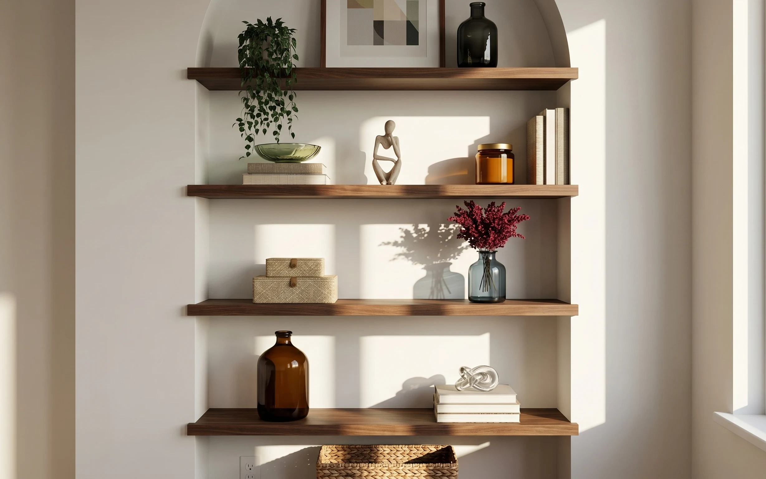
Under $300: move-ready shelf nook styling for shared housing
A renter-friendly shelf nook refresh for shared housing: seven move-ready swaps that lean on earthy glass, woven storage, and a pressed-flo…
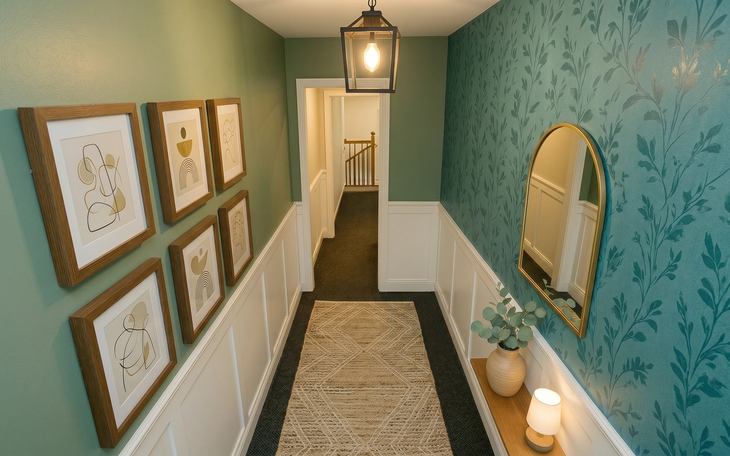
Under $1000: olive-and-gold hallway gallery nook refresh
A weekend refresh for an olive-green hallway gallery nook: update the runner rug, add a gold-tone oval mirror, and wrap one wall in botanic…