- Best for
- Anchoring a kitchen island nook
- Cost
- $570 total
- Difficulty
- Easy
- Time
- Weekend (4–6 hours)
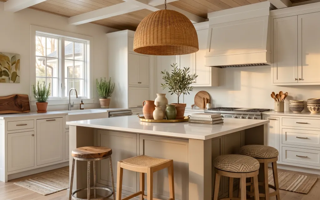
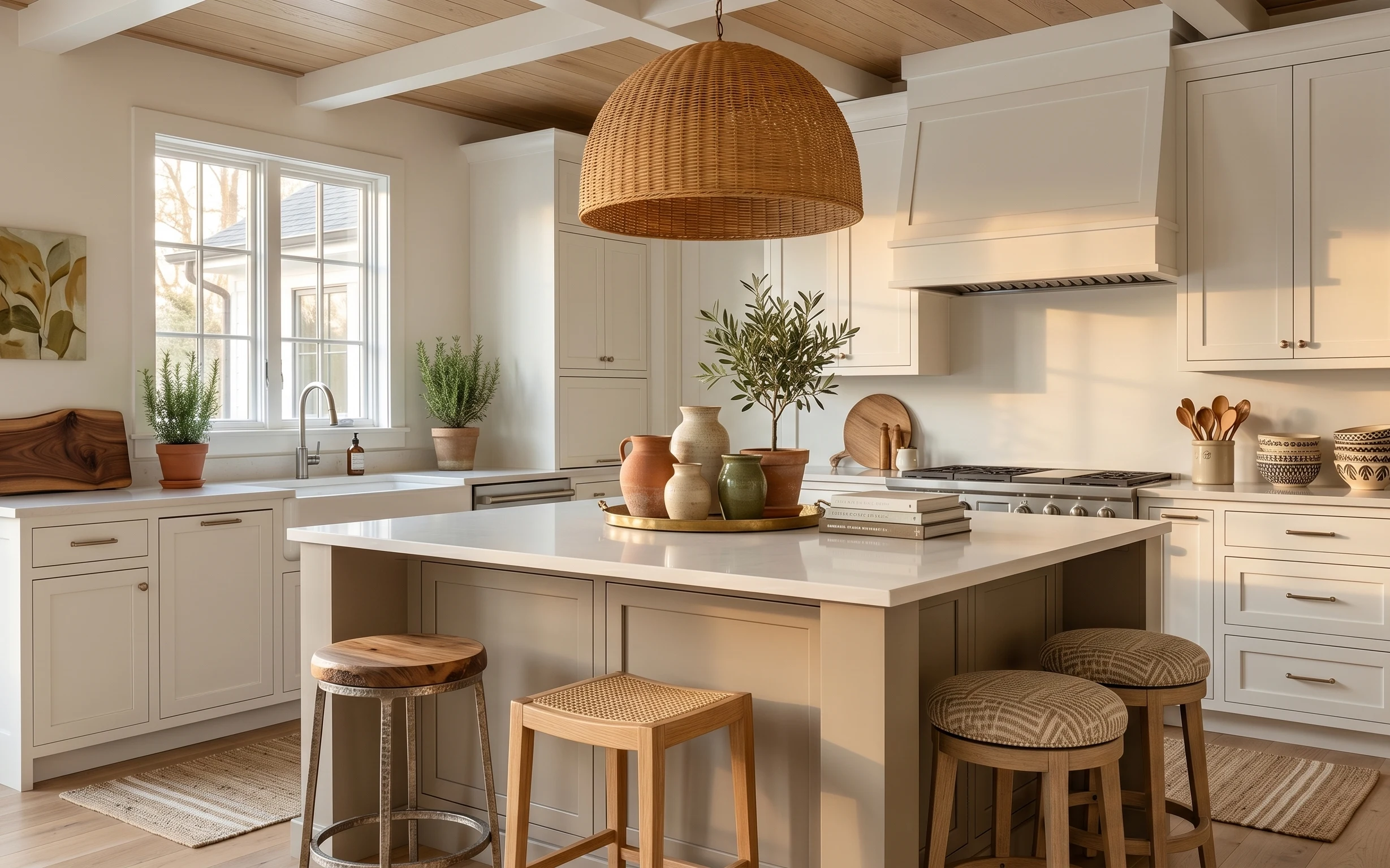
Why wicker-and-terracotta accents are the kitchen island nook of 2026
This setup works because it mixes soft materials with clean geometry: a woven rug anchors the island legs, white shaker cabinetry keeps everything crisp, and the wicker pendant adds a little texture without adding clutter. On the countertop, you can see a tray-and-books styling stack next to earthy ceramics, plus a tall olive tree on the open shelf for height. For homeowners working on a real-life budget, the path is simple: change the “framing” first (rug + light + art), then build out the styling details that make the room feel lived-in.
I used to chase the cheapest version of everything—one small plant here, a random print there—and the whole space still looked unfinished. The shift for me was realizing contrast matters more than matching: the warm woven light and terracotta tones need a grounded base (like the rug) so they don’t float against all that white. Once that base is in place, the ceramics and books read like a curated routine instead of leftover clutter.
Layer 1 — woven area rug under island ($200) anchors the island in one warm zone
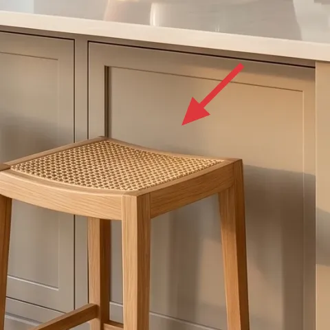
A woven area rug placed under the kitchen island does two jobs at once: it defines a boundary for the seating area and it softens the hard lines of white cabinetry. In this photo, the rug’s light neutral tone and small texture keep the scene bright while still hiding everyday scuffs. The trade-off is that a woven rug needs a little maintenance—vacuuming regularly helps it look even, not fuzzy. The obvious alternative is skipping the rug and relying on bare hardwood, but that tends to make bar stools feel “floating” under the island.
Vacuum the edges first
Woven fibers shed tiny bits at first; a quick edge pass keeps the pile looking even.
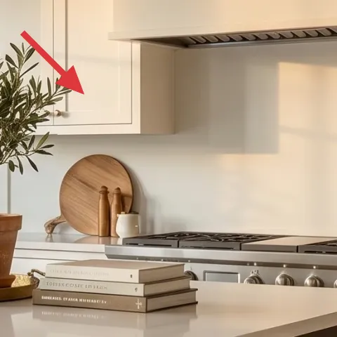
Layer 2 — framed botanical wall art ($80) adds an eye-level nature reference
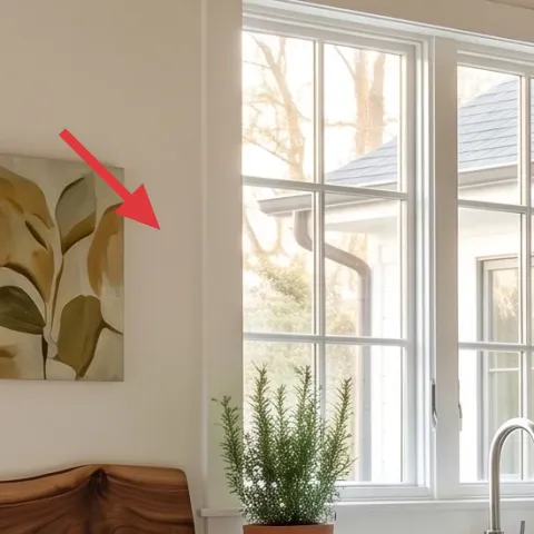
The framed botanical print on the left wall is sized like a focal point, not a random decoration: it gives your eyes a place to land while the rest of the kitchen stays mostly white. A mat and frame also help the art look intentional against painted walls and bright windows. The trade-off is that too-small art can disappear, especially when you have open shelves and a strong pendant overhead. A larger alternative can work, but it can feel heavy in a compact wall area, so sticking to a straightforward framed print is usually the better budget call.
Keep the frame simple
When the room already has wood beams and warm lighting, a clean frame keeps the look cohesive.
Layer 3 — large wicker pendant light ($120) brings texture over a shiny island
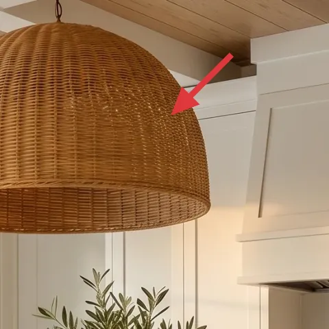
The large wicker pendant is the reason this kitchen feels “finished” even in daylight. It adds a layered texture that counters the island’s glossy white surface, and it looks good from both sitting height and standing height. Choosing wicker also helps because it’s warm-toned without being colorful, so it doesn’t fight the terracotta ceramics or the olive plant. The trade-off: wicker can collect dust if the kitchen runs hot or smoky, so a wipe-down schedule helps. The obvious alternative is a smooth glass or metal pendant, but those usually amplify reflections instead of adding softness.
Match the warmth, not the material
If you can’t find wicker, choose a shade with a similar warm tone and open weave effect.
Layer 4 — olive tree in terracotta pot on shelf ($80) creates height without taking floor space
The olive tree on the open shelf works like vertical styling: it fills the space above countertop level so the backsplash zone doesn’t look bare. In a white kitchen, that green contrast is what keeps the room from feeling like a clean showroom. The terracotta pot ties it back to the window-sill planters and the ceramic pieces, which is why the whole palette reads “planned.” The trade-off is light placement—tall plants need enough brightness to keep leaves looking full. Skipping it and using only small pots can leave the shelf visually flat and less dimensional.
Don’t overcrowd the shelf
Even with beautiful plants, too many tall items can crowd the line of sight from the island.
Layer 5 — terracotta plant pots on countertop ($25) so the palette looks intentional
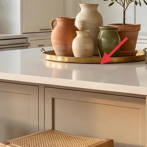
These warm terracotta pots are small, but they do the heavy lifting of color continuity: they connect the window greenery to the shelf plant and make the countertop ceramics feel like part of the same story. A set of matching pots also helps the room look “styled” instead of just naturally stocked. The trade-off is that terracotta can read a little orange if the rest of the kitchen leans cool, so sticking to a warm white or creamy counter palette keeps it balanced. If you only buy one pot, the room can look like it’s waiting for the rest of the styling—this is the easiest moment to coordinate.
Choose matching pot diameters
Even if the ceramics differ, consistent pot size makes the grouping feel curated.
Layer 6 — decorative tray with book stack ($35) gives the countertop a “use + display” rhythm
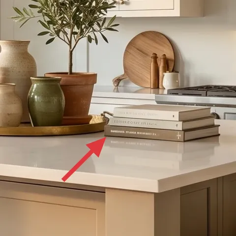
A decorative tray plus a small book stack is the quickest way to make an island counter look lived-in on purpose. Here, the tray collects the ceramics and styling items into one rectangle, so you don’t have to rely on symmetry. The books add a visual cadence—horizontal layers that balance the taller vases and the plant’s height. The trade-off is that too many objects turn into clutter fast, so keeping it to a tray, one book stack, and two or three ceramics keeps the look calm. The obvious alternative is scattering items around the island, but that reads messy unless you’re constantly editing.
Anchor with one rectangle
If everything is small, nothing reads as a focal area—use the tray as the anchor.
Layer 7 — ceramic vase cluster on countertop ($30) adds organic shape next to clean cabinetry
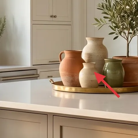
The ceramic vase cluster is doing quiet design work: organic curves and matte finishes soften the sharper cabinet lines and keep the countertop from feeling sterile. In this kitchen, the ceramics also repeat the warm neutrals—cream and tan tones—that match the wood beams and wicker pendant. The trade-off is that ceramics can look fussy if they’re all the same shape, so mixing slightly different forms (one taller, one shorter) makes the grouping look natural. Buying just one vase rarely gives enough visual density, so a small cluster is usually the better play for a weekend refresh.
Keep one glaze finish
Mix shapes freely, but aim for similar sheen levels so they don’t fight each other.
The cost, layer by layer
| Layer | Item | Cost |
|---|---|---|
| 1 | Woven area rug under island (about 5×7) | $200 |
| 2 | Framed botanical wall art (16×20) | $80 |
| 3 | Large wicker pendant light shade | $120 |
| 4 | Olive tree plant in terracotta pot (4–6 ft) | $80 |
| 5 | Terracotta plant pots on countertop (set of 2–3) | $25 |
| 6 | Decorative tray with book stack | $35 |
| 7 | Ceramic vase cluster (2–3 pieces) | $30 |
| Total | $570 | |
If you want a cheaper variant, start with the rug and one botanical print, then swap the big plant moment for a smaller olive-style tree on the shelf. Keep the pendant if possible, and focus the remaining budget on one good tray plus two ceramics so the island still looks “set,” not random.
What worked, what didn't (across the whole room)
The biggest wins here are the layers of texture: woven rug underfoot, wicker overhead, and matte ceramics on the countertop. The room stays cohesive because the warm terracotta shows up in multiple places, and the olive plant adds real height without crowding the floor.
What worked
- The woven rug anchors the bar stool area so the island feels intentional from every angle.
- The wicker pendant adds texture that softens the shine of a white countertop surface.
- The framed botanical print gives an eye-level focal point on an otherwise plain wall.
- The olive plant on the shelf creates vertical interest above the countertop zone.
- Terracotta pots repeat the warm color cue so the palette doesn’t feel scattered.
- The tray and book stack organize small decor into one readable grouping.
What didn't
- Too many loose ceramics around the island would make the counter look cluttered fast.
- Skimping on plant height can leave the open shelves looking unfinished against white cabinetry.
- A smooth, reflective pendant shade would likely fight the bright window light.
- Choosing a rug with harsh contrast can overpower the warm neutrals and ceramics.
- Matching every object perfectly would flatten the look instead of making it feel lived-in.
What we'd skip if we did it again
Skip adding more small decor pieces than you can group. The island counter already has vases, books, and a tray; adding extra cups or random minis tends to make the layout feel busy instead of curated.
Skip a very dark rug or one with heavy pattern contrast. In a bright white kitchen, darker options pull attention away from the plant and lighting and can make the island seating area feel visually cramped.
Skip duplicating the same terracotta shade everywhere. One warm terracotta thread is enough—use matching tones in the pots and one or two ceramics, then let the greens and whites do the rest.
Frequently asked
How long does a refresh like this usually take?
Plan for about 4–6 hours for the full look: rug placement, hanging the framed botanical print, setting plants on the shelf and window sill, and then doing one slow styling pass on the island with the tray and ceramics. If you’re swapping lighting, add time for the fixture change and testing. The styling part is the “real” time sink.
What if I rent and can’t change shelves or lighting?
This photo is very renter-friendly because most of the impact comes from movable items. Use peel-and-stick alternatives only if you’re allowed, but you can still get most of the look with a rug, a framed print, a plug-in pendant replacement style (if you already have a safe plug setup), and shelf-safe tabletop decor. Keep plants to items you can take with you.
My kitchen is smaller—how do I scale the styling down?
In a smaller kitchen, keep the same order of operations: rug first (to define the zone), then one wall focal point, then one plant height moment. Reduce the ceramic cluster to two pieces and keep the tray and book stack. A smaller rug or a runner under the island legs also works if you can’t fit a full 5×7.
My kitchen has darker cabinets. Will this color palette still work?
Yes—just swap which element leads. If the cabinetry is darker, let the rug and pendant stay light and warm (wicker + beige neutrals), and keep the ceramics in cream and tan. You may also want the framed botanical print to have more white background so it doesn’t compete with the cabinets.
Where should I shop for the biggest-looking items on a budget?
Start with the rug and framed art at discount home stores or resale marketplaces for the best savings. Plants are often best bought locally in season so you get fuller leaves. For the pendant look, check lighting showrooms during sales or look for a wicker shade with a compatible socket setup.
What’s the most common mistake in a kitchen island refresh?
People over-style the counter and under-style the “anchor” items. If the rug zone, pendant focal point, and one plant height moment aren’t in place, everything else looks random. Do the anchor changes first, then style in layers—tray, books, two or three ceramics—so the island reads as a routine, not a pile.
More in Kitchen & Dining
Under $600: 7 weekend swaps for a kitchen island nook refresh
Bright, airy kitchens don’t need a renovation to feel finished. This weekend-friendly island nook refresh uses 7 visible swaps—rug, art, li…
Under $350: coffee bar nook renter refresh with 7 swaps
Warm brass coffee bar nook refresh for US renters: a patterned rug, a wicker storage basket, a dish towel styling moment, and shelf swaps t…
Under $800: breakfast bar nook refresh with light-wood calm
A bright breakfast bar nook makeover using light-wood warmth, two glass pendants, and a softer rug under the stools. This weekend-friendly …