- Best for
- Bathroom vanity styling + renter-friendly updates
- Cost
- Under $600
- Difficulty
- Easy (mostly styling + labels)
- Time
- About 2–4 hours total
Why brass-and-cream counter styling is the bathroom vanity nook of 2026
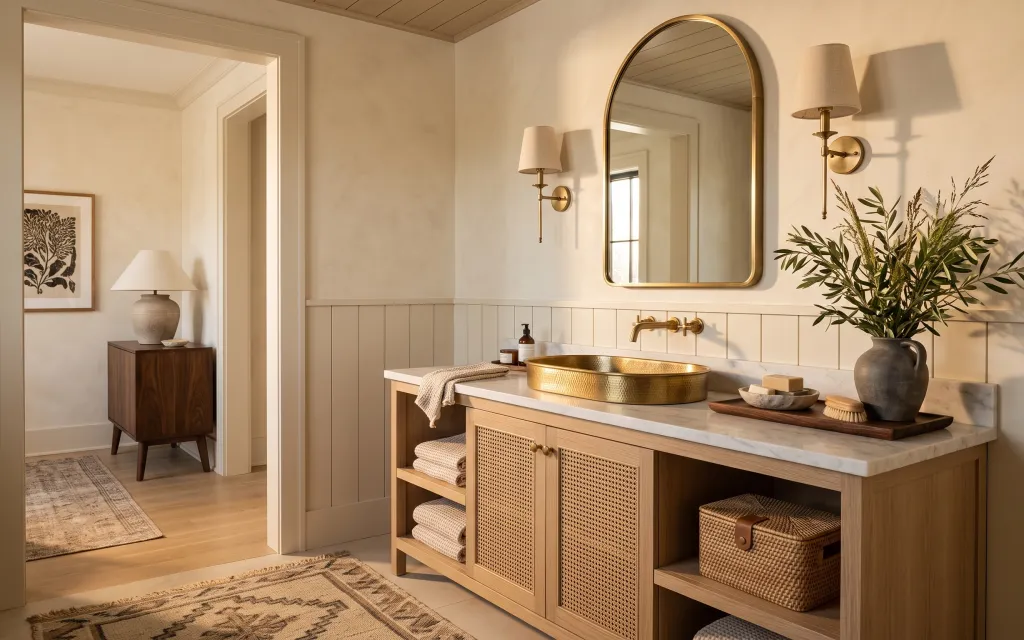
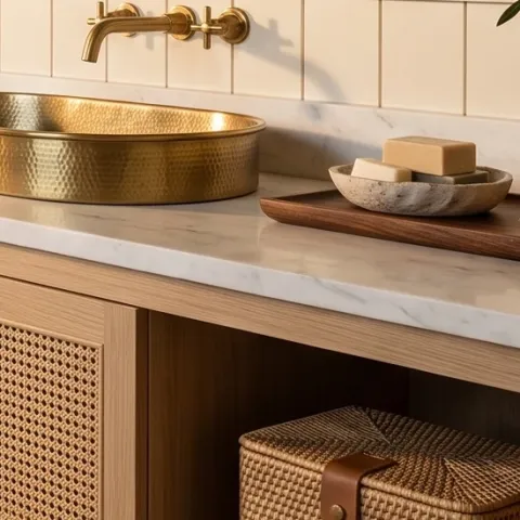
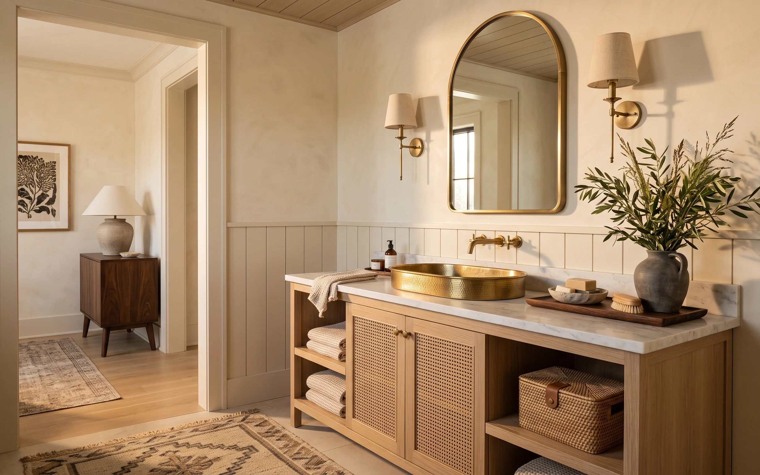
Start with what the bathroom already gives you: creamy walls, a white tile backsplash, and a marble-pattern counter that reads “clean” even when you’re busy. Then add texture where your eyes land—think the patterned area rug underfoot, the woven storage basket below, and a soft hand towel folded in a way that looks intentional. The gold-toned bowl on the counter and the tall leafy plant bring that warm focal point without asking you to change fixtures. For a renter, this is a swap-and-style plan: everything is removable and keeps the look cohesive.
The first time I tried a “styled counter” look in a rental, I overdid it—too many small items, not enough breathing room. What changed my mind was simplifying to one main tray, one gold accent bowl, and one tall plant that gives height behind the counter line. I also learned to pick textiles with a warm base (beige/taupe) so they don’t fight the tile and brass hardware.
Layer 1 — patterned area rug 5×7 ($180) Underfoot warmth for a high-traffic zone
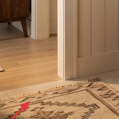
A patterned area rug in a 5×7 size anchors the whole vanity nook and makes the tile-and-wood contrast feel deliberate instead of accidental. In the photo, the rug’s taupe and warm gray tones echo the beige walls while adding a soft surface where you stand to brush your teeth. The best part for renters is that it’s purely movable: you can swap sizes to fit the bathroom footprint or roll it up for the next place. The trade-off is that you’ll want a rug pad if your bathroom is slippery, so it stays flat under everyday foot traffic.
Pick a rug pattern with warm grays
If you’re matching brass hardware, cooler black-and-white patterns can feel too sharp against cream tile—warm gray keeps it balanced.
Layer 2 — wicker storage basket on lower shelf ($50) Tidy lines without drilling
This wicker storage basket turns the lower open shelving into a “designed storage” moment instead of a visible catch-all. It sits on the lower shelf where you’d otherwise stash extra towels or small bathroom tools, and the woven texture adds warmth that matches the rug and lamp shade. A removable basket is also the most lease-friendly storage method—no hardware, no anchors, no permanent changes. The trade-off is capacity: it won’t replace deep cabinet storage, but it’s perfect for keeping the visual mess contained while staying easy to move.
Use it for the stuff you grab daily
Towels, spare washcloths, or a small brush kit belong here—so countertops stay calmer and shelves look styled.
Layer 3 — table lamp with beige fabric shade ($60) Soft light that flatters brass
That table lamp with a beige fabric shade adds the warm, “evening bathroom” glow that wall sconces alone can’t always deliver. The shade color matters: beige fabric diffuses light so the brass gold accents—like the bowl on the counter—look richer rather than shiny. This is also a renter win because a plug-in lamp can move with you, and the shade gives you a consistent look even if the bulbs vary. The trade-off is that you’ll need to position it so it doesn’t block pathways or cabinet doors, especially in narrower bathroom layouts.
Match shade warmth to your tile grout
Warm whites and beige shades reduce the “cold tile” effect when you’re trying to create a calmer vanity zone.
Layer 4 — framed art print with botanical linework ($80) A calmer side that keeps the vibe natural
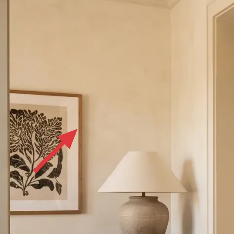
A framed art print with botanical linework on the nearby wall brings in the same organic cues as the leafy plant on the counter. In the photo, it sits in the left hallway zone, so you get a “set” feeling even though the vanity itself can’t move. Choosing linework (not heavy color blocks) is a smart trade for renters: it reads crisp against the light walls and doesn’t compete with tile texture. If you rent, hanging method matters—use removable hanging options so the frame stays secure without damaging walls.
Don’t size the frame too small
A tiny print on a large cream wall looks accidental. Go for a readable scale so the lines stand out from a normal standing distance.
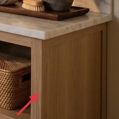
Layer 5 — wood tray on marble-pattern counter ($35) The grouping trick for a tidy countertop
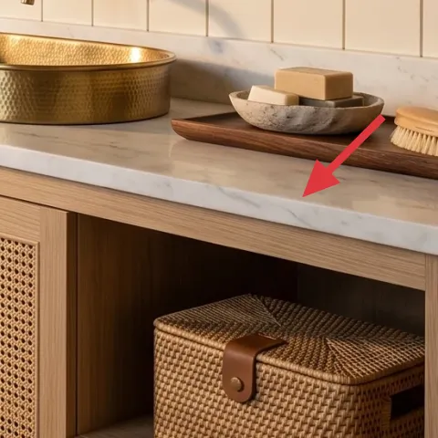
A wood tray on the marble-pattern counter is the easiest way to make counter styling look intentional instead of “random products in a dish.” In the photo, the tray groups the small everyday items and gives the brass bowl and folded textiles a clear visual stage. You get a clean, leveled look because the tray adds one consistent plane and keeps smaller pieces from drifting across the counter surface. The trade-off is that you’ll have to curate: if everything is on the tray, it loses the sense of purpose and starts looking cluttered.
Leave one edge of the tray mostly empty
A small gap makes the arrangement feel styled, not packed—especially next to a reflective gold bowl.
Layer 6 — tall leafy indoor plant in large vase ($80) Height that makes the vanity feel finished
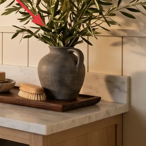
A tall leafy indoor plant in a large vase adds vertical balance and makes the vanity nook feel complete, even if your counter is mostly open space. The olive-green tones in the leaves pick up the warmth of brass hardware and keep the palette from turning too beige. Positioning matters: the plant should sit to the side of the gold bowl so the height frames the arrangement rather than blocking it. The trade-off is maintenance—plants need light and occasional trimming, but the look lasts longer than swapping seasonal decor every week.
Choose leaves with varied shapes
Single-texture greenery can look flat in bathrooms. Mixed leaf shapes read more “designed” from across the room.
Layer 7 — apothecary-style jar labels on counter bottles ($45) Clear labels that make styling feel intentional
Make it instead of buying it
This DIY apothecary jar label set adds the crisp, “purposeful counter” look to the small bottles on your marble-pattern counter without replacing any fixtures.
Materials
- Printable label paper (sheet) — 1 pack — $12
- Mini ink pad or printer ink cartridges — 1 set — $6
- Scissors — 1 pair — $8
- Clear label tape (for durability) — 1 roll — $7
- Painter’s tape — 1 roll — $3
Steps
- Measure each bottle’s label area and note the maximum width/height you can fit.
- Print the label layout using an apothecary-style font, then test print one sheet for scale.
- Cut labels with scissors using a straight edge for clean borders.
- Wipe and fully dry bottle surfaces so the tape adheres smoothly.
- Place painter’s tape guides on the bottle, align each label, and press firmly.
- Seal the label with a thin layer of clear tape on top edges for bathroom humidity.
Total DIY cost: $36 — saves about $9 over buying.
Keep labels short
Two to three words (“soap”, “hand wash”, “linen spray”) reads authentic and keeps the counter from looking busy.
The cost, layer by layer
| Layer | Item | Cost |
|---|---|---|
| 1 | Patterned area rug 5×7 | $180 |
| 2 | Woven storage basket | $50 |
| 3 | Plug-in table lamp with beige fabric shade | $60 |
| 4 | Framed botanical linework art print | $80 |
| 5 | Wood tray for countertop grouping | $35 |
| 6 | Large leafy indoor plant in vase | $80 |
| 7 | Apothecary-style jar labels (retail set) | $45 |
| Total | $530 | |
If you want a cheaper version, swap the 5×7 rug for a smaller runner-size rug, choose a simpler frame (or skip art if your wall is busy), and go with a tabletop plant instead of a taller one. That keeps the brass-and-cream vibe while lowering the spend.
What worked, what didn't (across the whole room)
The biggest wins were the rug and the counter grouping—both made the vanity look intentional from a standing distance. The tall plant also added depth that textiles alone couldn’t provide. The only snag was plant placement: if the vase sits too close to the gold bowl, it competes visually and the arrangement feels crowded.
What worked
- The patterned rug anchored the vanity area so tile didn’t feel sterile.
- The wicker basket hid “in-use” items while keeping shelves visually light.
- The beige lamp shade softened the gold accents and made evenings feel warmer.
- The botanical linework art echoed the plant and made the whole palette feel planned.
- The wood tray turned scattered countertop items into one cohesive moment.
- The tall greenery added height and balanced the counter’s horizontal lines.
What didn't
- Overloading the tray made the counter read cluttered instead of curated.
- If the lamp is too bright or too white-toned, it can make brass look harsh.
- A smaller plant in this spot can get “lost” against the mirror and backsplash.
- Labels with lots of tiny text can look decorative instead of functional.
What we'd skip if we did it again
Skip a matching set mentality. If every piece is the same material (all metal, all wood, all woven), the bathroom can look themed instead of lived-in. This photo’s charm comes from mixed textures: rug pattern, wicker texture, fabric lamp shade, and plant leaves working in different directions.
Skip heavy statement decor on the countertop. When the counter already has a reflective gold bowl and a marble-pattern surface, one main tray grouping is enough. Extra small items spread out too far and undo the calm “spa shelf” feel.
Skip choosing decor based on color alone—size and placement matter more. A plant that’s too small or art that’s too tiny won’t balance the mirror and backsplash. If it doesn’t work at the right height, it won’t fix itself with a better label or a different towel.
Frequently asked
How long does this bathroom vanity nook refresh take?
Plan for about 2–4 hours total. The rug placement and basket styling are quick, and the lamp/art positioning is mostly decision time. The only slower part is the DIY jar labels—printing, cutting, and aligning the labels usually takes 30–60 minutes.
Is this renter-safe if I can’t drill or change fixtures?
Yes. The plan relies on removable items: an area rug, a plug-in table lamp, a framed art print hung with renter-safe methods, plus countertop styling accessories and an easy label DIY. It avoids replacing landlord fixtures like the vanity, faucet, mirror, or built-in lighting.
What if my bathroom is smaller than the one in the photo?
Keep the “grouping” idea but scale down. Swap the 5×7 rug for a smaller runner that fits in front of the vanity area, and use a compact plant or shorter vase placed slightly farther back. The tray still matters most—one main tray grouping prevents clutter in tight counters.
What if my bathroom has different hardware colors (silver or black)?
Use the same layering rules, just shift the metal cue. Instead of leaning into brass-toned accessories, match your accent color with a small item in the tray grouping (like a soap pump stand or a single gold-toned bowl substitute). The rug and textiles should stay warm and neutral so the room doesn’t feel mixed.
Where should I shop for the rug, basket, and plant?
For the rug and basket, look for pieces that come in warm grays/taupes and have texture you can see in person. The plant can come from big-box stores or local nurseries; pick something with full leaves and a pot size that looks proportional to the counter height.
Biggest mistake people make with bathroom counter styling?
Overfilling the counter. The easiest fix is to choose one “landing zone” tray and keep everything else off. When the tray is the only grouping, your towel and small bottles look intentional instead of accidental, and the vanity reads cleaner even when daily items are out.
More in Bathroom
Under $600: brass-and-cream bathroom vanity refresh
A renter-friendly bathroom vanity nook refresh that leans brass-and-cream, from a patterned 5×7 rug to a tall leafy plant. This look comes …
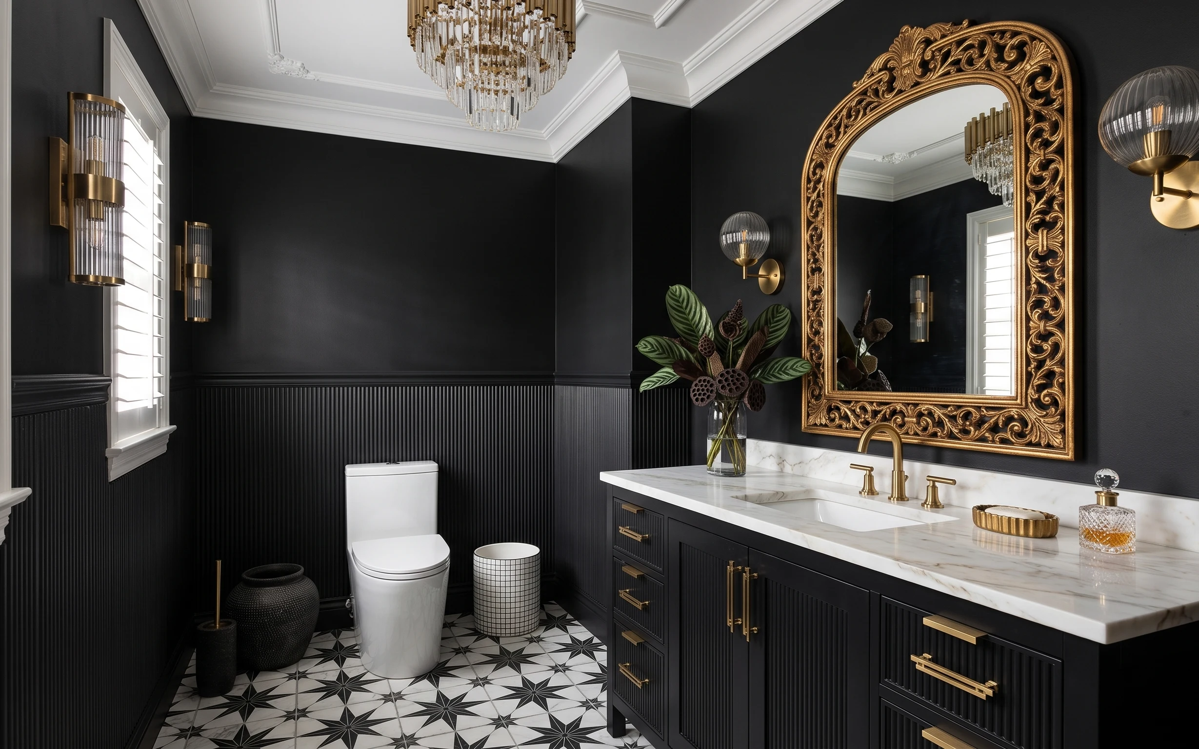
Under $700: black-and-gold bathroom vanity wall refresh
Refresh a black-and-gold bathroom vanity wall with paint-matching panels, a framed mirror, and warm brass details. This plan keeps the look…
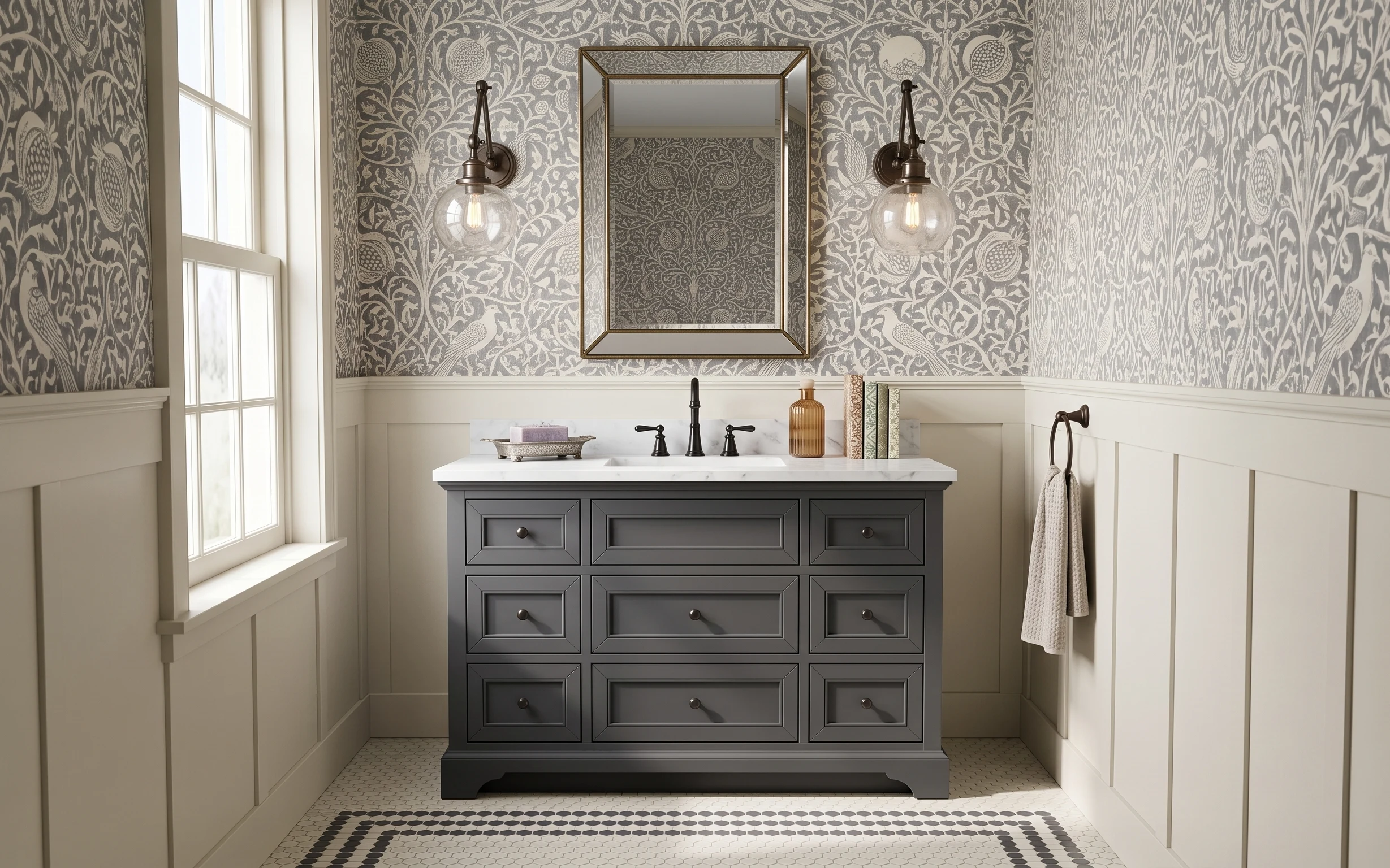
Under $1000: 7 weekend upgrades for a bathroom vanity nook
A gray wallpaper-and-mirror bathroom vanity nook can feel custom without a full renovation. This 7-layer weekend refresh targets the vanity…