- Best for
- Texture + gallery-wall energy
- Cost
- About $600 total for 7 swaps
- Difficulty
- Easy (styling + one art DIY)
- Renter-safe
- Yes (no-drill, move-ready)
Why warm brass-and-terracotta bedding is the bed nook of 2026
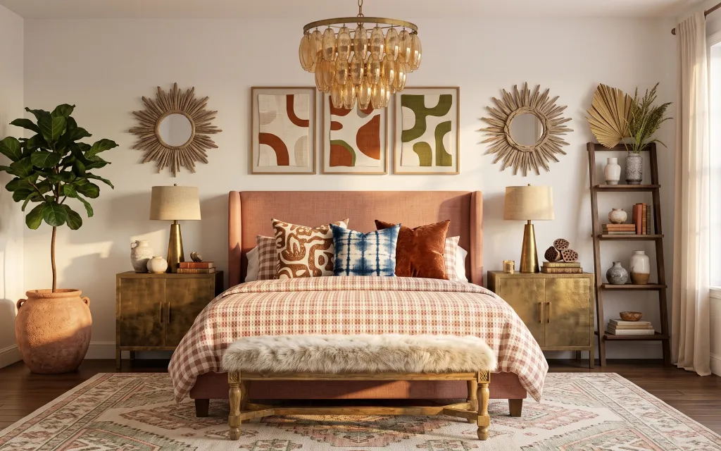
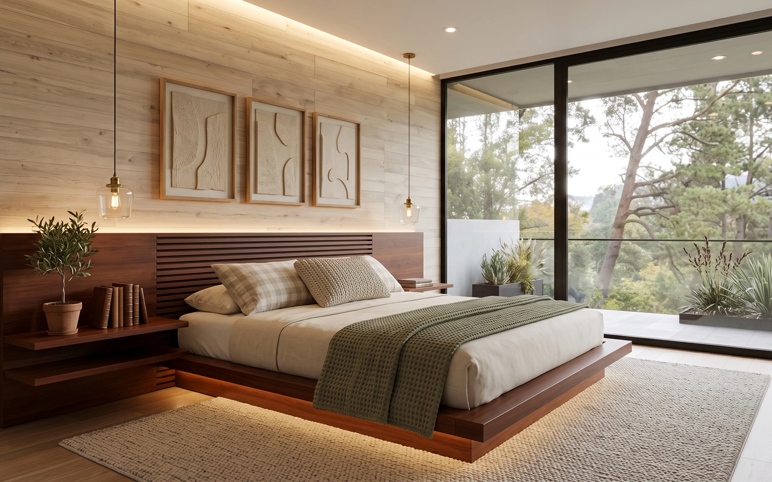
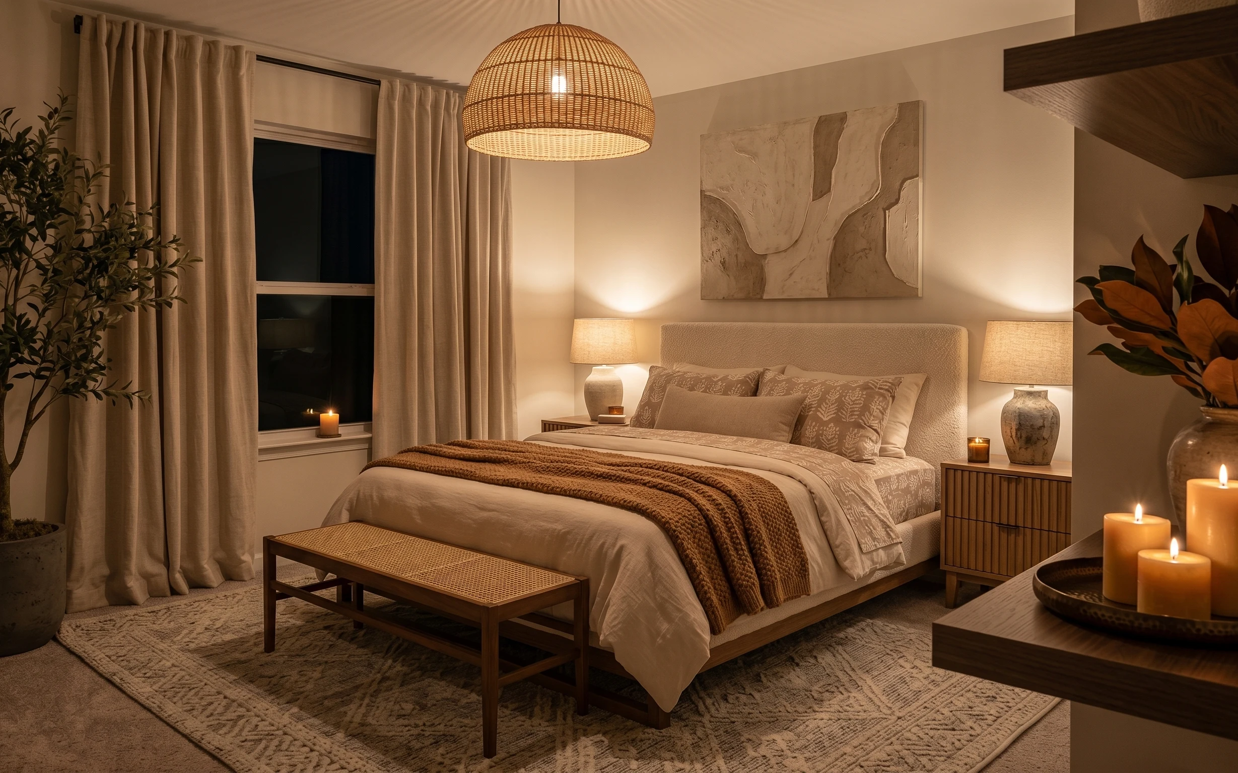
Start with warm metals and terracotta as your “color gravity,” then layer texture until it feels lived-in. In the photo, the brass lamp bases and the amber glass ceiling light create that soft, golden bounce, while the patterned rug and layered throw add visual noise in a good way. If you want a look that reads styled but still rental-safe, this mix is the sweet spot: art on the wall, lighting at different heights, and greenery to soften the edges. The best part is you can pack everything away when the lease ends.
I used to overdo matching sets—like, two nightstands meant two identical lamp shades, end of story. It made my rentals look polite, not personal. What changed was switching to one unifying metal tone (brass) and then letting the fabrics and art vary: plaid + fur + graphic prints. Suddenly the room felt collected instead of copied, and it still looked cohesive from across the bed.
Layer 1 — patterned area rug (8×10) ($200) Texture underfoot, not a blank floor
A patterned rug in an 8×10 size anchors the whole bed nook and gives your styling somewhere to “land.” In the hero, the rug’s rust-and-cream motifs mirror the terracotta accents, while the pattern keeps the space from feeling too smooth or too matchy. The trade-off with buying a rug is living with the pattern—so pick something with multiple neutrals (cream + warm brown) rather than a single bold color. This is also the swap that makes the room look finished fastest, because it frames the bed, bench, and nightstand area in one shot.
Pick a rug with warm neutrals
If your wall art is earthy, choose a rug that includes at least two of those same tones so the whole vignette feels intentional.
Layer 2 — plug-in table lamp pair with beige shades ($90) Warm light without hardwiring
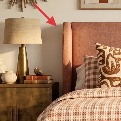
Two plug-in table lamps with beige shades are the lighting move that makes this bed nook look magazine-ready even in daylight. In the photo, the lamps sit on both nightstands, and their warm glow reinforces the room’s brass accents and terracotta palette. The trade-off versus a single overhead bulb: you need two sources instead of one, which means more pieces to store. Still, it’s rental-friendly—unplug, pack, done. Choose lamp bases in brushed brass tones (or warm gold) and keep the shade color neutral so the wall art stays the star.
Why the beige shades matter
Beige keeps the light from going either too pink or too blue, which helps patterned textiles look richer.
Layer 3 — framed abstract print (center) ($80) Colors that match the terracotta accents
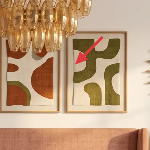
That center abstract print does the heavy lifting by echoing the room’s terracotta and olive tones while staying graphic enough to feel current. In the hero, the print is framed and placed between two other artworks, so it reads like part of a coordinated set rather than one random piece. The renter-friendly choice is to start with one “hero” frame first—then add spacing and symmetry around it later. The trade-off with going for abstract: it won’t hide clutter the way busy florals do, but it will make your palette look designed.
Make it instead of buying it
DIY a framed abstract on cardstock in the same terracotta-and-olive tones, so it looks like the gallery print without paying retail.
Materials
- Cardstock (pack of 30–40 sheets) — 1 pack — store stationery aisle — $12
- Acrylic paint set (earth tones) — 1 small set — craft store — $6
- Small poster frame — 1 frame — discount store — $18
- Painter’s tape — 1 roll — hardware section — $4
- Small foam brush set — 1 pack — craft store — $6
Steps
- Cut cardstock to fit your frame’s inner opening with a 1/16-inch test gap.
- Lightly tape off 3–5 shapes (rounded rectangles, arcs, or blocks) in a pattern that feels balanced.
- Block in the largest shapes first using terracotta and a warm cream base.
- Add the secondary colors (olive and muted brown) in smaller areas so the design breathes.
- Peel tape while paint is still slightly tacky to get clean edges; touch up with a foam brush.
- Let the artwork dry fully, then slide it into the frame and secure the backing.
Total DIY cost: $46 — saves about $34 over buying.
Don’t chase perfect symmetry
Abstract only looks “designed” if it feels natural—aim for color balance, not mirror-image shapes.
Layer 4 — sunburst wall mirror (right) ($80) More dimension than a flat mirror
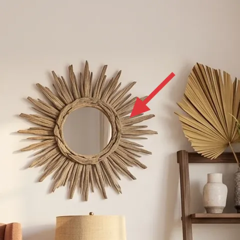
A sunburst-style mirror adds that framed, sculptural wall texture you can’t fake with a plain oval. In the hero, the mirror’s radial shape works like a visual spotlight next to the framed art, and it also bounces light around the bed nook. The trade-off is placement: if you hang it too high or too low, it won’t visually “stack” with the other wall items. Keep it within an eye-line zone when standing at the foot of the bed. A budget alternative is to look for a similar shape in warm wood tones or sand-colored finishes.
Match the metal tone, not the exact shade
If the mirror’s finish isn’t exactly brass, pick something close and let your lamps and hardware unify the look.
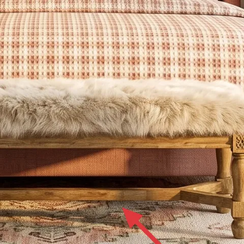
Layer 5 — faux fur throw blanket ($25) Soft contrast for the patterned textiles
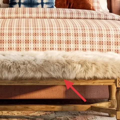
The faux fur throw on the front of the bed adds a different texture layer than plaid and graphic prints, which is exactly what makes the bed nook feel cozy without adding visual clutter. In the hero, it sits in the foreground where you see it when you walk in, so it reads instantly as “intentional styling.” The trade-off with fur-style textiles is shedding and fuzz transfer—so choose a machine-washable option if possible and keep it draped, not stuffed into tight places. Styling tip: use it sparingly in one spot for contrast, then let the rest stay pattern-focused.
Texture reads better in one dose
One fur moment usually looks richer than three fluffy layers fighting for attention.
Layer 6 — tall ladder-style bookshelf ($80) Vertical storage that frames the window wall
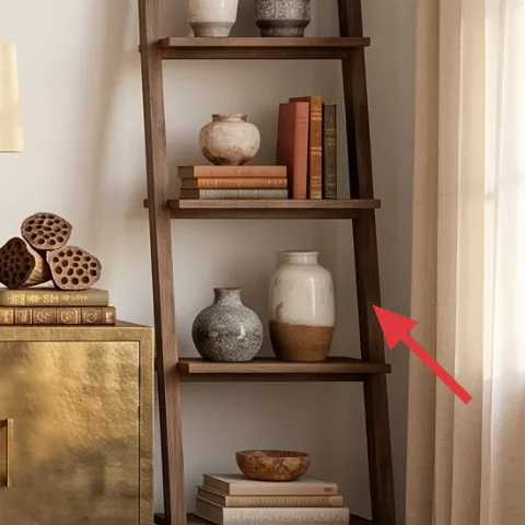
A tall ladder-style bookshelf gives you vertical rhythm next to the bed and creates a place for small decor objects without drilling anything into the wall. In the photo, it sits by the window, and the open shelves let the room breathe while still looking styled. The trade-off versus closed cabinets: open shelving shows more, so you’ll need to keep items grouped by color and scale. Stick to a simple formula—two vases, a book stack, and one small “texture” item per shelf level. This is also a move-friendly piece: it’s easy to pack compared to wall-mounted shelving.
Group in threes
Arrange decor as small clusters of three (tall, medium, small) so shelves look curated instead of random.
Layer 7 — terracotta floor vase and potted plant set ($25) Green + clay = instant warmth
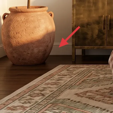
That terracotta floor vase and leafy plant combo brings the organic element the rest of the room only hints at. In the hero, the large clay vessel gives you a grounded, earthy shape on the left side, and the broad green leaves soften all the angles from frames and lamps. The trade-off is space: a big plant needs room to feel intentional, so don’t cram it into a corner. If your rental’s lighting is limited, choose a hardy plant variety that tolerates brighter indirect light. The visual payoff is immediate—this detail makes the bed nook feel lived-in, not staged.
Skip tiny plants in big rooms
If the plant scale is too small, the vase reads bulky and the greenery won’t balance the wall art.
The cost, layer by layer
| Layer | Item | Cost |
|---|---|---|
| 1 | Patterned area rug (8×10) | $200 |
| 2 | Plug-in table lamp pair with beige shades | $90 |
| 3 | Framed abstract print | $80 |
| 4 | Sunburst wall mirror | $80 |
| 5 | Faux fur throw blanket | $25 |
| 6 | Tall ladder-style bookshelf | $80 |
| 7 | Terracotta floor vase and potted plant set | $25 |
| Total | $580 | |
If you want a cheaper version, downsize the framed art by choosing one center print instead of coordinating extras, and swap the mirror for a simpler round frame. Keep the rug, because that’s the biggest visual anchor, then add one plug-in lamp instead of two to reduce the lighting spend.
What worked, what didn't (across the whole room)
This bed nook works because it stacks warm metals, terracotta tones, and multiple textures at different heights: rug on the floor, lighting on side tables, and sculptural decor on the walls. The one thing that’s easy to get wrong is over-matching—too many identical items can make the space feel staged. When you vary textures but repeat the color story, it reads collected instead of cluttered.
What worked
- The patterned rug keeps the bed area visually grounded even with lots of wall texture.
- Plug-in table lamps create warm pools of light without touching any hardwired fixtures.
- The center framed print ties terracotta accents to the rest of the color story.
- Sunburst mirror adds depth and a focal point next to flat wall art.
- Faux fur throw softens busy patterns so the bed feels comfortable, not busy.
- The ladder-style bookshelf adds vertical structure near the window wall.
What didn't
- Trying to match every decor shade exactly makes the room feel less personal and more uniform.
- Placing lamps too far forward can block sightlines across the bed nook.
- Using a very small plant in a visually large corner makes the vase look overpowering.
- Adding too many textured textiles at once creates a chaotic effect instead of contrast.
- Hanging the mirror outside of your artwork “stack” range breaks the balanced look.
What we'd skip if we did it again
Skip buying every piece as a matching set. In this style, the palette is what repeats (brass, terracotta, cream), while the shapes and textures should vary—prints, sunburst mirror, and soft throw.
Skip going wall-only for interest. Even if the gallery and mirror are perfect, the room won’t feel warm at night unless you add plug-in lighting at side-table height.
Skip small-scale decor in bigger visual zones like the window side. The ladder bookshelf and plant need presence; swapping to one larger object usually looks more intentional than stacking tiny ones.
Frequently asked
How long does this bed nook refresh take?
For most renters, plan on about 3–5 hours total. The rug and lamp placement is quick, and the framed art is the main time sink (especially if you DIY the print). Styling the pillows, throw, and shelf objects takes another hour or so because you’re adjusting spacing and height until it looks intentional.
Is this renter-friendly if my lease restricts wall changes?
Yes—this look leans on freestanding items (rug, lamps, bookshelf, bench) and removable wall art strategies. In the photo, the big visual wins come from placement and color coordination, not permanent changes. When it’s time to move, you can take everything down or pack it without touching the walls beyond whatever removable hanging method your landlord allows.
What if my bed is bigger or my room is smaller?
For a bigger bed, scale up the rug toward an 8×10 or 9×12 range and keep the nightstands centered on either side of the bed opening. In a smaller room, choose a slimmer rug and reduce the number of accent pillows. The trick is to keep one “hero” texture (like the faux fur throw) and let the rest of the bed styling stay simpler.
Where can I shop for the lamp and mirror finishes?
Look for plug-in lamps at retailers with “plug-in” or “table lamp” listings rather than hardwired fixtures, then filter by brushed brass or warm gold bases and beige shades. For the sunburst mirror, search by shape keywords like “sunburst mirror” or “radial wall mirror” and prioritize finishes that pull from your terracotta palette.
What’s the biggest mistake people make in this kind of bed nook?
Over-matching. If everything is the same color and the same texture (too many identical beige-and-brass pieces), the room looks flat and a bit staged. Instead, repeat the color story and vary the materials: patterned rug, graphic framed art, sculptural mirror, and one soft textile contrast.
More in Bedroom

Under $600: brass-and-terracotta bed nook refresh
A warm brass-and-terracotta bed nook makeover that stays renter-friendly and packs up when the lease ends. Get the layered, gallery-wall lo…
Under $400: window-side bedroom refresh with 7 move-ready swaps
A warm light-wood and olive bedroom look—made renter-friendly for shared housing. This $400 refresh uses 7 packable swaps (rug, textiles, f…
Under $400: warm rattan-and-linen bed nook refresh
A warm, move-friendly bed nook refresh built from seven renter-safe swaps—mostly textiles and a framed print. The look leans rattan-and-lin…