- Best for
- earthy-texture bedroom refresh
- Cost
- about $536 for the full look
- Difficulty
- easy (mostly swapping textiles + decor)
- Time
- 1 weekend for styling
Why olive-and-caramel bed styling is the wood-paneled bedroom of 2026
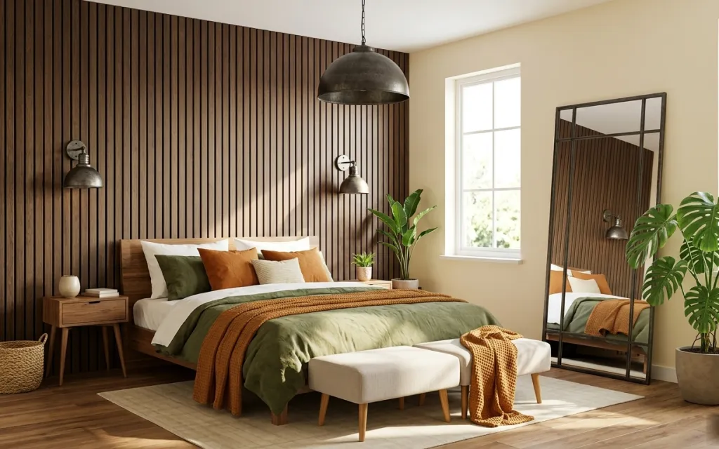
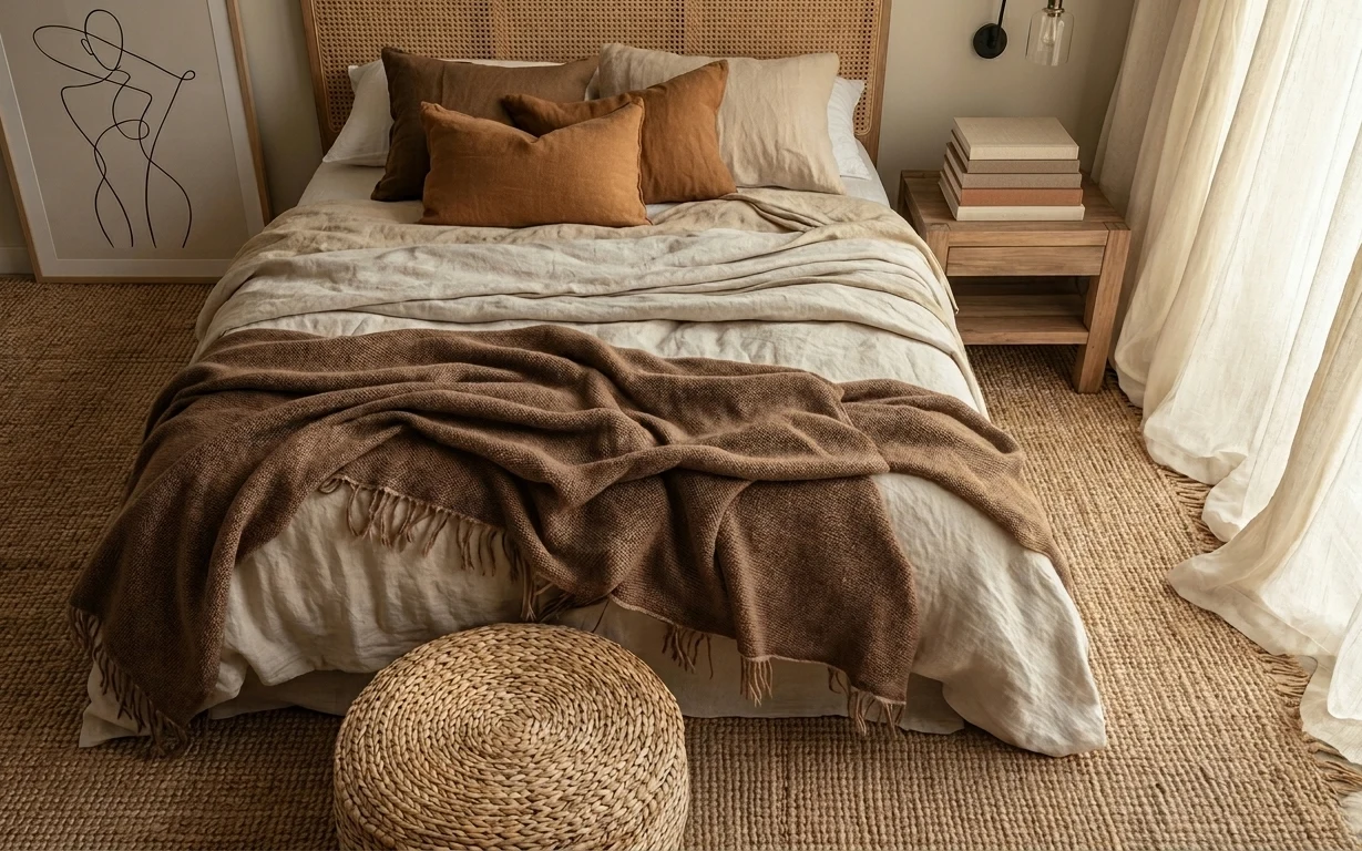
The vibe in this photo comes from the contrast: deep vertical wood slats against soft, linen-like bedding and warm earth-tones. You can see that in the light beige area rug, the olive green throw draped across the bed, and the burnt orange accent blanket that adds heat without going too bright. The black-framed floor mirror also changes the feel by making the room look bigger and letting the light travel farther. For renters, the good news is you don’t need permission for any of the layers—everything is swap-and-go with no drilling.
I used to chase “perfect matches” when I styled my own rented bedrooms, and it always looked flat once I stepped back. What finally worked was picking just one warm wood tone, then limiting accents to one muted green and one rusty orange. Here, the textiles do the talking while the mirror and nightstand keep the palette grounded. That’s why this plan stays budget-friendly but still reads intentional in daylight.
Layer 1 — light beige area rug ($180) Soft underfoot with a warm, natural base
This light beige area rug anchors the whole bed zone and softens the wood-floor contrast, especially where the rug overlaps the bench at the foot of the bed. It’s a smart renter move because a rug can completely change how big the room feels without touching the landlord surfaces. I’d pick this exact “warm neutral” range over gray or stark white, since gray can fight the wood slats and make the room feel colder. The trade-off is that light rugs do show some dust, but the payoff is that olive and burnt orange look richer instead of muddy.
Use the rug to define the bed zone
Center the rug so the front legs of your bed area sit comfortably inside its footprint—then the whole layout looks intentional instead of accidental.
Layer 2 — burnt orange throw blanket ($45) A rust pop that shows up from across the room
The burnt orange throw is the color “spark” that keeps the palette from going monotone with all that warm wood. It’s draped where it’s visible—across the bed and carried toward the bench—so you get that color hit even when the sheets are rumpled. If you went with a brighter orange, it would feel louder than the japandi framing; burnt orange lands closer to the room’s earthy temperature. The trade-off is that accent color is less forgiving than neutrals, so choose a shade that feels terracotta/rust rather than neon.
Let the throw repeat once more
Mirroring the burnt orange in two places (bed and a small accessory) makes the room feel styled, not just decorated.
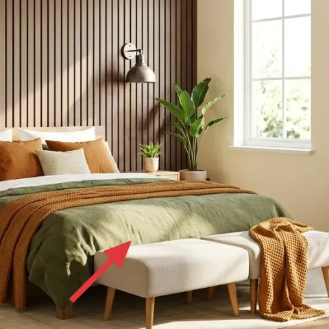
Layer 3 — olive green throw blanket ($36) Muted greenery that matches the room’s warmth
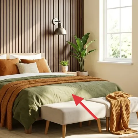
The olive green throw blanket is doing double duty: it adds texture on top of the off-white bedding and it ties into the room’s organic, wood-forward backdrop. In this setup it’s draped in a way that reads relaxed—more “lived-in” than perfectly folded—so it forgives everyday use. I’d skip a glossy satin blanket here; matte knit or woven texture looks right with wood slats and prevents the color from looking too sharp. The trade-off is that olive can look drab if your rug is too cool-toned, which is why the light beige rug choice matters.
Choose matte texture over shine
A knit or woven olive blanket keeps the look grounded and pairs better with natural woods than a shiny fabric would.
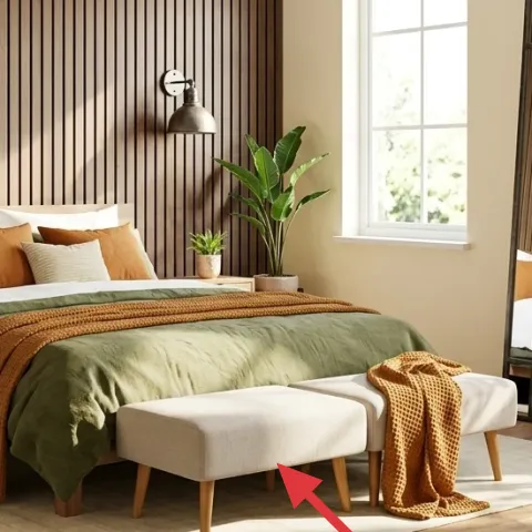
Layer 4 — wood bench at foot of bed ($80) Extra seating that also serves as a styling platform
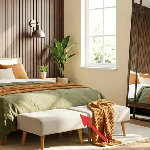
The wood bench at the foot of the bed adds a visible “layer” between the rug and the bedding, which makes the bed feel intentional rather than floating. It’s also practical: you can use it as a place for a throw or to set items down temporarily without cluttering nightstand surfaces. This is the renter-friendly option compared to adding a bulky dresser-style piece, because the bench silhouette stays light while still giving you function. If the bench is the same tone as your bed frame, the room looks pulled together even when your textiles are doing most of the work.
Avoid oversize for the walkway
If the bench crowds the path to the bed, the room will feel tight fast—measure the clearance before you shop.
Layer 5 — wood nightstand ($60) Warm side storage that keeps styling tidy
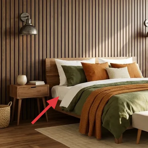
The wood nightstand brings the look’s main material—warm wood—down to bedside level, and it’s where the “small scene” can live. In the photo, the nightstand surface holds a small potted plant and a minimal stack of books, which is exactly how you get that calm japandi feel without adding a lot of objects. Over an obvious alternative like a white plastic table, wood reads warmer against the vertical slats and looks more cohesive with the bed frame. The trade-off is you’ll want to keep the surface curated; otherwise, the organic wood tone can make clutter stand out.
Style at one height
Keeping plant + books at similar heights makes the bedside look intentional even when you swap accessories later.
Layer 6 — large freestanding floor mirror with black frame ($100) Depth without wall changes
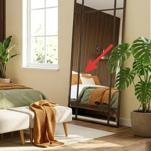
A large freestanding floor mirror with a black frame is the move here because it visually doubles the space and adds a clean geometric contrast to the vertical wood slats. Since it’s freestanding, it’s a renter-friendly way to get the “designed” look you’d normally see with expensive built-ins. I’d choose a taller mirror over a small round one—taller reflects the window area and makes the ceiling feel higher. The trade-off is storage: when you move, it takes a bit of careful transport, so wrap it like glass and plan your car space accordingly.
Position it to catch daylight
Angle the mirror so it reflects the brightest window area, not a dark corner.
Layer 7 — painted terracotta planter set ($35) DIY-friendly earthy accents for the corners
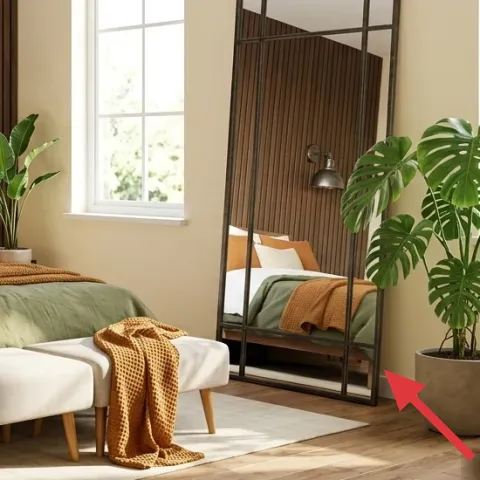
This planter set idea is meant to echo the terracotta tone you already have in the room, but with a more custom look you can refresh over time. In the photo, the medium and tall potted plants bring life and soften the room’s straight lines, especially near the floor mirror. A painted finish helps the pots match your textile palette—olive and burnt orange read more cohesive when your ceramic tones are intentional. The trade-off is that hand-painted pots take a little prep time, but they pack up easily and don’t require any landlord changes.
Keep the paint muted
Choose terra-cotta-adjacent colors (warm clay, soft sand, olive-gray) so the plants feel integrated, not “craft project” bright.
The cost, layer by layer
| Layer | Item | Cost |
|---|---|---|
| 1 | Light beige area rug | $180 |
| 2 | Burnt orange throw blanket | $45 |
| 3 | Olive green throw blanket | $36 |
| 4 | Wood bench at foot of bed | $80 |
| 5 | Wood nightstand | $60 |
| 6 | Large freestanding floor mirror with black frame | $100 |
| 7 | Terracotta planter set (painted) | $35 |
| Total | $536 | |
If you need it cheaper, start by swapping the rug for a smaller size or a lower-pile option and choose one throw instead of two. A second-hand wood nightstand and a basic freestanding mirror can usually cut the remaining cost while keeping the same olive-and-rust direction.
What worked, what didn't (across the whole room)
The biggest win is how the lighter rug and olive/burnt-orange textiles soften the strong vertical wood slats. The mirror also helps the room feel calmer and more open without adding clutter. The only area that can go wrong is color balance—if the orange reads too bright or the olive is too gray, the earthy palette loses its warmth.
What worked
- The light beige rug makes the bed feel grounded and prevents the wood floor from overpowering everything.
- Olive and burnt orange throws add warmth through texture, not through loud decor objects.
- The wood bench creates a functional “layer” at the foot of the bed for throws and daily use.
- A freestanding floor mirror brings depth and reflects window light without any wall work.
- The nightstand supports a small plant-and-books vignette that reads curated, not crowded.
- Plants soften straight lines and keep the room from feeling too “designed” in a sterile way.
What didn't
- Too-bright orange accents can clash with warm wood and start to feel orange-spotty instead of cohesive.
- If the rug is too cool-toned, olive can look dull and the whole palette turns flat.
- A bench that’s too wide can block the walkway and make the room feel smaller than it is.
- Over-styling the nightstand (too many items) breaks the calm, japandi rhythm.
- Picking a short mirror reduces the “ceiling lift” effect and limits the light bounce.
What we'd skip if we did it again
Skip matching everything in the exact same wood tone. A big part of this look is the mix: warm wood furniture, then lighter textiles and a black-framed mirror. Even in a tight budget, mixing wood tones slightly will still read intentional as long as the palette stays within olive, burnt orange, and beige.
Skip adding more accent colors on top of the throws. When you already have olive green and burnt orange doing the heavy lifting, adding a third saturated color usually makes the vertical-slats backdrop feel busy.
Skip a shiny throw or high-gloss decor finish. With wood slats, shine can look out of place and highlights fingerprints and streaks faster—matte woven textures keep the room feeling warm and lived-in.
Frequently asked
How long does this renter-friendly bedroom refresh take?
Plan for about 2–4 hours for the initial swap (rug placement, throws, bench and mirror positioning) plus another hour or two to style the nightstand and adjust the mirror angle. The only “extra” time is wrestling a larger freestanding mirror safely into place and deciding where the plants look best. If you’re sourcing items, add a separate shopping day.
Will this work in a smaller bedroom (or one with less natural light)?
Yes, especially if you keep the rug lighter and the mirror tall. In a smaller bedroom, prioritize a rug that still fits under the bed front area, then choose one throw color to lead (olive or burnt orange) and use the other as a smaller repeat. With less daylight, angle the mirror to reflect whatever window light you have and avoid very dark accessories on the nightstand.
What if my bed dimensions don’t match the photo?
Use the photo as a “layering guide,” not a measurement guide. Aim for the same logic: a light rug foundation, at least one olive throw laid where it’s visible, and a rust/burnt-orange accent that shows from the doorway. For the bench, scale down to a narrower version if needed, but keep it centered at the foot so the bed still reads framed.
Where can I shop for these items on a budget?
For the rug and throw blankets, look at big-box retailers for mid-range textures, and check thrift and resale for nightstands and mirrors. Online marketplaces can be great for freestanding floor mirrors, but confirm dimensions before ordering. Plants are often cheapest locally, and potted plants can be swapped later without breaking the palette.
What’s the biggest styling mistake in this type of bedroom?
Over-coloring the room. If your throws are bright orange or your olive reads too gray, the palette stops feeling earthy and starts feeling random. The fix is simple: stay within beige/cream, warm wood, olive, and burnt orange, and prioritize texture (knit/woven throws, matte finishes) over shiny surfaces.
More in Bedroom

Under $600: Japandi-style bedroom refresh with 7 renter swaps
A wood-paneled bedroom refresh that leans japandi—olive, burnt orange, and warm wood—using renter-safe swaps only. This plan breaks down 7 …
Under $700: earthy-neutrals bedroom reading nook refresh
This earthy-neutrals bedroom refresh leans on texture: a woven area rug, warm throw blanket, and lineny curtains. With 7 layers that all sh…
Under $700: modern dark-green bedroom nook refresh
Turn your bedroom nook into a darker, calmer, hotel-luxe corner with a few weekend swaps. This $700 plan covers a patterned rug, curtain pa…