- Best for
- cohesive bedroom texture
- Cost
- about $670 total
- Difficulty
- DIY-friendly weekend
- Renter-safe
- mostly renter-safe swaps
Why this warm earthy-neutrals bedroom reading nook is the bedroom reading nook of 2026
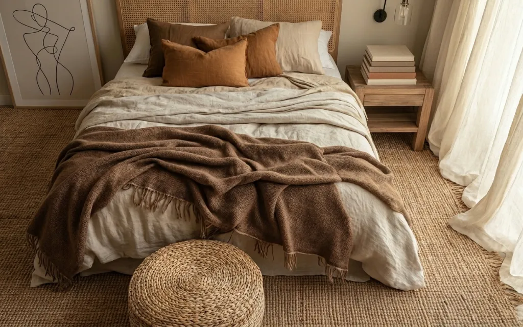
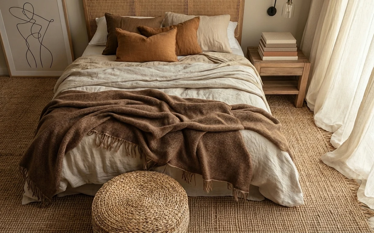
Every time I see this setup, I notice how much texture does the talking: the woven area rug anchors the whole floor, and the throw blanket adds that rumpled, lived-in drape across the bed. The cream tones and camel-brown accents read warm without looking fussy, especially with the upholstered headboard acting like a soft backstop. For homeowners, the biggest lever is usually the “big surface” choices—rug, curtains, and headboard—because they change how the room photographs in one weekend.
I used to overthink wall decor first. Then I caught myself doing the same thing again in my own place: buying two pretty prints before the room had a rug. This photo made me flip the order—start with the rug and curtains, then place the art last so the colors actually match the textiles. That’s the difference between “styled” and “finally feels right.”
Layer 1 — area rug ($200) woven texture underfoot
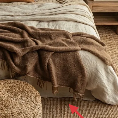
The area rug in camel tan is doing heavy lifting: it warms up the floor and gives the bed-and-curtain wall a grounded base. It’s also why the whole corner looks softer—woven fibers catch light differently than smooth wood, so the room doesn’t feel flat. The obvious alternative is a thinner flatweave, but you’d lose that cozy, tactile depth and the room would read more minimal than this. I’d pick a rug with a similar height and neutral undertone (camel, not yellow) so the throw blanket and pillows don’t clash.
Match undertones, not just color names
If your throw pulls more brown than gold, your rug should too—camel-brown reads closer to what’s in the photo.
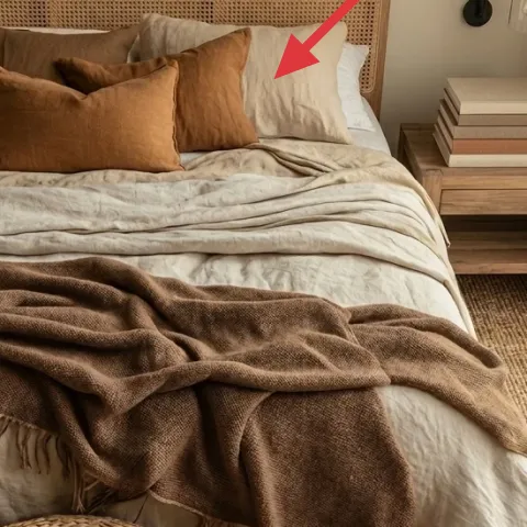
Layer 2 — throw blanket ($30) draped folds over the bed
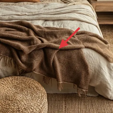
This throw blanket is the visual relaxer of the whole bedroom. It’s not crisp or tightly tucked; it’s spread with intentional mess so the bed looks lived-in instead of staged. The color sits in that coffee-with-cream family, which is what keeps the room from going too beige. A lighter throw would brighten the corner, but it wouldn’t create the same contrast against the cream bedding. The trade-off with this look is that you’ll probably smooth it out a little more often—but the payoff is a bed that looks styled even when it’s not perfectly made.
Use drape, not symmetry
Let one edge fall lower than the other so it mimics the laid-over folds in the photo.
Layer 3 — round woven ottoman ($50) extra texture where you’ll step
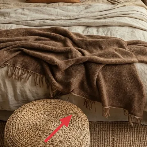
The round woven ottoman (the one near the foot of the bed) adds a second texture layer at floor level. That matters because rugs can feel visually “one note” if everything else is flat or straight-lined. This ottoman also creates a small landing spot for anything you drop in that transition zone—shoes, a book, or a folded throw—without needing extra furniture. Buying the cheapest ottoman usually means losing the woven look and the sturdy rim, so stick to something that reads like basketry. The trade-off is size: make sure it’s not so big it blocks walking paths.
Place it at the “drop zone”
Put it where your body naturally pauses—near the bed edge—so it earns its spot.
Layer 4 — curtain panels ($80) airy cream framing the corner
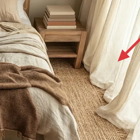
The curtain panels on the right side are light and floaty, and that’s why the bedroom doesn’t feel heavy even with all the brown-and-cream fibers. They also soften the room’s right edge, which keeps the rug and bed from looking like separate islands. If you swap in blackout curtains, you’ll gain privacy, but you’ll lose the airy visual weight that makes this corner feel calm. For a weekend refresh, aim for cream with a slight texture (not glossy) and hang them so they pool just a touch. That small choice is what makes the room feel “styled” instead of merely covered.
Hem height changes the whole read
If they hit too high, the corner looks chopped; if they’re too long, they’ll drag.
Layer 5 — side table ($80) warm wood surface for your stacks
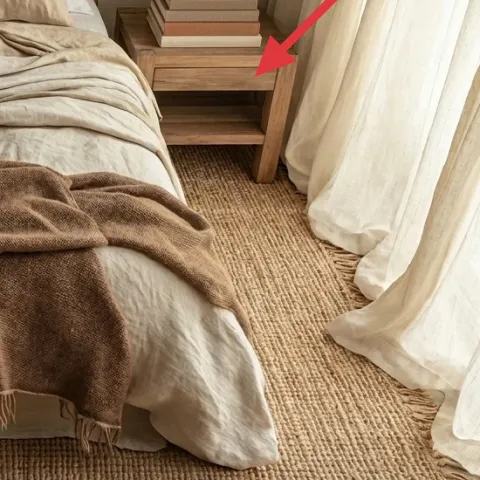
This side table adds a practical, lived-in layer: a warm wood surface holding stacked books. That combination is doing two jobs—giving you a place to land small items, and adding visual height so the styling doesn’t stay only low near the rug. If you used a metal side table instead, the room would lose the cozy warmth that makes the woven textures work. The key detail is the scale: it needs to sit beside the bed without making the corner feel cramped. I like this because it’s easy to keep consistent—stack books, add one small tray later, and the look holds.
Skip wobble-prone tops
If the table has a flimsy top, book stacks will tip and the “curated” look won’t last.
Layer 6 — bed with upholstered headboard ($250) fabric back drop for the whole palette
The upholstered headboard is what makes the entire palette feel soft instead of harsh. It’s also the reason the throw blanket and pillows don’t fight the wall—fabric absorbs contrast and gives the bed a defined “statement” area without needing extra decor. You could go with a simple wood headboard, but then you’d lose that cushioned, warm backdrop that makes the room read cozy. The trade-off here is cost: upholstered pieces are pricier than a basic frame, but buying this single anchor saves you from having to add more wall texture elsewhere. Make sure the tone stays in the camel-to-taupe family.
Pick a neutral that matches your rug
If your rug is more taupe than gold, choose the headboard to lean taupe too.
Layer 7 — framed abstract line drawing ($80) one bold line on the left wall
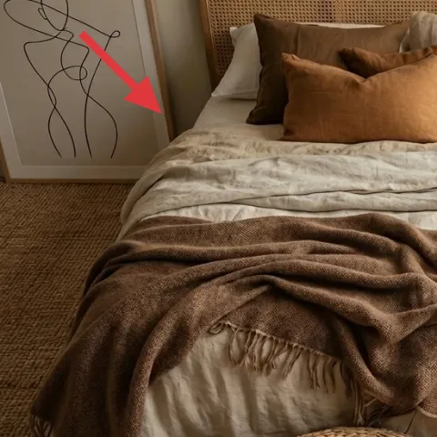
Make it instead of buying it
A painted abstract line drawing lets you match the exact warm-brown and cream tones in the room, without paying full retail for art.
Materials
- 16x20 blank canvas (or paintable board) — 1 — craft store — $18
- 16x20 wood frame — 1 — discount home goods — $25
- Acrylic paint set in warm neutrals (espresso brown + cream) — 1 set — art supply — $12
- Painter’s tape — 1 roll — hardware store — $6
- Paint pens/brushes (fine-tip liner brush) — 1 set — craft store — $9
Steps
- Use painter’s tape to mark a loose border on the canvas so lines don’t wander.
- Lightly sketch the main curves and anchors in pencil, keeping the composition asymmetrical.
- Paint the first pass with espresso brown, using a fine-tip brush for thin lines.
- Layer a few cream accents on top, then add small irregular gaps to keep it organic.
- Let the paint fully dry, then refine line weight with the paint pen/liner brush.
- Slide the finished canvas into the frame and hang at eye level.
Total DIY cost: $70 — saves about $10 over buying.
Where to place it
Center the art to the left side of the headboard so the bed looks intentional from the doorway.
The cost, layer by layer
| Layer | Item | Cost |
|---|---|---|
| 1 | Area rug (camel tan woven look) | $200 |
| 2 | Throw blanket (brown drape) | $30 |
| 3 | Round woven ottoman | $50 |
| 4 | Curtain panels (cream, light texture) | $80 |
| 5 | Side table (warm wood) | $80 |
| 6 | Upholstered headboard | $250 |
| 7 | Framed abstract line drawing (DIY) | $80 |
| Total | $670 | |
If you want a cheaper variant, skip the upholstered headboard and keep the bed simple. Use the rug ($200), curtains ($80), and a textured throw ($30) to carry the look, then spend around $60–$80 on a larger framed print instead.
What worked, what didn't (across the whole room)
This bedroom refresh works because it builds depth from materials: woven rug fibers, a draped throw, and soft textiles around the bed. The round ottoman and warm wood side table add texture at two heights, so the corner doesn’t feel one-dimensional. The only part that can quickly look “off” is the wall art color—keeping it in the same warm-brown and cream family matters.
What worked
- The woven area rug adds warmth and hides day-to-day scuffs better than low-pile alternatives.
- The throw blanket’s brown tone creates contrast against cream bedding without making the room feel dark.
- The round woven ottoman adds texture close to the floor, balancing the large bed surface.
- Cream curtain panels soften the room’s edges and keep the palette airy even with brown accents.
- The side table surface gives a readable styling height with the book stacks beside the bed.
- The upholstered headboard acts like a fabric backdrop, so the whole bed area looks cohesive.
What didn't
- Too-bright whites in curtains can fight the warm rug tone and make the corner look mismatched.
- A sleek, glossy throw fabric would read harsher and lose the lived-in drape effect.
- If the ottoman is too small, it feels decorative; if too large, it blocks the walking line.
- Wall art with a cool undertone (gray-blue) will make the warm neutrals feel less intentional.
What we'd skip if we did it again
Skip replacing multiple textile items at once. The rug and curtains are the palette anchors; changing both throws off the undertones and makes it harder to match the headboard and art.
Skip wall art that’s too detailed for this room’s vibe. One clean abstract line drawing keeps the bed textiles as the main texture story, while a busy piece can compete.
Skip a headboard that’s either very bright or very cool-toned. The upholstered headboard needs to live in the same warm-brown/cream family as the rug, or the whole corner loses that soft, cohesive read.
Frequently asked
How long does this kind of bedroom refresh take?
Plan for 1 weekend for sourcing and swaps (rug, curtains, ottoman, and side table placement) and another short session for styling. The longest part is usually getting curtain height right and arranging throw drape so it looks natural, not staged. The DIY framed line drawing can take a few hours including drying time, but it’s very flexible.
If I rent, what should I avoid in this look?
Skip anything that requires new permanent wall work. The easiest rental-friendly pieces are the rug, throw blanket, pillows, ottoman, and curtains. For the wall art, you can use the existing artwork location with picture hooks and swap the print only. If a headboard change isn’t allowed, keep your current bed setup and focus on textiles and curtain length.
What if my bedroom is smaller than the photo?
Choose a slightly smaller ottoman or a narrower side table so it doesn’t visually crowd the floor. Keep the rug large enough that it still reaches at least under the bed front edge—under-sizing makes the corner look disconnected. For curtains, hang them wider than the window frame so you get that stretched, airy border even in a compact room.
What if my bedroom has darker walls or less natural light?
Lean brighter in the curtains (still warm cream, not icy white) and bring in more light texture with the throw blanket—think linen-cotton weave rather than smooth knits. Keep the rug tone neutral and not too deep. The upholstered headboard becomes especially valuable because fabric texture makes dark walls feel softer instead of heavy.
Where can I shop for items like these on a budget?
For the rug and curtains, look at big-box home stores and discount home departments first, then check home decor resale shops for woven ottomans. For the headboard, search “upholstered headboard neutral” and watch for sales. Wall art can be thrifted frames in the right size, then DIY the print so you match the warm-brown palette.
Biggest mistake people make when copying this style?
The most common slip is mixing undertones—grays with warm camel-browns or bright whites with coffee fabrics. Another frequent issue is buying a rug that’s too thin, which removes the cozy woven texture. Keep everything in the same warm-neutral family, then build upward from rug to curtains to wall art.
More in Bedroom
Under $700: earthy-neutrals bedroom reading nook refresh
This earthy-neutrals bedroom refresh leans on texture: a woven area rug, warm throw blanket, and lineny curtains. With 7 layers that all sh…
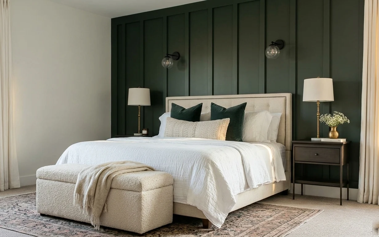
Under $700: modern dark-green bedroom nook refresh
Turn your bedroom nook into a darker, calmer, hotel-luxe corner with a few weekend swaps. This $700 plan covers a patterned rug, curtain pa…
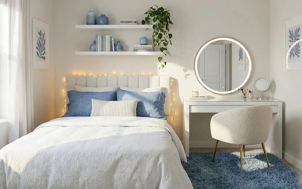
Under $500: 7 move-ready upgrades for a bedroom vanity corner
A light, white-and-blue bedroom vanity corner makeover built from 7 renter-safe swaps. With a total retail spend of under $500, the bed, ru…