- Square footage
- Small footprint, big visual impact
- Cost
- Under $600 total
- Difficulty
- Weekend-friendly
- Renter-safe
- No-drill decor and packable swaps
Why black-and-beige staircase styling is the entryway landing of 2026
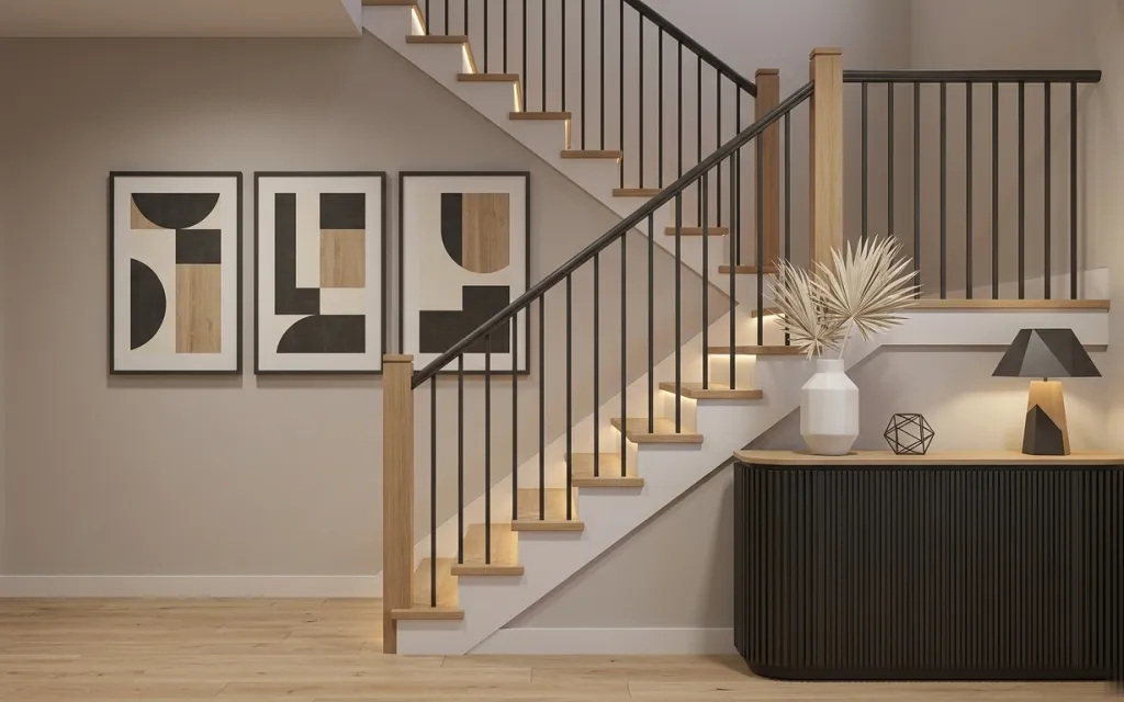
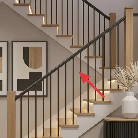
The easiest win in this photo isn’t the staircase—it’s the way everything above the light wood floor feels intentional: three framed abstract prints, a console cabinet with a warm table lamp glow, and a clean white vase break in the middle. The materials matter here. You’ve got matte black lines, light wood tones, and creamy wall color all playing together. For shared housing, that’s good news: most of these pieces are decor swaps that pack into boxes when the lease ends.
I almost overdid it the first time I tried to “make a hallway look like a magazine.” I added tiny trinkets everywhere, and the space felt busy instead of calm. The turning point was when I treated the console like a stage: one lamp for height, one vase for softness, and art that repeats shapes and tones. This setup keeps the same modern rhythm you see here, without permanent installs or moving-heavy furniture twice.
Layer 1 — Console cabinet ($200) makes the whole landing feel grounded
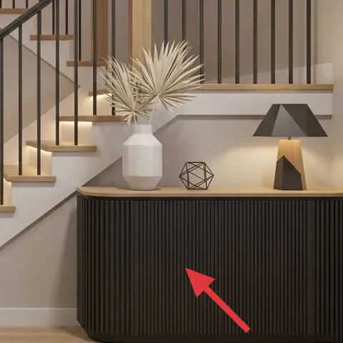
A console cabinet is the anchor piece in this scene. The ribbed dark front and warm wood trim create a strong base while echoing the light wood stairs. A big reason to choose a console (instead of a flimsy floating shelf) is that it gives a stable surface for a lamp, plant, and decor that won’t wobble when roommates set things down. The trade-off is footprint: consoles can feel “tight” in narrow entryways, so pick a slimmer profile and plan for a clear walking path to the stairs.
Choose a ribbed or panel-front finish
Texture reads more expensive in small entryways, especially when you can’t change wall paint or flooring.
Layer 2 — Table lamp on console cabinet ($60) adds warm glow without hardwiring
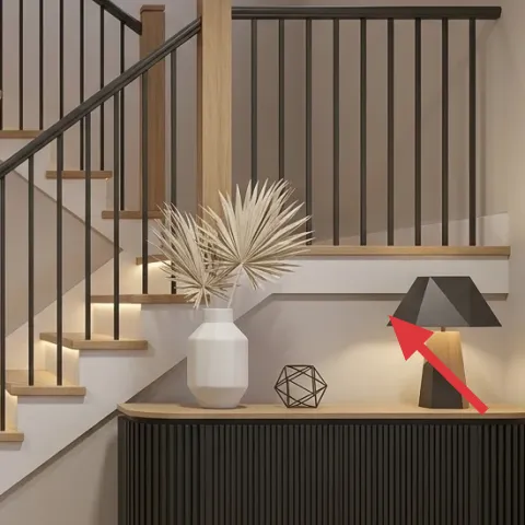
The table lamp on the console is doing heavy lifting here. It’s a plug-in source, and its warm light softens the black-and-wood contrast from the staircase railings. This matters in a landing because overhead lighting tends to flatten everything, and you lose that “finished” look. Going for a sculptural base also beats a basic shade lamp because it holds visual weight even when the bulb is off. The trade-off: a lamp with a taller silhouette needs a quick clearance check from the staircase steps so it doesn’t feel cramped.
Pick height for the art, not the floor
If the lamp is too low, the framed prints start looking disconnected from the console.
Layer 3 — White vase with palm fronds ($25) keeps the palette light and airy
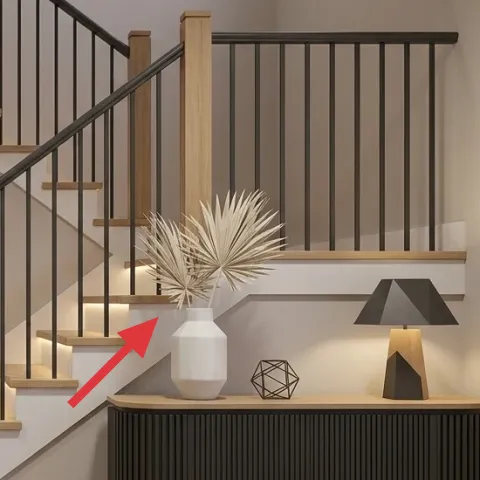
The white vase with palm fronds is the color reset in this photo. The crisp white keeps the landing from turning too dark next to the black railing, and the spiky fronds add movement without adding clutter. This is a smart swap for shared housing because a vase-and-plant moment is easy to pack in boxes—no bulky furniture moving required. If you’re choosing between a tall faux plant and a shorter bouquet, go tall enough that it visually reaches into the space above the console. The trade-off is realism: some faux fronds look “stiff,” so choose fuller stems or switch to seasonal dried stems if you want softer texture.
Match the vase color to the wall brightness
In this palette, white makes the black railing look intentional instead of heavy.
Layer 4 — Geometric wire decor on console cabinet ($18) adds mid-century interest at shelf height
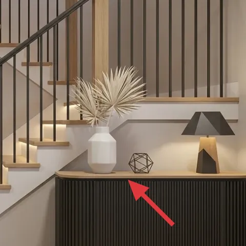
The geometric wire decor works because it sits at eye level and supports the modern lines coming from the staircase railing. It’s also the exact kind of small object that helps a landing feel designed without taking up space. Compared to a stack of coasters or small figurines, a wire shape reads airy—so it doesn’t visually crowd the lamp or plant. The trade-off is stability: wire pieces can tip if they’re too top-heavy, so place it toward the back edge of the console and keep it away from where people set bags.
Avoid glossy finishes on dark surfaces
High-gloss decor can create glare right in the lamp’s light cone.
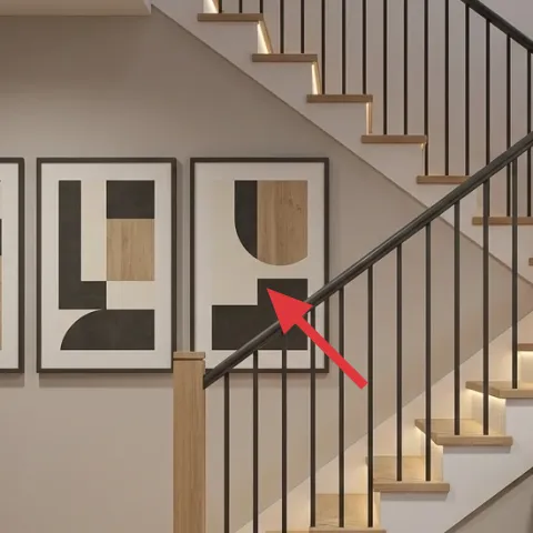
Layer 5 — Framed abstract print ($70) brings the “set” feeling up on the wall
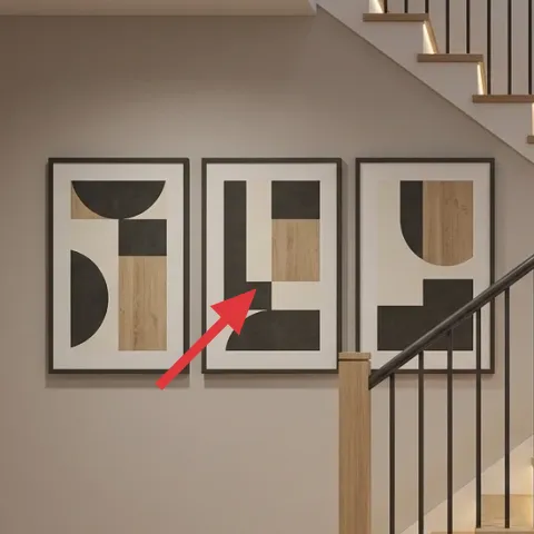
Three framed abstract prints are part of why the landing looks curated instead of random. One print alone can feel like an accident; three at similar heights create a rhythm that matches the staircase lines. This specific move also works well for impermanence—frames can be packed, and artwork can be swapped later without touching the wall. The trade-off is choosing frames that are sturdy enough for moving: lightweight frames are easy to transport, but corners can chip if they’re not boxed carefully.
Make it instead of buying it
This DIY swaps one framed abstract print for a hand-painted cardstock version that can slide back into the existing frame during each move.
Materials
- Cardstock (thick, for painting) — 1 pack — store paper aisle — $3
- Acrylic paint set (small bottles) — 1 set — craft store — $10
- Black fine-tip marker — 1 — craft store — $4
- Painter’s tape — 1 roll — craft store — $6
- Clear acrylic spray (optional topcoat) — 1 — craft store — $3
Steps
- Cut the cardstock to the frame’s opening size with a small margin for a snug fit.
- Tape simple block shapes, lines, and curves to guide the abstract layout.
- Paint the larger areas with acrylics, using black and warm neutrals to match the landing palette.
- Wait for the first paint layer to dry fully.
- Remove tape and touch up edges with the black fine-tip marker.
- If using a clear acrylic spray, apply a light coat and let it dry completely.
Total DIY cost: $26 — saves about $44 over buying.
Keep repeats across the set
If all three prints share similar black shapes and warm neutrals, the landing stays cohesive even after you swap one.
Layer 6 — Framed abstract print ($70) makes the spacing feel deliberate
The middle framed abstract print is the “breathing space” between the left and right pieces. In practice, this is what keeps a trio from looking like a random cluster. When the shapes are roughly similar in scale, the eye reads it as a set—especially important on a landing where people pass quickly. Choosing framed prints (instead of loose art) is also more move-friendly because the finished pieces travel well in boxes. The trade-off is measuring once: if one frame sits noticeably higher than the others, it’s much harder to correct later.
Align frame centers before you commit
Use the console lamp top as a visual reference point for consistent height.
Layer 7 — Framed abstract print ($70) completes the trio with matching tones
The right framed abstract print finishes the modern geometry you see in the staircase railing. A trio like this works because the wall art and the rail lines both use bold, simple blocks—so the landing feels designed rather than disconnected. The biggest reason to buy a matching-style print here is speed: it’s the easiest way to get cohesion without changing any fixed elements like flooring or stair materials. If a move happens mid-year, you can also rotate new prints in and keep the frame style consistent. The trade-off is storage: frames take up volume, so wrap them individually and keep corners protected.
Choose matte finishes to reduce glare
Matte art stays readable under warm lamp light.
The cost, layer by layer
| Layer | Item | Cost |
|---|---|---|
| 1 | Console cabinet (slim modern) | $200 |
| 2 | Plug-in table lamp with shade | $60 |
| 3 | White vase with palm fronds | $25 |
| 4 | Geometric wire decor | $18 |
| 5 | Framed abstract print (DIY ~$26 materials) | $70 |
| 6 | Framed abstract print (set-matching) | $70 |
| 7 | Framed abstract print (set-matching) | $70 |
| Total | $513 | |
If the console cabinet price feels high, a lighter alternative is a smaller sideboard or a thrifted console you can refinish in your existing style palette. The main goal is a stable, textured base for the lamp and plant so the framed prints still look intentionally placed.
What worked, what didn't (across the whole room)
This landing works because every new piece supports the same visual logic: black geometric lines, warm wood tones, and creamy negative space. Layering the lamp for warm light and using a trio of framed abstract prints gives structure even with minimal decor on the surface.
What worked
- The console cabinet’s ribbed texture makes the entryway feel styled without adding extra objects.
- The plug-in table lamp adds warmth that flatters the matte black staircase railing.
- The white vase keeps the landing bright against the darker rail tones.
- The geometric wire decor adds mid-century shape repetition at shelf height.
- A matching trio of framed abstract prints reads intentional instead of accidental.
- Swap-ready frames keep the look updated between leases.
What didn't
- Too many small knickknacks on the console competes with the framed print trio.
- Glossy decor can reflect lamp light and make parts of the wall art harder to read.
- Art that’s mismatched in shape scale looks “random” even when colors are close.
- A lamp that’s too short makes the console feel disconnected from the staircase visual rhythm.
- Faux plants that are overly thin can look sparse beside the palm fronds style.
What we'd skip if we did it again
Skip replacing the whole wall setup with temporary wall treatments that require removal tools or messy residue. This photo’s look is about curated decor placement, not changing the structure—so frames, freestanding pieces, and plug-in lighting keep the move-friendly win.
Skip bulky storage furniture in the landing zone. A heavier cabinet can be hard to transport and makes the entry feel crowded, especially with stairs nearby. A slimmer console keeps the same anchored feeling without turning moving day into a two-person event.
Skip mismatched wall art when it doesn’t share the same black-and-warm-neutral logic. If one print has a totally different palette or shape style, the trio loses cohesion and the landing starts to look like leftover decor instead of a set.
Frequently asked
How long does this kind of entryway landing refresh take?
Most of the work happens in two blocks: setting the console layout and lining up the framed prints. For move-friendly swaps, plan about 2–3 hours total, plus extra time for careful frame spacing. If the DIY cardstock print is included, add another 1–2 hours depending on drying time.
Is this renter-friendly if the space is shared and I can’t control the whole room?
Yes—the changes are surface-level decor, plug-in lighting, and wall art that can be boxed for the next lease. The key is choosing freestanding, lightweight items and keeping the wall art consistent as a trio, so it still looks cohesive even if you adjust the console later.
What if my entryway landing is narrower than this one?
Go for a slimmer console footprint and reduce the number of objects on top. Keep the lamp as the main vertical element and use the vase plus one wire decor piece, but leave more negative space around the center. For wall art, maintain the trio look with similar frame sizes rather than making it lopsided.
What if I want the same look in a bigger space?
Scale up the console width slightly and consider a larger vase or a taller plant arrangement to balance the staircase visual height. For the framed trio, you can go up one frame size while keeping the same black-and-warm-neutral shapes. The goal is consistent repetition, not more items.
Where should shopping start if I want the modern palette in the photo?
Start with a console cabinet and a table lamp that share the light wood + black feel, then match the wall art to that tone. For decor accents, look for white vases and wire geometric shapes in matte finishes. Shopping in this order makes it easier to avoid buying items that clash once they’re all on the same surface.
Biggest mistake to avoid on this type of landing?
Over-styling the console. When too many small items sit near the lamp and plant, the landing stops reading as a set. Another common mistake is mixing art styles—if one framed print doesn’t share the same shape logic, the trio looks accidental even with matching colors.
More in Small Spaces

Under $600: modern entryway landing refresh with 7 move-ready swaps
A modern entryway landing refresh on a shared-housing budget: 7 move-ready swaps centered on a console cabinet, warm lamp glow, and framed …
Under $400: entryway console nook refresh with 7 move-ready swaps
A renter-friendly entryway console nook refresh using warm wood, white surfaces, and gray patterns—no drilling and everything packs away. T…
Under $300: 7 move-ready swaps for a stair landing console
A stair landing console gets the same airy, natural texture look using 7 move-ready swaps for under $300. Focus: woven baskets, a stoneware…