
- Best for
- Renter-friendly statement style
- Time
- 2–4 weekend afternoons
- Total cost
- Under $600
- Renter-safe
- Yes—no-drill swaps and pack-away styling
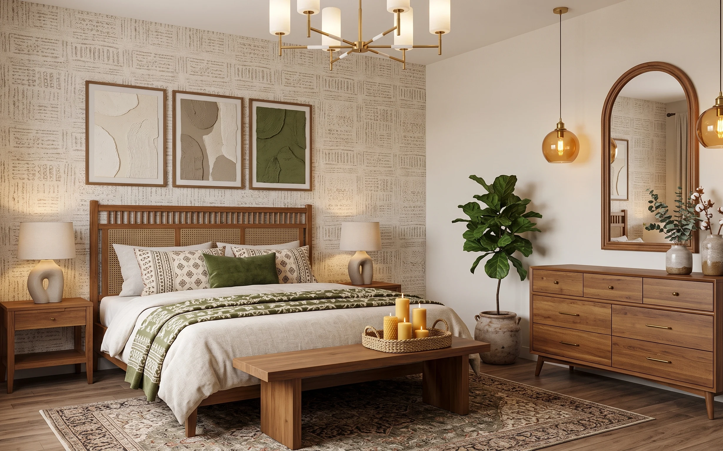
Why olive-and-tan details are the bedroom of 2026
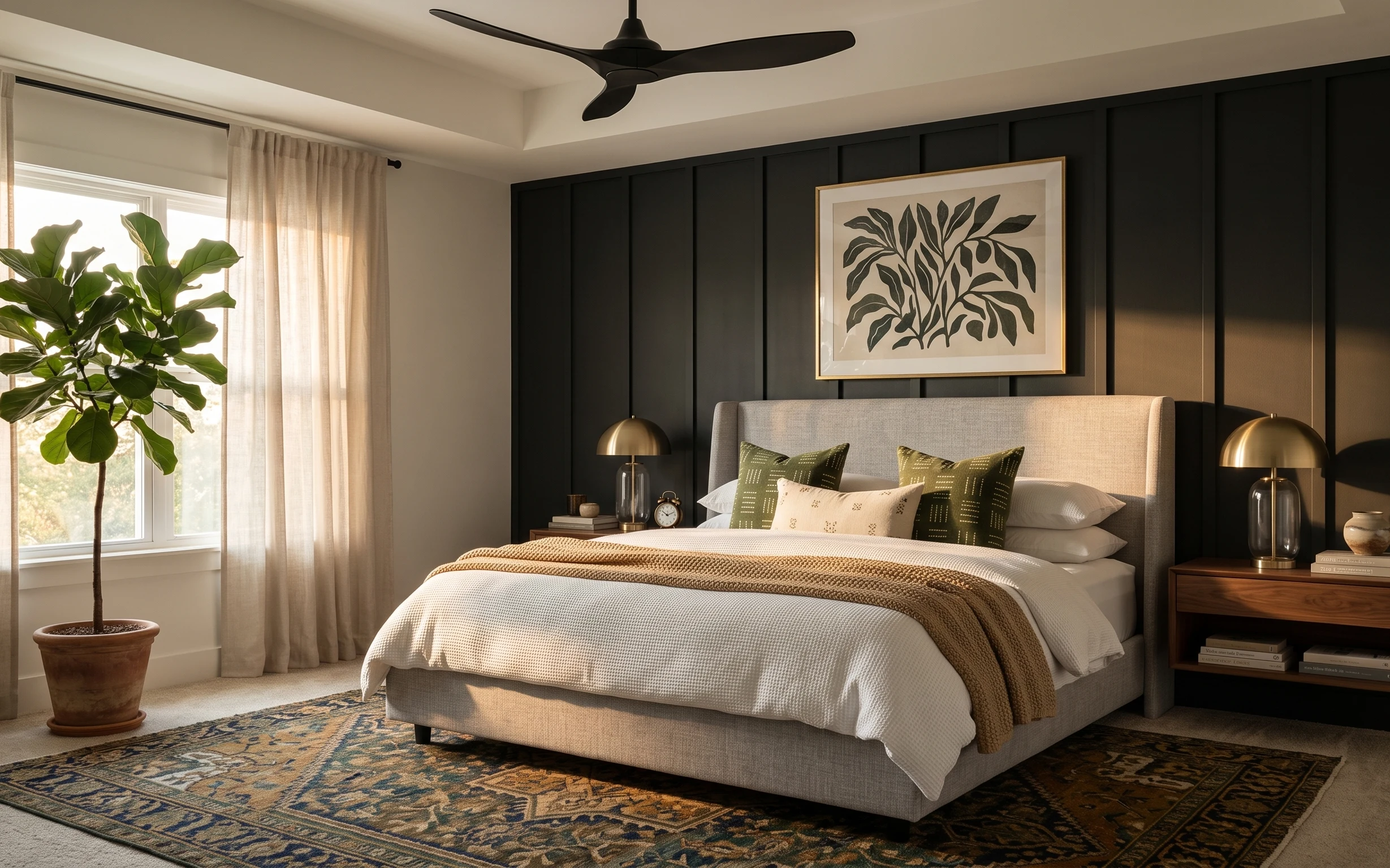
Start with what the room already does well: the warm tan walls and the brass-toned lighting create that golden “late afternoon” mood. This version leans into three textures you can feel at a glance—soft curtains, woven rug fibers, and the grounded wood surfaces. The olive patterned throw and pillows add the color note without making the whole space look themed. For renters, the payoff is that everything here is either freestanding or attaches without drilling, so the look stays cohesive even when you swap items between apartments.
I almost overcomplicated the styling when I first copied this setup. My mistake was trying to match every decor piece in the exact same shade of green. What fixed it was limiting the color story to one olive blanket moment, then repeating that tone through smaller accents like a single tray-and-candles vignette and the plant pot. Suddenly the room felt curated instead of busy.
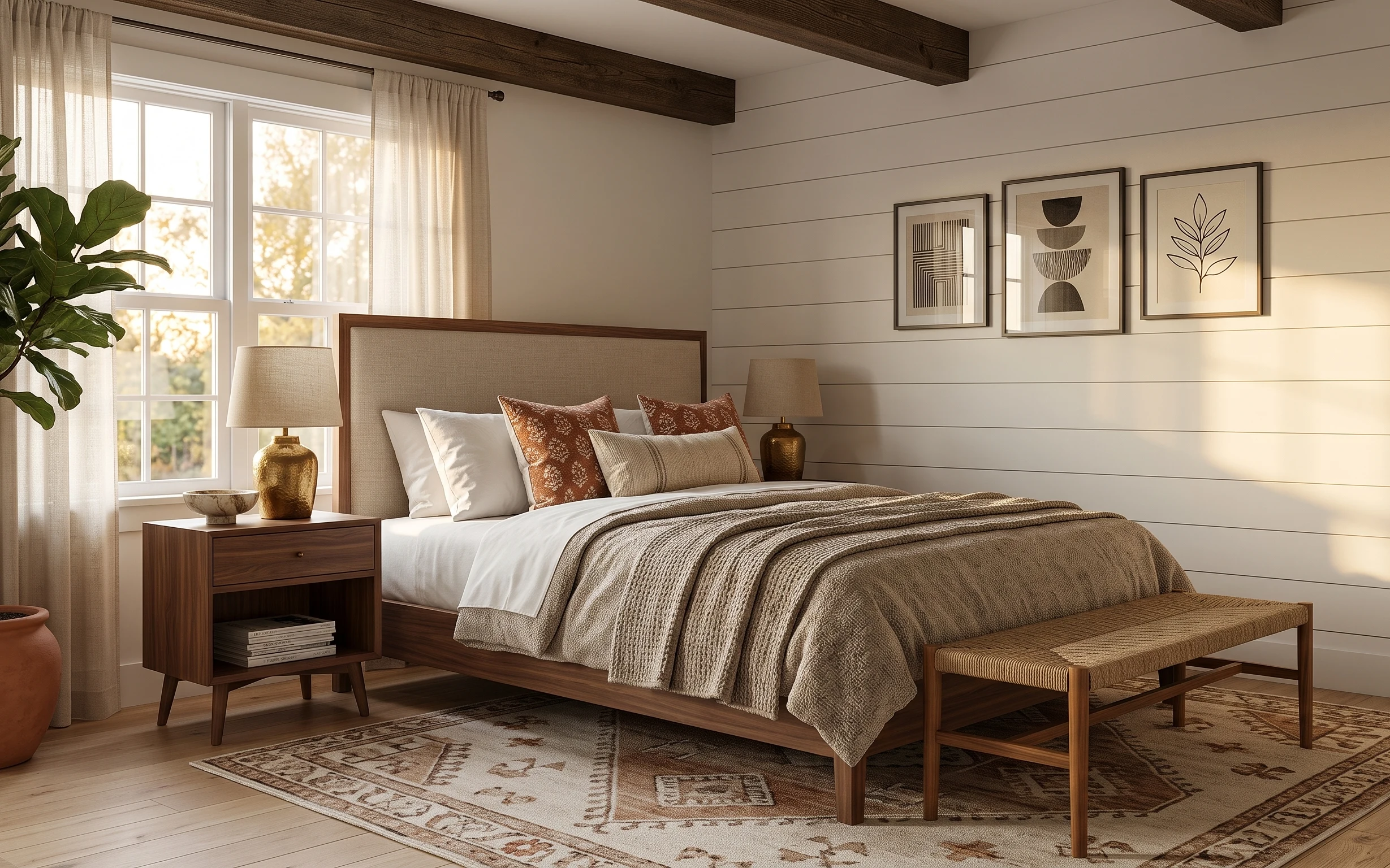
Layer 1 — large patterned area rug ($200) Grounds the whole color story
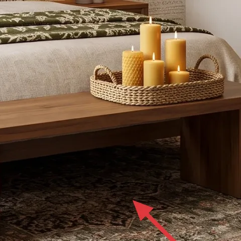
Choose a large patterned area rug that pulls together tan, cream, and muted olive tones—then let it sit fully under the bed front and extend beyond the coffee table edges. In the hero, the rug’s busy pattern does two jobs at once: it hides foot-traffic wear and it softens the straight lines of the wood bed frame and dresser. The obvious alternative is a solid rug, but solids show scuffs and they don’t create the same collected, layered feel. The trade-off here is vacuuming a bit more carefully, because high-contrast patterns love to show debris if you rush.
Pick the rug first, then shop colors
Bring the rug home and match pillows and art to two tones you see in it—tan for balance and olive for contrast.
Layer 2 — cream curtain panel pair ($60) Adds vertical softness without commitment
Cream floor-length curtains are doing the “taller walls” work in this room. The panels hang straight and keep the palette bright against the warm tan wall, which makes the olive accents look intentional instead of heavy. For renters, the key is using tension rods or removable curtain hardware so the fabric disappears when the lease does. A common alternative is skipping curtains for blinds and sheer panels, but that can leave the window area looking unfinished. The trade-off is light control—cream fabric gives more visibility than blackout options, so it’s best for daytime privacy needs.
Hang for puddling, not just coverage
You want the panels to kiss the floor so the room feels tailored, even in a rental.
Layer 3 — three framed abstract prints ($180) Brings in the olive-and-cream rhythm
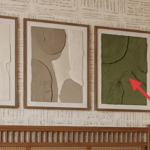
Use three framed abstract prints with a cream base and a single green that echoes the throw blanket color. In the hero, the frames sit in a tight row above the bed headboard, making the wall feel designed even when the furniture is simple. The reason this works is repetition: olive appears in both the art and the textiles, while tan/cream threads through everything else. The obvious alternative is one large print, but three smaller pieces add scale variety and look more expensive without needing a giant frame. The trade-off is spacing—measure the gap so the row feels even from across the room.
Keep frames level on the first placement
If a renter uses removable hooks and eyeballs it, the row can drift. Level the middle print, then build outward.
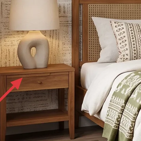
Layer 4 — plug-in table lamp with white shade ($60) Makes the glow look planned
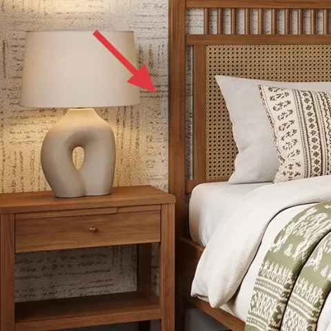
A plug-in table lamp with a white shade adds warm, clean light that flatters both the rug pattern and the wood grain. In the hero, the lamp sits on the left nightstand and balances the darker elements under the bed frame with a bright “pool” of light. The obvious alternative is a single overhead fixture, but relying on that alone usually turns the room into a shadowy hallway. The trade-off is bulb consistency—use the same warm color temperature (around 2700K) in every lamp so the room doesn’t feel patchy at night.
Use warm bulbs for the tan walls
Warm bulbs make the tan and brass tones look cohesive instead of gray.
Layer 5 — green patterned throw blanket ($25) Adds the one color note
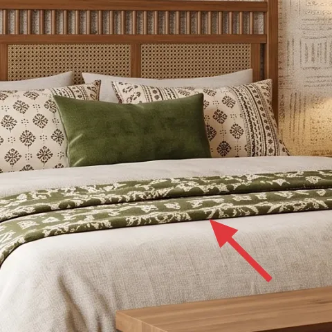
Pick a green patterned throw blanket with a subtle cream linework and drape it where it’s seen from the foot of the bed. The hero uses a green textile that sits casually across the bed blanket, which makes the bed feel styled without locking you into matching sets. This works especially well with earthy neutrals because the pattern adds depth while still reading calm. The alternative is a plain solid throw, but solids can look flat next to the patterned art and rug. The trade-off is that patterned throws hide wrinkles better than smooth knits, so it’s an easy choice for busy weeks.
Let one textile pattern lead
Keep pillow patterns lighter and let the throw do most of the “busy texture” work.
Layer 6 — woven tray with stacked candles ($35) Makes styling feel intentional
A woven round tray topped with stacked candles turns a coffee table into a focal point without needing wall changes. In the hero, the tray sits on the wood coffee table and repeats the room’s warm, natural textures—wood, woven fiber, and creamy light. The reason this works is height and grouping: candles give vertical rhythm, and the tray provides a boundary so the table doesn’t look cluttered. The obvious alternative is loose candle placement, but that reads messy in daylight. The trade-off is safety—use stable candle holders and keep them away from drafts when the room is open.
Group in odd numbers
Three or five candles look balanced faster than trying to make every height match.
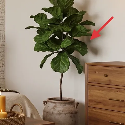
Layer 7 — large indoor plant in terracotta-style pot ($35) Adds life plus a DIY color moment
Make it instead of buying it
Paint your terracotta-style pot so the plant looks like it belongs with the olive-and-tan palette, without replacing the plant later.
Materials
- Acrylic paint (tan + olive, 2 small bottles) — set — $10
- Foam brush set — 2-pack — $4
- Painter’s tape — 1 roll — $2
- Disposable gloves — 1 pair — $3
- Paper towels / stir stick extras — small pack — $1
Steps
- Wipe the pot clean and let it fully dry.
- Use painter’s tape to mark simple stripes or a banded pattern.
- Paint the tan base coat with a foam brush, using thin layers.
- Remove tape carefully once the paint is set to the touch.
- Add olive accents with light, dabbed strokes for texture.
- Let the pot dry completely before placing the plant back on top.
Total DIY cost: $20 — saves about $15 over buying.
A leafy indoor plant in a terracotta-style pot is the finishing layer that makes the whole room feel lived-in. In the hero, the plant brings volume to the right side of the bedroom and balances the heavy furniture lines—the dresser and the mirror frame it visually. This is why it’s worth the spot: no other item adds “soft” shape as efficiently as foliage. Buying the look is one option, but DIY-painting the pot helps it match the olive-and-tan story without needing a new plant. The trade-off is that painted pots show touch-up needs over time, but they’re easy to repaint during weekend refreshes.
Match to your rug, not your art
Terracotta and olive should pick up from the rug tones so everything feels tied to the floor.
The cost, layer by layer
| Layer | Item | Cost |
|---|---|---|
| 1 | Large patterned area rug | $200 |
| 2 | Cream curtain panel pair | $60 |
| 3 | Three framed abstract prints | $180 |
| 4 | Plug-in table lamp with white shade | $60 |
| 5 | Green patterned throw blanket | $25 |
| 6 | Woven tray with stacked candles | $35 |
| 7 | Large indoor plant in terracotta-style pot (DIY painted) | $35 |
| Total | $595 | |
If the framed prints cost feels like a lot, swap to a framed set of three smaller prints on a similar cream-and-green palette. It keeps the same “color rhythm above the bed” idea while lowering spend.
What worked, what didn't (across the whole room)
This layout succeeds because the palette is consistent: warm tan and brass tones are repeated in the rug, curtains, and lamp glow. Olive shows up in a few controlled places, so the room feels styled instead of themed. The styling tray and plant make the coffee-table and dresser areas feel finished without clutter.
What worked
- The patterned rug anchors the bed and reduces how “empty” the floor looks in daytime.
- Three framed abstract prints add vertical interest without overwhelming a rental wall.
- Cream curtains soften the window area and make the room feel taller than it is.
- Plug-in table lighting creates a warm pool of light that flatters the wood furniture.
- The olive throw blanket gives a single clear color note that repeats through the art.
- The candle tray vignette makes the coffee table feel curated in seconds.
What didn't
- Matching multiple greens at once looked too busy, so the color stayed limited to two zones.
- If curtains are hung too low, the wall height drops and the room looks boxed in.
- Using one oversized print can leave a “gap” above the bed compared with three smaller frames.
- Over-styling the coffee table next to the candle tray blurs the focal point.
- Skipping a plant makes the right side feel flat next to the mirror and dresser lines.
What we'd skip if we did it again
Skip going too matchy with greens. It’s tempting to buy every olive item at the same tone, but the room reads better when one olive piece leads (the throw or pillow) and the rest echo the palette more loosely.
Skip replacing the room’s lighting with extra overhead options. Instead, keep it simple: one plug-in lamp per side table and warm bulbs that make the tan walls look golden.
Skip bargain “busy” rug patterns that don’t include your cream tone. The goal is cohesion across rug, curtains, and prints; if the rug lacks cream or leans too cool, the whole bedroom starts to fight itself.
Frequently asked
How long does this bedroom refresh take?
Most of the work is assembly and placement: rug positioning, hanging curtains with tension rods, and setting up three framed prints above the bed. If the plant pot needs paint, plan one extra dry time session for the DIY. In real life, it’s usually 2–4 weekend afternoons depending on how quickly you pick frames and curtains.
Is this renter-safe if my lease doesn’t allow hardware?
The core pieces here are freestanding (rug, coffee table styling, plant) or curtain-based. For wall art, use removable hanging methods like Command strips or picture-rail hooks where the rail already exists. The trick is to avoid permanent fixings and remove everything at move-out so the wall stays clean.
What if my bedroom is smaller than the photo?
Shrink the visual footprint by choosing a rug that still goes under the bed front and at least one clear edge beyond it. Keep the curtain panels but hang them slightly higher for height. For the art, three prints can work in a smaller space—just tighten the spacing and keep the row centered above the headboard line.
What if my bedroom is bigger and feels empty?
Use a larger rug or let the curtain panels travel farther on each side of the window so the fabric draws the eye upward. Add a second small styling spot on the dresser with a ceramic object from the existing color palette. The key is repeating tan/cream and olive in two or three “zones,” not everywhere at once.
Where should I shop differently to stay under $600?
Treat the rug and framed prints as the items you buy once, then thrift or shop discounted for smaller decor like trays and candles. Table lamps are often cheaper on reseller sites, as long as the shade is clean and the base looks sturdy. For DIY-painted pots, any terracotta-style pot works—use what fits your plant size.
Biggest mistake to avoid in this room type?
Overloading the green. When every textile and decor piece tries to be the main character, the room reads chaotic instead of cohesive. Pick one olive anchor (throw blanket or pillow), then let the rest of the palette support it with tan, cream, and warm wood tones.
More in Bedroom
Under $600: warm olive-and-tan bedroom refresh with move-ready swaps
A warm, earthy bedroom look is achievable for under $600 with renter-safe swaps: a bold patterned rug, soft cream curtains, three framed ab…
Under $500: olive-and-brass bedroom refresh with 7 move-ready swaps
This bedroom refresh leans olive green, cream textiles, and warm brass for a lived-in look. With 7 move-ready swaps, the whole update lands…
Under $400: move-ready bedroom refresh with warm earth tones
A warm earth-tone bedroom refresh for shared housing—built from move-friendly swaps that pack into boxes. This plan hits the look with curt…