
- Best for
- earthy seating area refresh
- Cost
- $665 total
- Difficulty
- Easy
- Time
- 1 weekend
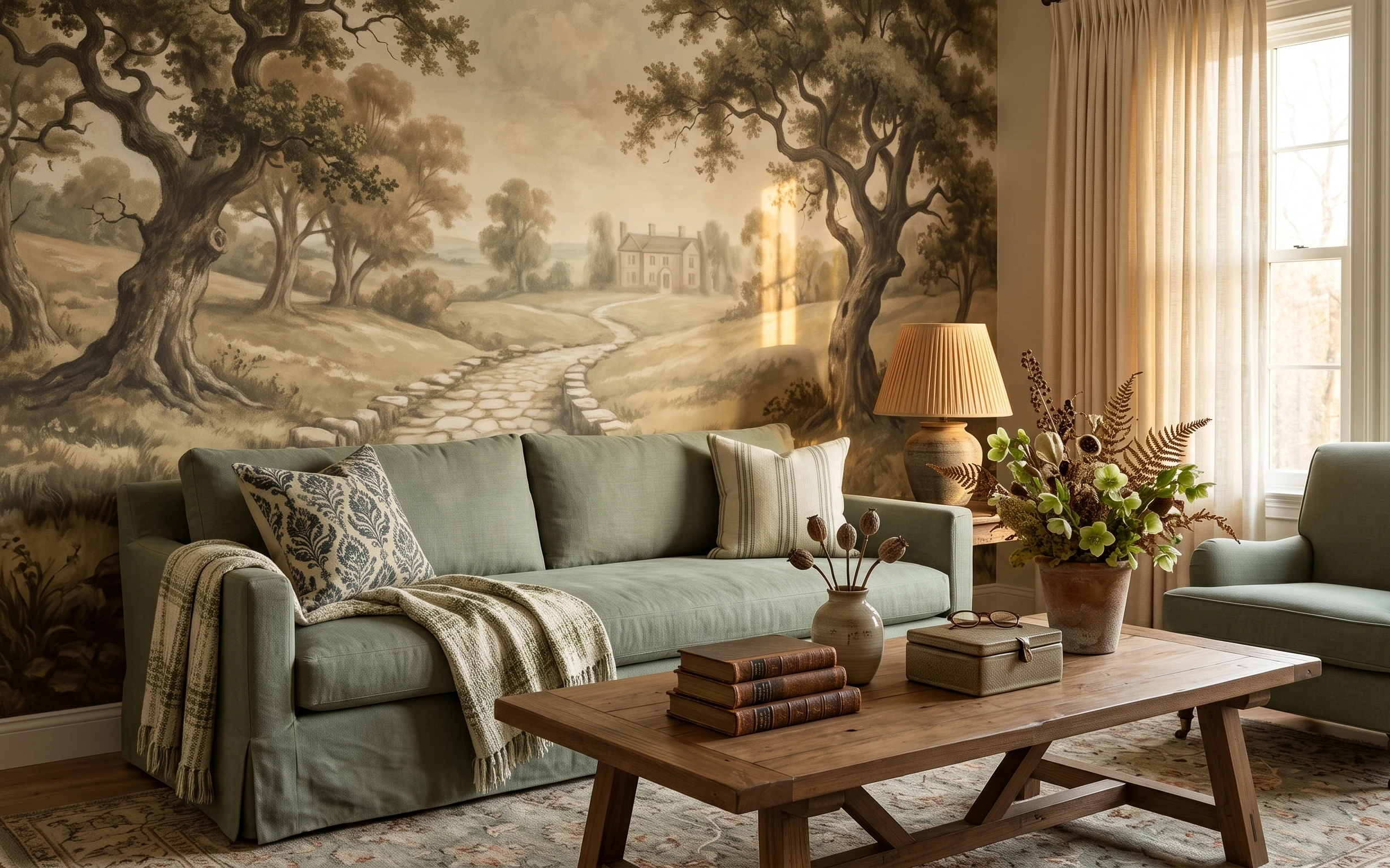
Why warm sand-and-leather palette is the living room seating area of 2026
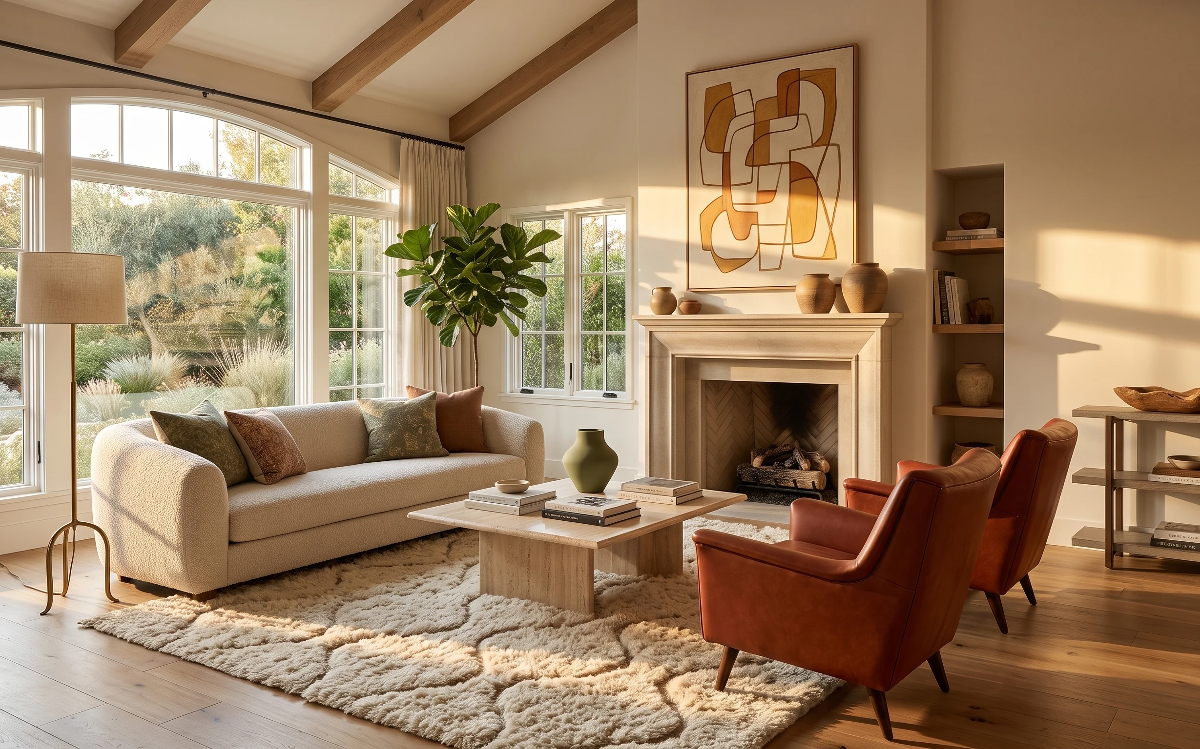
That beige shag rug and the warm leather chair do a lot of work before you even touch a paintbrush: they turn “bright and open” into something you’d actually sink into. The room also leans mid-century modern, with the wood ceiling beams and clean lines around the white fireplace. Texture matters here—shag pile, soft curtain fabric, and smooth ceramic surfaces all read different in daylight. For US homeowners, this kind of layered, color-repeating refresh is achievable fast because you can pick the most visible upgrades first instead of doing everything all at once.
I used to overthink it and start with wall paint. This time, I caught myself right away: the bigger shift was replacing “random” textiles with coordinated warm neutrals and giving the mantel styling more intention. The moment I repeated the same browns (leather + ceramics) and added one leafy green, the whole seating area looked calmer and more finished, even without changing anything structural.
Layer 1 — Beige shag area rug ($200) Texture underfoot that feels instantly settled
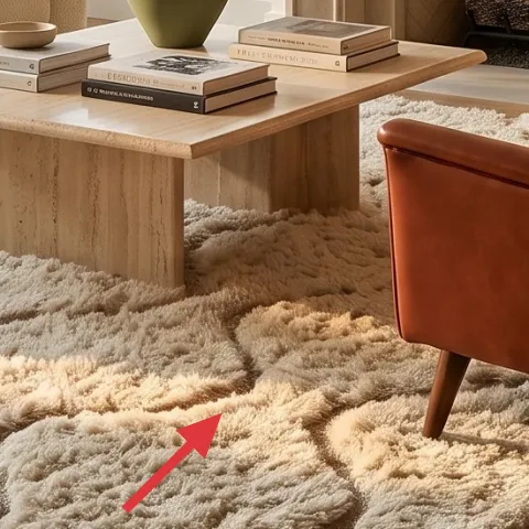
A beige shag area rug is the anchor layer for this living room seating area—its pile height makes the wood floors feel warmer and visually “buffers” the chairs and sofa. In a bright space with big windows, flat rugs can look a little sharp and echo-y, but shag softens that edge without needing a darker palette. The trade-off: shag can trap a little grit, so regular vacuuming matters (use a beater bar only if the label allows it). Still, when you’re going for lived-in rental energy at homeowner speed, this one item changes how the whole room reads.
Hide the messy days with a cream-base rug
Choose an off-white/beige rug with subtle variation so everyday dust and small specks don’t look like obvious stains.
Layer 2 — Beige curtain panels ($80) Higher, softer window framing
Beige curtain panels add height and softness, which is exactly what your eye needs in a room with wood ceiling beams and lots of daylight. Pulling fabric up (rather than letting curtains stop at the window frame) makes the windows feel taller and the whole seating area more intentional. The trade-off is that you may need to hem or ensure the panels puddle just right—too short looks “installer-brained.” For an easy weekend win, hang them so they skim the floor or just kiss it, then keep the color warm so it matches the leather and mantel ceramics.
Match undertones to the rug, not the curtains alone
If your rug is creamy-beige, pick curtains with a similar warmth so you don’t get a yellow-vs-cream mismatch.
Layer 3 — Large framed abstract wall art ($80) A color cue above the fireplace
The large framed abstract wall art above the white fireplace mantel works like a “palette reference”—it ties the warm browns to the muted greens and keeps your seating area from feeling randomly decorated. In rooms like this, the fireplace is a natural focal point, so skipping art (or going too small) leaves a visual blank even when everything else is styled. The frame size is the trade-off: you want it to feel substantial, not like it’s hanging because you had extra wall space. If you’re shopping, prioritize a print with similar warm tones and enough negative space so the room still feels airy.
Size up for the mantel wall
Pick art that spans most of the mantel’s width so your eye doesn’t break into tiny details.
Layer 4 — Throw pillows on sofa ($40) Repeat the warm palette in smaller doses
Throw pillows are where you can control the vibe fast: they add softness, break up sofa color, and echo the room’s warm brown theme without committing to a full fabric change. Here, pillows in warm neutrals and one muted green-toned accent create a small “frequency shift” against the cream upholstery. The trade-off is scale—too many small pillows can make the sofa look busy, while one or two larger silhouettes feel more tailored. Go for a mix of textures (like a velvety look next to something more matte) so daylight doesn’t flatten everything.
Don’t match everything exactly
Keeping pillow colors in the same warmth family is the goal—try to avoid perfectly identical shades that read flat.
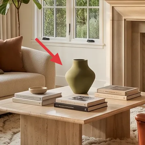
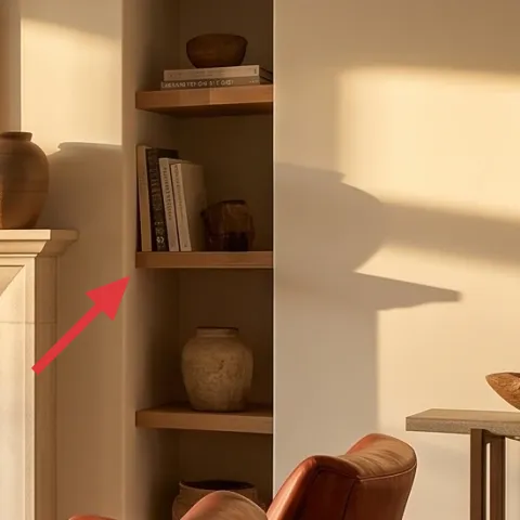
Layer 5 — Decorative vases on fireplace mantel ($140) Painted ceramics that look curated
Make it instead of buying it
Paint a set of plain ceramic vases in warm terracotta-style tones so the mantel styling matches your rug and leather without paying for a full “decor set.”
Materials
- Ceramic vases (3–4 small pieces) — assorted — $12
- Acrylic paint, warm terracotta — 2–3 colors total — $15
- Acrylic paint, cream/ivory — for highlights — $8
- Brush set (small flat + angled detail) — $10
- Clear matte sealer (spray or water-based) — $4
Steps
- Wash and fully dry each vase so paint sticks evenly.
- Lightly scuff with fine sandpaper, then wipe away dust.
- Base-coat with warm terracotta and let it dry completely.
- Add cream highlights with a dry-brush technique for a soft, ceramic-like variation.
- Paint subtle darker accents at the necks/bases for depth, then dry.
- Seal with a matte clear coat and let it cure fully before styling.
Total DIY cost: $49 — saves about $91 over buying.
Even though ceramics are small, this mantel moment sets the tone for the entire seating area. The decorative vases and bowls give you height variety (one tall form, a couple mid pieces) and a warm, earthy note that ties directly into the brown leather chair and the beige rug. Buying a pre-made mantel set can get pricey fast, so DIY-ing a similar look is the fastest path to “high effort, weekend work” energy. The trade-off is that paint needs a careful, even coat and proper drying before arranging, but once they’re sealed, they look cohesive and stay low-maintenance.
Keep the ceramics matte, not shiny
Matte finishes look more expensive under daylight and won’t glare next to the textured rug.
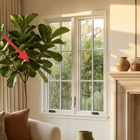
Layer 6 — Large green leafy plant ($80) One living color to balance all the neutrals
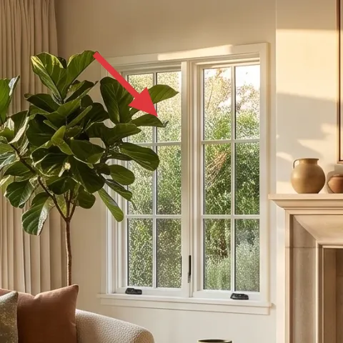
A large green leafy plant adds the one “cool” color that keeps warm neutrals from turning flat. In this room, the muted green of the foliage echoes what’s already happening visually through the windows, so it feels natural instead of decorative-on-top-of-decorative. The plant also brings vertical movement between the curtain lines and the fireplace focal point, which helps the seating area feel layered rather than boxed in. The trade-off: a full, upright plant takes a little space and occasional leaf dusting—nothing intense, just consistent care. Place it where it won’t block sightlines, then rotate weekly to keep growth even.
Choose leaves that read “sculptural,” not wispy
Thicker leaves fill more of the frame and look better in bright rooms.
Layer 7 — Brown leather accent chair ($45) A single warm seating pop
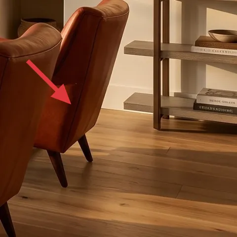
If you’re trying to make a living room seating area feel grounded, one leather accent chair in a warm brown does that job better than another throw blanket ever will. Leather adds sheen contrast next to the matte wall, the textured rug, and the fabric sofa—so the room reads designed even when everything else is calm. The trade-off is that leather can show wear sooner than you’d like, which is why choosing a flexible neutral tone matters (too red-brown can dominate). This is a good “one-piece” upgrade if you already have a sofa and want the room to feel complete without swapping everything.
Let the chair repeat the mantel browns
When the chair tone and mantel ceramics share the same warmth, the room looks intentionally styled.
The cost, layer by layer
| Layer | Item | Cost |
|---|---|---|
| 1 | Beige shag area rug | $200 |
| 2 | Beige curtain panels (pair) | $80 |
| 3 | Large framed abstract wall art | $80 |
| 4 | Throw pillows set | $40 |
| 5 | Decorative vases on fireplace mantel | $140 |
| 6 | Large green leafy plant | $80 |
| 7 | Brown leather accent chair | $45 |
| Total | $665 | |
If you want to spend less, cut the framed art budget first and choose a 16×20 print instead of a larger piece, or reduce curtain panel length so they just graze the sill. You can also swap one of the mantel ceramics for a single taller vase to keep the silhouette while trimming cost.
What worked, what didn't (across the whole room)
The biggest wins were layering texture (shag rug + soft curtains) and repeating warm brown tones where your eye naturally returns—fireplace, sofa, and the leather chair. The mantel styling also made the room feel “finished” without changing any structural elements.
What worked
- The beige shag rug softened the hard edges of the wood floor and made the seating feel warmer.
- Beige curtain panels added height, so the windows looked taller against the ceiling beams.
- The large framed abstract print anchored the fireplace and gave the palette a clear reference point.
- Muted green pillows and a leafy plant kept the neutrals from turning flat or one-note.
- Warm ceramic vases on the mantel repeated leather tones and made the focal area feel intentional.
- Leather contrast (matte rug + smooth chair) added depth without extra color chaos.
What didn't
- Using too many tiny decor pieces on the mantel made it look like storage instead of styling.
- Short curtains stopped at the window trim, which shrank the room visually and reduced the “lift.”
- Matching pillows too exactly to the rug created a flat look that disappeared in daylight.
- Skipping a leafy plant left the space feeling warm but lifeless—neutrals alone read as “complete,” not living.
- A frame that was slightly too small for the fireplace wall left an awkward blank area above the mantel.
What we'd skip if we did it again
Skip buying a “bundle” of mantel decor from the same retailer. Matching sets often look coordinated in the product photo but too uniform in real daylight—ceramics with slightly different shapes look more natural and more expensive.
Skip short curtains that end at the window frame. In a room with tall wood ceiling beams, the height loss is noticeable fast, and you lose that airy, framed-window effect even if the fabric color is perfect.
Skip adding more patterns before repeating colors. If the rug, chair, and ceramics don’t share warmth, new prints feel random. The simplest fix is one more warm element (pillows or pottery) before introducing any additional design.
Frequently asked
How long does this kind of living room refresh usually take on a weekend?
Plan for one full weekend if you’re doing the mantel DIY and swapping textiles. Curtains take the most hands-on time (measuring and hanging), while the rug and pillow styling are quick. The mantel ceramics painting is mostly downtime for drying and curing, so it can run while you shop or prep the room.
If I rent, can I still do this look without drilling or permanent changes?
Yes—swap the curtain hardware approach for a renter-safe tension rod only if your window setup allows it, and prioritize peel-and-stick-friendly art placement using existing hooks or removable anchors. For the mantel styling, DIY ceramics are perfect because they don’t change the property. Choose a rug that can be rolled out easily and keep lighting changes minimal.
What if my room is smaller than the photo?
Downsize by keeping the scale logic: keep the curtain “height” (hang higher) and choose a rug that still reaches under the front legs of the sofa. For art, avoid going tiny—use a smaller print but keep it centered above the mantel or focal area. Use fewer pillow pieces, and let the plant be one strong shape instead of a bunch of smaller decor.
What if my room is larger or taller?
Go bigger on the framed abstract art and keep curtain panels fuller so they don’t look thin. In a taller room, add one more height cue on the mantel (a taller vase form) and consider a slightly larger rug so the seating area looks like one cohesive zone rather than separate furniture islands.
Where should I shop for the most similar budget versions?
For rugs and curtains, focus on stores that carry beige shag textures and curtain lengths in 84-inch sizing. For framed abstract art, choose print sizes that fit above a mantel wall (often 24×36-ish or larger). For the plant, local nurseries tend to have healthier leaf structure than big-box plants in this size range.
What’s the biggest mistake people make with this kind of living room palette?
The biggest mistake is buying items that only match color, not texture and proportion. Beige rugs, cream pillows, and warm ceramics need different tactile surfaces to look layered, and curtains need height to avoid shrinking the room. If those basics are right, the look holds even if every specific item isn’t exact.
More in Living Room
Under $700: 7 weekend upgrades for a living room seating area
A bright, earthy living room seating area can look pulled-together with simple weekend swaps. This refresh uses 7 budget-friendly layers (r…
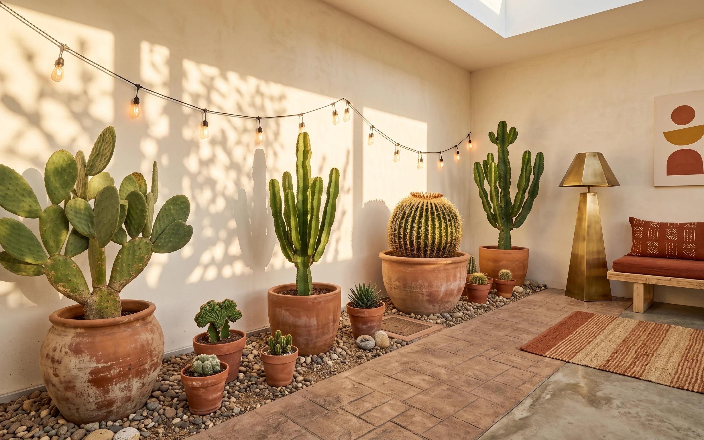
Under $400: renter-friendly cactus corner refresh
Turn a plain corner into a desert-modern cactus corner for under $400. This renter-friendly refresh uses warm string lights, an abstract pr…
Under $400: olive-and-cream living room refresh
A living room refresh built around olive-green upholstery, cream curtains, and a soft rug—kept move-friendly for shared housing. This 7-lay…