- Best for
- Weeknight lighting + calm color
- Total cost
- $630
- Difficulty
- Weekend-friendly, mostly no-drill swaps
- Renter-safe
- Mostly (curtains + art + optional DIY paint)
Why this warm olive-and-brass palette is the primary bedroom of 2026
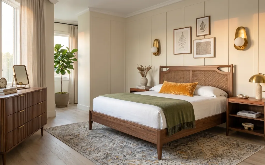
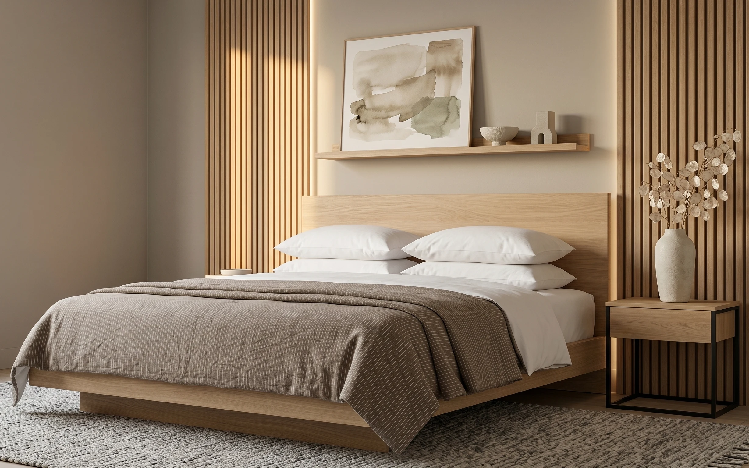
The first thing this photo gets right is contrast without chaos: cream walls and taupe linen soften the room, while the olive throw and gold fixtures add warmth you can actually feel. You can see the material mix in the light wood floor, the woven rug, and the textured headboard. I’ve made this exact mistake before—going too matchy with beige—and it always ends up looking flat. This version stays calm by repeating textures, not repeating colors.
I used to obsess over “statement pieces” and ignore the quieter ones. On a weekend refresh, I’ll always start with the rug and curtains now because they control the whole room’s scale. When the framed leaf prints and brass lighting went up, everything finally looked intentional instead of like I’d collected pieces over time.
Layer 1 — area rug 5×7 with faded medallion pattern ($200) Grounded underfoot, even in a bright room
This rug anchors the bed area with a faded medallion that reads soft instead of busy—perfect for a primary bedroom where you want calm, not clutter. Its size also matters: it spreads across the floor so the bed doesn’t feel like it’s floating. The medallion pattern is the trade-off here: it won’t hide every stain, but it will hide the “normal life” things (tracking, vacuum marks, a little grit). If you bought a plain solid rug instead, the room would feel cleaner, but it would also feel less layered and less finished.
Pick the rug width first, then buy everything else to match
Let the rug edges set your bed-and-nightstand alignment, so your curtains and wall art don’t end up fighting the layout.
Layer 2 — linen curtain panels in taupe/cream ($80) Taller lines make the bed wall feel wider
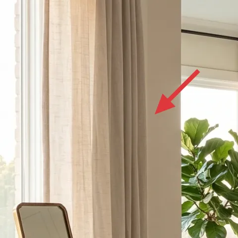
The linen curtain panels add that slow, spa-like softness that cream walls alone can’t give. They’re hanging high enough that the window frames feel less “boxy,” and the taupe/cream tone ties into the rug’s sandy palette. The key decision is the fabric look: true linen texture reads more expensive than smooth sheers, even when the room has simple furniture. I’d skip super-sheer curtains here—this room already has a lot of light, and sheer-only panels would erase the grounding effect of the rug and headboard.
Keep the curtain color slightly warmer than the walls
That little undertone difference is what makes the room feel cozy instead of gray.
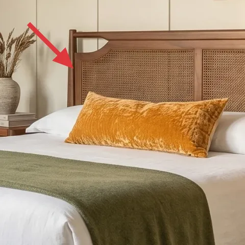
Layer 3 — framed botanical leaf print (16×20) ($80) One leaf print, repeated color warmth
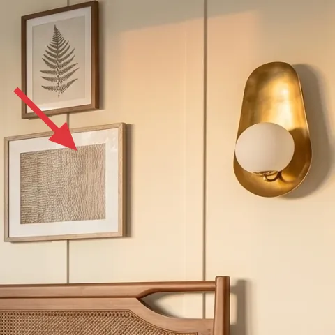
This framed botanical leaf print brings in the natural theme without adding clutter. The frame tone works with the wood furniture, and the leaf shapes keep the wall composition light above the bed. You could chase a whole set of matching prints, but that’s how you end up with a “decor haul” look. Instead, pick one print that already includes your palette colors—cream paper, tan frame, and a little green—then repeat the warmth elsewhere with pillows and lighting. That’s the trade-off: fewer prints, more cohesion.
Make it instead of buying it
DIY the frame so you can match the warm wood tone instead of settling for a beige frame that looks flat against cream walls.
Materials
- All-purpose paint sample (warm wood-tone) — small can — Home improvement store — $12
- Stain-blocking primer — small can — Home improvement store — $10
- Fine-grit sandpaper (220/320) — 1 pack — hardware store — $6
- Paintbrush set (angled sash brush) — 1 set — craft store — $8
- Painters tape + drop cloth — 1 roll/set — hardware store — $4
Steps
- Lightly scuff the existing frame with fine-grit sandpaper.
- Wipe off dust with a barely damp cloth and let dry.
- Tape off the glass and backing edges so paint stays off the print.
- Brush on a stain-blocking primer in thin coats, letting it dry.
- Sand smooth with a quick pass of fine-grit sandpaper.
- Apply 1–2 thin coats of warm wood-tone paint, then let fully cure.
- Remove tape carefully and reassemble the frame with the print.
- Hang the print at eye level on the same rail height as the other frames.
Total DIY cost: $40 — saves about $40 over buying.
Why botanical prints work over a bed
Leaf lines look “open” when the room has a lot of horizontal fabric, like the duvet and curtains.
Layer 4 — gold wall sconce with white glass shade ($120) Warm light at face level, not only bedside
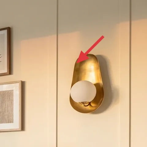
The gold wall sconce gives you that warm ambient glow without eating nightstand space. Because the shade is white glass, the light stays soft instead of harsh, which helps the room read brighter even when you turn it on at night. The gold finish also repeats the warmth already hiding in the rug and wood furniture, which is why it feels intentional instead of “random brass.” The trade-off is you’ll want to keep bulbs dimmable (or at least warm temperature) so the room doesn’t feel office-bright.
Match the bulb temperature to your palette
Go warm (2700K-ish) so the gold stays flattering and the cream walls don’t look bluish.
Layer 5 — orange throw pillow on bed ($30) Small pop that doesn’t overpower
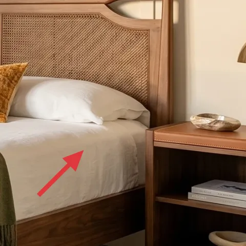
The orange throw pillow is the easiest “color steering wheel” in the room. It pulls warmth out of the gold lighting and adds energy right where your eyes land first—on the bed—without introducing a new dominant color. The fabric choice matters: a textured orange reads cozy against the crisp white duvet and the olive drape. You could choose olive-on-olive pillows for a quieter look, but then the bed would blend into the bedding and the headboard. This pillow is a controlled contrast: noticeable, but still grounded by the neutrals.
Use one bold pillow instead of three different accents
One repeatable color beats a rotating mix when you’re staying under a budget.
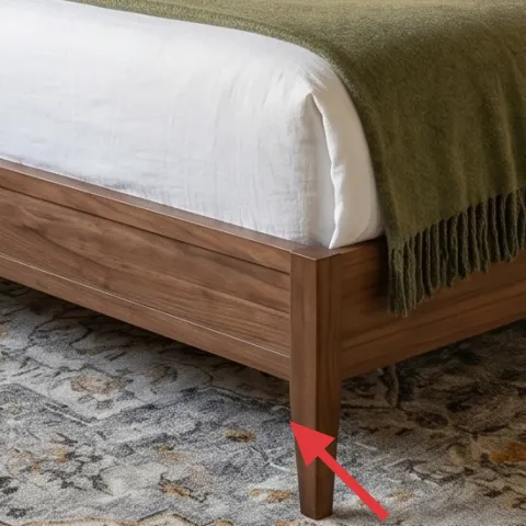
Layer 6 — wood nightstand with open top surface ($80) A place for the “real-life stack”
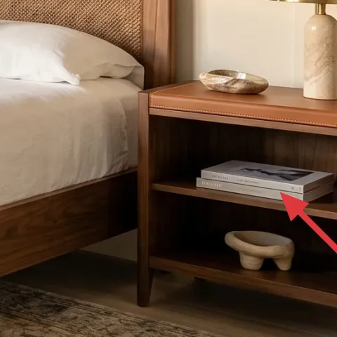
This nightstand gives the room a practical styling surface: lamp base, a book stack, and a little object without looking cluttered. The wood tone is also doing quiet work—tying together the bed frame and the dresser so the room feels cohesive. If you swapped it for a metal side table, the brass could look coordinated, but the overall warmth would drop and the room would feel more temporary. The trade-off with wood is that you’ll need to keep the top slightly curated; dust and small items show more than on darker finishes.
Leave a “breathing strip” on top
Set the lamp and one object, then leave a small gap so the surface doesn’t feel crowded.
Layer 7 — tan vase with dried stems on nightstand ($40) Natural texture that looks styled in daylight
The tan vase with dried stems adds height and movement, and it stays decorative even when you’re not actively maintaining a bouquet. The dried texture also mirrors the woven rug and the upholstered headboard—so it belongs in the room’s material language instead of looking like a seasonal add-on. This is a better choice than fresh-cut flowers for a weekend refresh because it costs less and doesn’t require daily care. The trade-off is learning how to place the stems: trim them so the top hits a similar height each time, then angle them slightly toward the bed for a relaxed look.
Match plant color to your neutrals, not your wall
Tan and muted greens read natural against cream walls and won’t fight the rug pattern.
The cost, layer by layer
| Layer | Item | Cost |
|---|---|---|
| 1 | Area rug 5×7 with faded medallion pattern | $200 |
| 2 | Curtain panel pair (84") in linen-look taupe/cream | $80 |
| 3 | Framed botanical leaf print (16×20) (DIY paint-matched frame) | $80 |
| 4 | Gold wall sconce with white glass shade | $120 |
| 5 | Throw pillow cover in orange fabric | $30 |
| 6 | Wood nightstand with open top surface | $80 |
| 7 | Tan vase with dried stems | $40 |
| Total | $630 | |
A cheaper variant: swap the rug for a smaller 5×6 size in a similar faded neutral and choose a single framed print instead of focusing on more wall detail. Keep the linen curtains and gold sconce—those do most of the visual work for the money.
What worked, what didn't (across the whole room)
This room’s best moves are repeatable: natural textures (rug + linen), warm lighting (gold + white glass), and one controlled color pop. The result feels styled and livable without relying on a lot of expensive furniture swaps. The only places it can wobble are when the wall art spacing or lamp temperature goes off.
What worked
- The 5×7 rug grounds the bed so the wall and ceiling trim don’t feel disconnected.
- Linen curtain texture adds softness that reads expensive even with simple furniture.
- The gold wall sconce keeps the room warm without taking up nightstand surface space.
- The orange pillow creates a noticeable focal point without introducing a new dominant color.
- The framed botanical leaf print repeats nature shapes and keeps the wall from feeling empty.
- The tan vase and dried stems add height and movement during both day and night.
What didn't
- If the rug is too small, the bed won’t feel anchored and the pattern looks accidental.
- Cool or high-K lighting can make cream walls look gray next to gold fixtures.
- Too many bold pillows at once would compete with the rug’s medallion pattern.
- Wall art hung too low makes the bed feel cramped instead of balanced.
- A cluttered nightstand top makes the warm, minimal vibe slip into “temporary” territory.
What we'd skip if we did it again
Skip buying a matching set of nightstand décor all at once. It’s tempting, but in a warm-minimal room it quickly looks staged. Instead, choose one practical anchor (the lamp base) and one decorative object (the tan vase) so the surface still looks lived-in.
Skip going for super-sheer curtains just because the room is already bright. With a crisp duvet and a patterned rug, sheer-only panels can make the overall look feel too flat and too light, like nothing is holding the room together.
Skip adding more than one “main” wall print above the bed. If the leaf print and textured art already create the balance, extra frames usually crowd the visual field and fight the height of the sconces.
Frequently asked
How long does a refresh like this usually take?
For a typical homeowner with basic tools, plan one day for the rug swap and curtain install, plus a second day for wall art and lighting setup. If you DIY-match a frame, add an extra half-day for sanding/primer/paint drying time. Most of the time goes to measuring and deciding placement so the bed wall feels balanced.
What if I rent and can’t do wall sconces?
The easiest renter-friendly substitutes are plug-in options and picture-rail-style hanging methods (if your building supports them). Keep the same placement heights as the photo so the room still gets warm light from the wall. Swap the gold wall sconce layer for a plug-in wall fixture or a small table lamp on the nightstand while keeping the curtains and rug as the main anchors.
My room is smaller—should I scale down the rug?
Yes. A smaller room usually needs a rug that still lands under the front legs of the bed (or at least the base area) so it doesn’t look like a separate accessory. In practice, sizing down by one step is better than going too small, because the rug’s job is to visually connect the bed, nightstands, and the open floor.
What if my walls aren’t the same warm cream color?
You can still copy the palette. If your walls are cooler, slightly warm up the room with the lamp bulb temperature and keep curtain panels in a taupe/cream that’s warmer than the wall. The orange pillow and tan vase will also help bridge the temperature gap.
Where should I shop for the key pieces?
For this look, start with the rug, curtains, and framing options where you can sort by color undertone. Lighting and sconces are easiest to compare online by finish (gold tone) and shade style (white glass). For the DIY frame paint, a home improvement store or craft store is usually the fastest match for small paint samples.
What’s the biggest mistake people make with bedrooms like this?
They overdo coordinated “sets” and end up with a room that feels too uniform. The winning move is repeating textures and materials instead—woven rug, linen curtains, warm wood, and one nature print. Keep the color pop to one pillow and let the lighting finish do the rest.
More in Bedroom

Under $700: warm olive-and-brass primary bedroom refresh
A warm olive-and-brass primary bedroom refresh that feels styled (not fussy) using 7 weekend-friendly upgrades. Total layer cost lands unde…
Under $500: japandi bedroom refresh with 7 renter-friendly swaps
A japandi-inspired bedroom refresh you can pull off without painting or drilling, using seven renter-friendly swaps. See the exact pieces (…
Under $700: warm oak dressing table nook refresh
A warm oak-and-cream dressing table nook can look intentional on a weekend. With $700 worth of swaps (rug, lamp, round mirror, shelves, cha…