
- Best for
- calm, warm layering
- Cost
- under $700
- Difficulty
- Moderate
- Time
- 1 weekend
Why warm wood-and-cream is the bedroom vibe of 2026
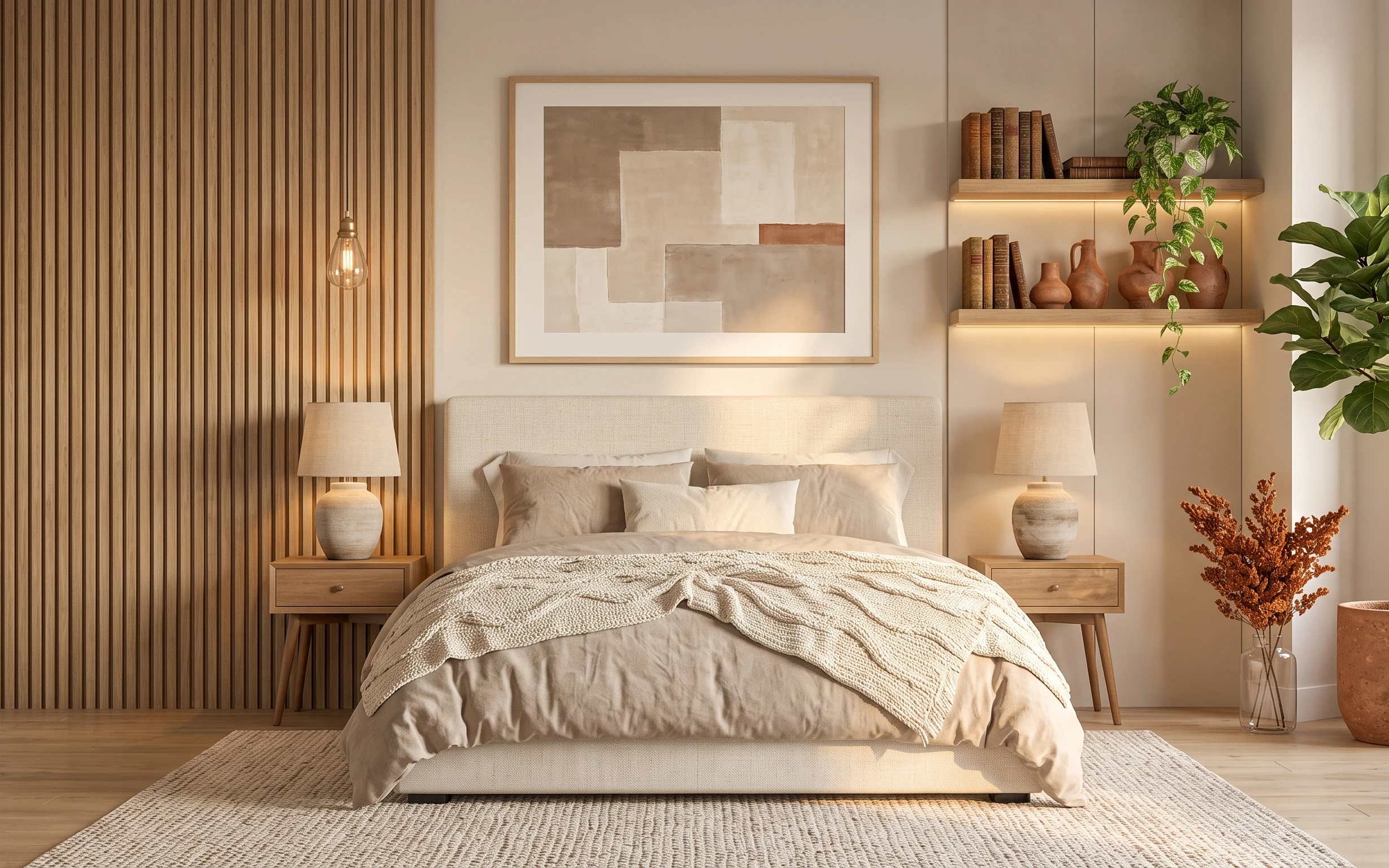
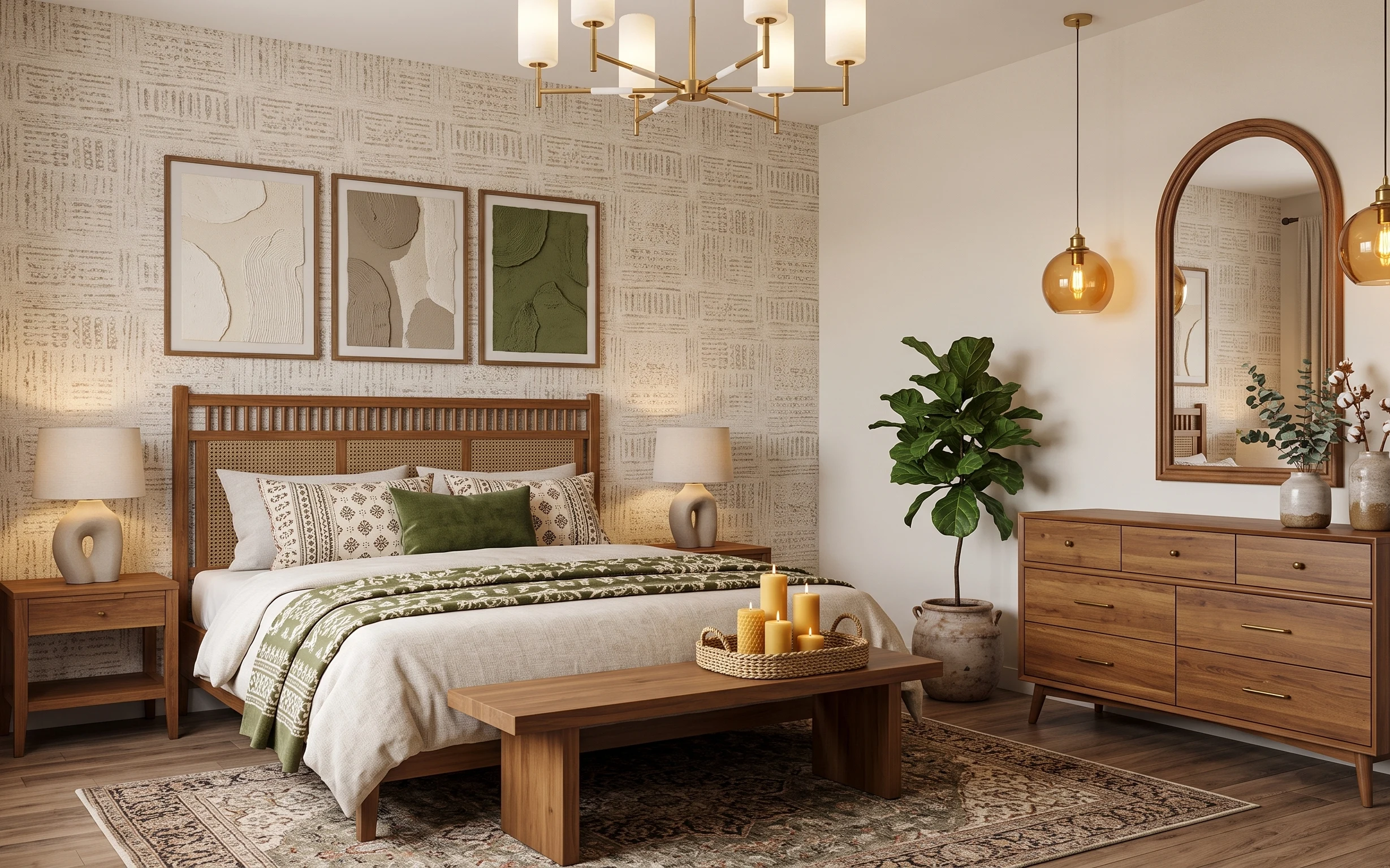
When I redecorated my own place for the sixth time, I stopped chasing “new” and started chasing balance: warm wood verticals on one side, cream textiles in the middle, and soft lighting that doesn’t glare. Here, the vertical wood paneling, cream duvet cover, and off-white rug create that grounded base, while the large framed abstract print keeps the wall from feeling flat. The hanging glass globe light and the warm light strips under the shelf add glow at night without needing extra fixtures. For homeowners, this kind of layered refresh is realistic because you’re choosing impact-first pieces, not redoing everything at once.
The moment that made me pause was the first time I tried to copy this look with “pretty” decor only. It looked styled in photos, but in person it felt busy. What changed my mind: the spacing. Leaving breathing room around the framed art, keeping the lamp shades a soft cream fabric, and letting the throw blanket land in one relaxed fold instead of covering every inch. That’s the difference between cluttered and calm.
Layer 1 — off-white area rug 8×10 ($80) ground the bed in one calm layer
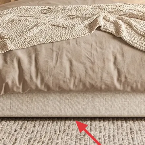
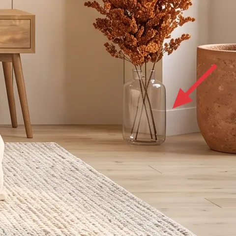
This off-white area rug sits under the bed and brings the whole room to one height: everything else (the vertical wood paneling, the framed print, the lamps) can stay visually “lighter” because the rug provides a quiet foundation. Choose a similar light neutral and don’t overthink pattern—texture does the work here, especially against the smooth painted beige wall. The trade-off with an inexpensive rug is that it can shed, so plan a quick vacuum pass the first week and consider a non-skid pad if your floor feels slick. A jute-leaning weave is the closest match to the soft texture shown.
Use rug color to control how big the wall feels
Light rugs make the bed wall read larger because there’s less visual contrast at the floor line.
Layer 2 — large framed abstract print ($80) pull the eye upward without crowding the wall
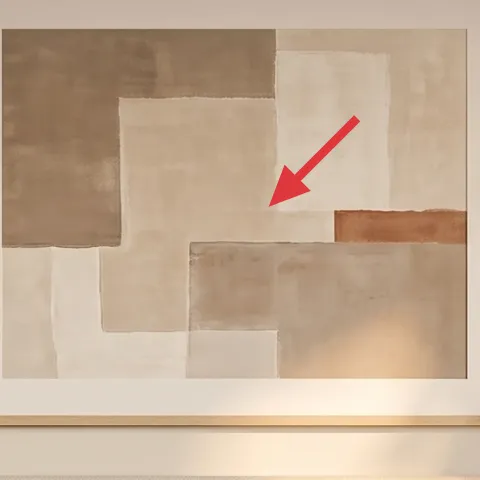
The large framed abstract print is the anchor over the bed: it fills the “quiet” center space so the headboard zone doesn’t feel like a blank wall with furniture stuck underneath. The frame is a warm wood tone, which ties back to the vertical wood paneling and keeps the palette cohesive. If you go smaller than this, the wall starts to look patchy—like the art can’t decide what it’s anchoring. The trade-off is cost and weight: you’ll want a sturdy frame and careful hanging, but the payoff is immediate, especially in a bedroom where wall space is the biggest visual real estate.
Pick a frame finish that matches your wood paneling undertone
Warm blond/medium wood frames read calmer next to vertical paneling than cool gray frames.
Layer 3 — cream throw blanket over bed ($35) add texture where the eye actually lands
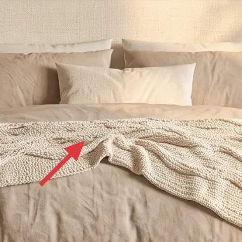
This cream throw blanket is draped in a relaxed fold across the front of the bed, which is why it reads “designed” instead of just “made.” The texture shows up against the smoother cream duvet cover and light pillows, giving depth without adding more color. A common alternative is buying another set of decorative pillows, but that usually makes bedrooms look busier than intended. The trade-off with a throw: it has to look intentional when you walk in—so keep the fold centered and skip a pile of extra blankets that bunch unevenly. Choose a knit or woven throw so the texture stays visible in daylight and at night.
Fold once, then stop
One centered drape reads styled; multiple folds start looking like you “tried.”
Layer 4 — matching wood nightstands (pair) ($160) balance the bed with real surface space
The matching wood nightstands on both sides of the bed do two jobs: they frame the headboard and they give the lamps and decor a stable “home.” In this photo, the nightstands match the warm wood tones elsewhere, so your eye feels guided instead of jumping from bed to wall to shelf. The trade-off is that two matching pieces cost more than one, but the symmetry is what makes the whole bedroom feel cohesive. If you only buy one, the other side tends to feel unfinished unless you replace it with something equally substantial. To keep this look on a budget, shop for pre-finished wood styles and use matching hardware if possible.
Don’t mismatch heights with the lamps
If your lamp shades sit too low, the room loses that soft “glow layer” effect.
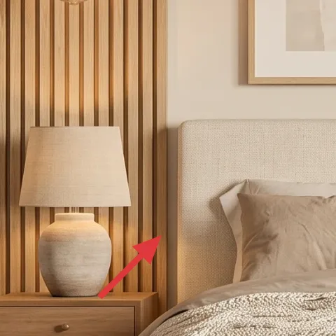
Layer 5 — fabric-shade table lamps (pair) ($120) soften the room with warm, indirect light
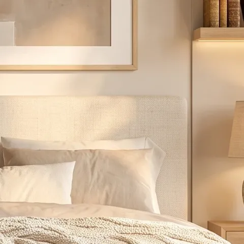
The fabric-shade table lamps are the reason this bedroom looks inviting after dark. The warm bulbs plus the creamy lampshades create a diffused pool of light instead of a harsh point source, which matters in rooms with light walls and minimal pattern. The trade-off is that fabric shades can collect dust, but that’s an easy wipe-down habit. Buying matching lamps (rather than random finds) also helps keep the palette tight—cream shade tones echo the duvet and throw. If you’re working on a weekend timeline, prioritize cord length and shade size so the light lands near the bed, not halfway across the nightstands.
Match shade color, not just lamp height
Even small differences in shade warmth show up against light walls.
Layer 6 — terracotta floor planter pot ($40) make the plant feel intentional, not accidental
Make it instead of buying it
Paint a plain terracotta floor planter so it blends with the warm wood-and-cream palette instead of standing out too orange.
Materials
- Sandpaper (medium grit) — 1 pack — $4
- Bonding primer (spray or small can) — 1 can — $8
- Creamy-beige paint (interior acrylic) — 1 small can — $7
- Clear matte sealer — 1 small can — $6
- Drop cloth + painter’s tape — 1 roll set — $0
Steps
- Clean the planter and lightly sand to scuff the terracotta surface.
- Wipe off dust with a damp cloth and let it dry fully.
- Apply a thin bonding-primer coat in even strokes.
- Let primer dry completely, then lightly sand once more for grip.
- Paint with 2–3 thin coats of the creamy-beige color.
- Dry fully between coats, then apply a matte clear sealer.
Total DIY cost: $25 — saves about $15 over buying.
The large leafy indoor tree is already doing the “life” work, but the planter color is what keeps it from tugging attention away from the bed. In a warm, japandi-leaning bedroom, a cleaner cream-beige planter reads calmer than bright, straight-orange terracotta. The trade-off with painting terracotta: you have to seal it so the finish withstands watering and light spills. This DIY stays weekend-friendly because it’s mostly prep, a couple of paint coats, and sealing—no special tools required. Once it’s painted, the plant blends into the room the way the shelves and nightstands already do.
Test the color on the bottom first
Terracotta absorbs paint differently, so a quick swatch prevents a too-gray or too-pale finish.
Layer 7 — hanging glass globe light ($120) add a warm focal glow without clutter
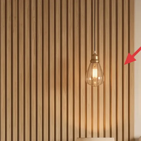
The hanging glass globe light is a small fixture with big visual impact because it sits high and catches the warm bulb glow. It also balances the vertical wood paneling—where that paneling runs up and down, the globe adds a rounded pause. The trade-off is placement: if you position the globe too low, it can feel busy over a lamp zone; too high, and it won’t visually connect with the bed. Aim for a height that places the center of the globe roughly in the upper third of the wall area above the bed. Choosing a glass globe (not a shade-heavy pendant) keeps the look airy.
Keep the globe style simple, then let the bulb warm up the room
A clear glass globe + warm bulb makes the light feel soft rather than bright.
The cost, layer by layer
| Layer | Item | Cost |
|---|---|---|
| 1 | Off-white area rug 8×10 | $80 |
| 2 | Large framed abstract print | $80 |
| 3 | Cream throw blanket over bed | $35 |
| 4 | Matching wood nightstands (pair) | $160 |
| 5 | Fabric-shade table lamps (pair) | $120 |
| 6 | Terracotta floor planter pot (DIY equivalent) | $40 |
| 7 | Hanging glass globe light | $120 |
| Total | $635 | |
If you want a cheaper variant, swap the nightstands for slimmer thrifted wood tables and use one lamp style repeated on both sides. Keep the large framed print and light-colored rug—those are the high-impact pieces that make the bedroom read calm.
What worked, what didn't (across the whole room)
This room works because the palette stays warm and consistent, and the lighting creates softness at multiple heights. The bed styling feels intentional: one throw, not a pile, and the wall art anchors the entire composition.
What worked
- The off-white rug hides everyday scuffs while keeping the bed wall visually open.
- The large framed abstract print creates a clear focal point above the upholstered headboard.
- Fabric lampshades diffuse light so the bedside glow doesn’t feel harsh or clinical.
- Matching nightstands add symmetry, making the room feel finished even with minimal decor.
- The cream throw blanket adds visible texture without changing the overall color story.
- The painted planter keeps the tree reading intentional instead of competing with the bed.
What didn't
- If the throw blanket drape lands too low, it visually “shortens” the bed.
- A too-dark frame on the abstract print makes the wall feel heavier against beige paint.
- Too-small rugs can leave blank floor around the bed, which reduces the calm effect.
- Bright bulbs in the lamps flatten the texture and make the space feel less soft.
- Skipping a sealer on a painted terracotta planter can lead to scuffs over time.
What we'd skip if we did it again
Skip adding more decorative pillows in the same cream family. When the duvet cover and throw already have texture, extra pillow styling can look like “coverage” instead of calm.
Skip a rug that’s too small for the bed footprint. The quickest way to keep this look refined is making sure the rug extends under the bed so the floor doesn’t interrupt the composition.
Skip matching décor “by brand” instead of matching tones. Warm beige lampshades, warm wood frames, and a sealed planter finish are what tie the room together—not the retailer label.
Frequently asked
How long does this bedroom refresh take on a weekend?
Plan for 6–10 hours total, depending on how quickly you source the rug, framed print, and lamps. Day one is usually the big moves—rug placement, art hanging, nightstands and lamp setup. Day two is styling time plus any painting/finishing for the planter. If you’re DIY-ing the planter, add extra drying time for primer, paint coats, and a final sealer.
Can this work in a rental, or is it homeowner-only?
Most of it can work for renters if you swap permanent steps for removable solutions. Use temporary hooks for the framed print, choose plug-in table lamps with long cords, and keep the rug and throw as the main visual budget. The planter painting can still happen, and swapping the lamp styling is renter-friendly because you’re not altering the electrical setup.
What if my bedroom is smaller or has less wall space?
In a smaller bedroom, keep the “one anchor” approach—use one larger framed print or reposition it higher rather than adding a second small artwork. Choose a rug size that still reaches under the bed (even slightly) so the room doesn’t feel cut up. For lamps, use slimmer bases or narrower shades, but preserve the warm cream shade color so the glow stays soft.
What if my walls are a cool gray instead of warm beige?
Warm neutrals still work, but you’ll need to correct the undertone. Look for rug and duvet textures that lean creamy rather than stark white, and choose a frame finish that reads warm wood, not cool metal. For lighting, pick bulbs described as warm (around 2700K) so the lamp glow harmonizes with the beige palette rather than turning the room bluish.
Where should I shop if I want this look without overspending?
Start with the anchors: rug size and the framed print. For budget options, check home stores for pre-finished wood nightstands and then compare lamp shades separately if needed. For the hanging glass globe light, local hardware lighting sections or online retailers with returns are easiest. When sourcing plants and ceramics, look for matching terracotta tones so you’re not forced to change the room palette.
What’s the biggest mistake people make in bedrooms like this?
The biggest mistake is adding too many competing textures and colors at once. This look succeeds because it repeats a small palette—warm wood, cream off-white, and soft beige—and it uses texture placement (rug weave, throw knit, fabric shades) instead of more objects. One throw drape, one large art anchor, and two matching light sources beat a crowded styling moment.
More in Bedroom
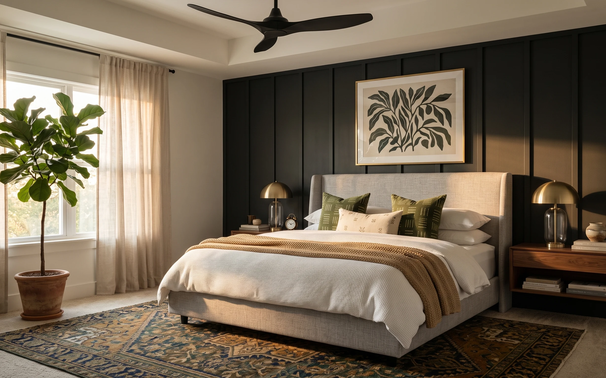
Under $700: warm wood-and-cream bedroom refresh with 7 swaps
A warm wood-and-cream bedroom refresh that looks designed without major renovation. This weekend plan uses 7 visible swaps for bedding styl…
Under $600: warm olive-and-tan bedroom refresh with move-ready swaps
A warm, earthy bedroom look is achievable for under $600 with renter-safe swaps: a bold patterned rug, soft cream curtains, three framed ab…
Under $500: olive-and-brass bedroom refresh with 7 move-ready swaps
This bedroom refresh leans olive green, cream textiles, and warm brass for a lived-in look. With 7 move-ready swaps, the whole update lands…