- Best for
- big color-mood shifts with paint + textiles
- Time
- One weekend (paint day + hang day)
- Total cost
- about $760
- Renter-safe
- No—paint is DIY-owner only
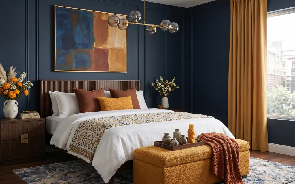
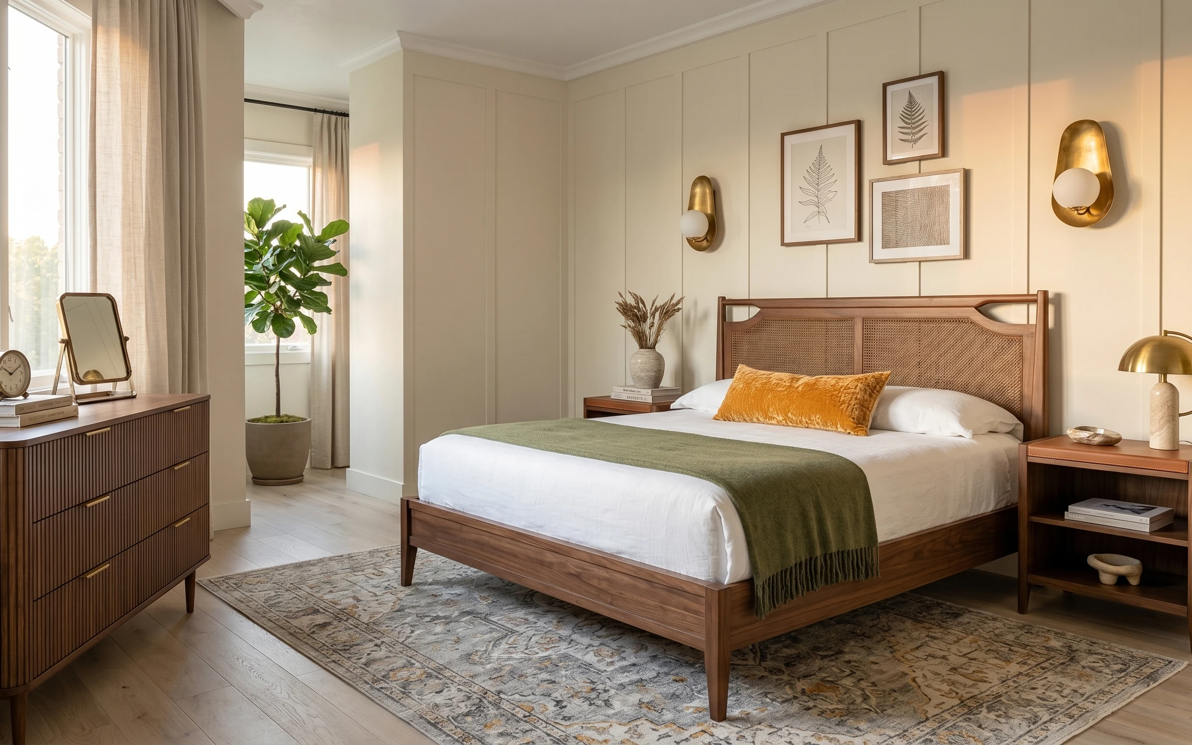
Why this navy-and-rust palette is the sleep space of 2026
The first thing the eye lands on here is the contrast: deep navy walls, warm wood, and those mustard-and-rust textiles. The texture mix matters, too—crisp white linens against a textured throw pillow and a folded blanket on an upholstered bench. Even the lighting choice plays along with the color temperature: the brass globe pendant keeps the room from feeling too chilly, especially with daylight coming through the warm gold curtains. For homeowners, this is a satisfying weekend refresh because you can pick higher-impact items (art, curtains, paint) instead of replacing everything.
I almost went too matchy when I did my own six-room refresh phase. I grabbed “pretty” throw pillows, but they were the wrong texture weight, so the whole bed looked flat. What fixed it was copying the hero’s mix: keep one bold warm accent (that mustard pillow) and let the rest stay simple—white linens and one patterned rug. Once that foundation read intentional, every small object (like the tray details on the bench) started looking like it belonged.
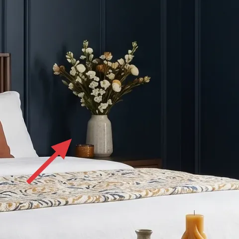
Layer 1 — Area rug 5×7, navy-and-tan pattern ($200) Anchors the whole bed
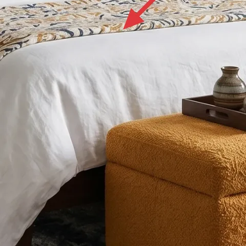
This patterned area rug sits under the bed and extends into the walking zone, so it visually ties the navy walls to the warm wood floor. The navy base keeps the sleep space feeling grounded, while the tan highlights echo the gold frame and warm curtain tone. A plain solid rug is the obvious swap, but it won’t pick up the room’s painterly color shift the way this one does. The trade-off is that patterns show fewer stains than you’d think, but you still want to vacuum regularly to keep the texture crisp.
Use a rug pad so the pattern stays crisp
A pad also helps prevent edge curl on wood floors, especially near the bench where feet land.
Layer 2 — Curtain panel pair in warm gold ($80) Pulls in daylight without fighting the navy
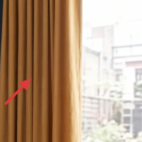
Those warm gold curtain panels frame the right side and soften the room’s strong color block. They also do double duty: they bring in brightness from the window, but the golden tone keeps everything from reading stark against navy. The “obvious” alternative—white or gray curtains—leans cooler and makes the brass light feel warmer than the rest of the palette. The trade-off here is weight: heavier panels drape better, so expect a little more effort hanging them straight and at the right height for that tailored look.
Hang high for the vertical effect
Mounting closer to the ceiling helps the navy wall feel taller and makes the room look more finished.
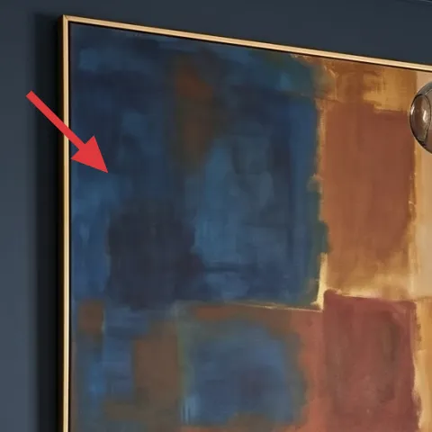
Layer 3 — Framed abstract wall art with gold frame ($80) Adds a warm focal point
The gold-framed abstract art works because it repeats the room’s “warm metal” note while adding painterly color movement—blue, rust, and cream-like tones. It’s placed above the paneled wood headboard, so it reads like part of the bed’s design, not a random decoration. A smaller, simpler print is tempting, but you’ll lose the punch that makes the navy wall feel intentional instead of empty. The trade-off is spacing: you want the frame centered over the headboard so the eye doesn’t have to search.
Don’t hang it too low
If the bottom edge slips toward the headboard, the composition looks cluttered even with clean styling.
Layer 4 — Mustard textured throw pillow cover ($30) One bold warm accent
That mustard throw pillow cover is the color bridge between the curtains, the warm wood, and the rust tones in the rug and art. It also has the right texture weight—more interesting than a smooth accent pillow—so it looks “styled” even when the bed is made quickly. The alternative is going all-in with multiple bright throw pillows, but then the sleep space starts competing visually with the wall art and pendant light. The trade-off with one statement pillow is that the rest of the bed needs to stay clean and cohesive, especially the white linens.
Pick one textured accent, not three
One tactile pillow gives depth; too many textures can make the bed look busy.
Layer 5 — Upholstered bench at foot of bed ($150) Makes the color story usable day-to-day
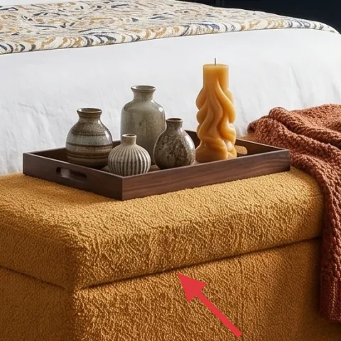
The upholstered bench at the foot of the bed adds a low, warm seating plane that keeps the room from feeling only vertical. It also gives you a surface for styling without cluttering the nightstands. In this hero setup, the bench coordinates with the rust throw, so the warm tones feel layered rather than random. A small ottoman might seem like the obvious alternative, but this bench scale reads more grounded and helps the rug pattern feel purposeful. Trade-off: you’ll want a bench that’s comfortable for quick sits, because you’ll actually use it.
Let the bench do the “styling work”
Use a tray so small candle jars and decor stay contained on one surface.
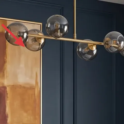
Layer 6 — Brass globe pendant light fixture ($150) Keeps navy from feeling heavy
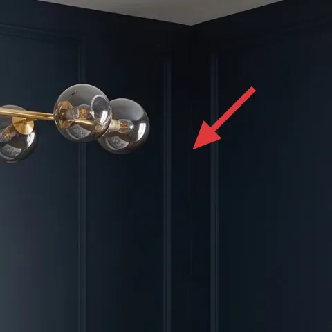
The brass globe pendant light brings round, reflective shapes that balance the room’s straighter lines—paneled headboard and crisp wall edges. Because it’s warm-toned, it pairs naturally with the navy paint and the gold frame, and it also makes the curtains feel richer instead of flat. The obvious alternative is a simple flush mount, but it would remove the “design moment” hovering above the bed. The trade-off is brightness control: choose bulbs that read warm (not blue-white) so the room stays cozy and not sterile.
Match metal tones across three places
Here it’s brass in the light, gold in the frame, and warm wood across furniture.
Layer 7 — Navy wall paint (1 gallon, DIY) ($70) Sets the mood in one swipe
The navy walls are the entire starting point for this look, and you can copy that same “bold but livable” depth with paint. Navy makes the warm wood feel richer and makes the gold frame and brass light look intentional instead of accidental. If you try to recreate the vibe with decor alone—rugs, pillows, art—you’ll still feel like something is missing because the background isn’t doing the heavy lifting. The trade-off is time: painting is messy, and you’ll need clean cut lines around the trim so it doesn’t look rushed.
Make it instead of buying it
Paint your main wall navy to get the exact deep backdrop effect, then re-style with warm accents so everything reads connected.
Materials
- Interior paint (1 gallon) — enough for one main wall — $40
- Painters tape (1–2 rolls) — for trim edges — $8
- Mini roller kit with cover — for smooth coverage — $8
- Plastic drop cloth — for floor protection — $6
- Sanding sponge — for quick prep scuffs — $3
Steps
- Clean the wall and lightly sand any glossy spots so paint grips evenly.
- Apply painters tape along trim, ceiling line, and any edges you must keep crisp.
- Cut in around corners and trim with a brush using steady, even strokes.
- Roll the main wall in sections, keeping a “wet edge” as you go.
- Let the first coat dry fully, then check for streaks or thin spots.
- Apply a second coat if needed, then remove tape while paint is slightly tacky.
Total DIY cost: $65 — saves about $5 over buying.
The cost, layer by layer
| Layer | Item | Cost |
|---|---|---|
| 1 | Area rug 5×7, navy-and-tan pattern | $200 |
| 2 | Curtain panel pair in warm gold | $80 |
| 3 | Framed abstract wall art with gold frame | $80 |
| 4 | Mustard textured throw pillow cover | $30 |
| 5 | Upholstered bench at foot of bed | $150 |
| 6 | Brass globe pendant light fixture | $150 |
| 7 | Navy wall paint (DIY equivalent, 1 gallon) | $70 |
| Total | $760 | |
If you want a cheaper version, go with a solid low-pile rug, basic grommet curtains, and a standard framed print—then spend your remaining budget on the navy paint and one warm metallic lighting moment.
What worked, what didn't (across the whole room)
The navy wall color and the warm gold accents work together like a set: the room reads coordinated even though the decor has multiple textures. Layering one bold mustard pillow plus patterned rug keeps the bed from looking plain. The only places that can go wrong are scale and placement—especially the art height and curtain hang.
What worked
- The navy paint made the brass pendant and gold frame look intentionally “matched,” not random.
- The 5×7 patterned rug visually ties the bed to the wood floor and hides everyday scuffs.
- Warm gold curtain panels bring daylight in while still feeling rich against dark walls.
- One mustard textured throw pillow adds warmth without turning the bed into a color pile.
- The upholstered bench creates a place for styled objects without crowding nightstands.
- The abstract art adds painterly color movement that the paneled headboard can play off.
What didn't
- If curtain rods sit too low, the room feels chopped and the window looks smaller.
- A too-small framed print above the headboard makes the navy wall feel empty.
- Cold-toned bulbs in the pendant light pull navy toward gray and flatten the warm accents.
- Skipping a bench means styling spills onto the nightstand surfaces and feels crowded.
- Using multiple bright throw pillows at once competes with the art and pendant light.
What we'd skip if we did it again
Skip going “matchy-matchy” with every warm item. Pick one primary warmth (gold frame/pendant) and repeat it, then let the mustard pillow and rust throw read as accents. Too many coordinated tones flatten the look, especially when the wall is already bold.
Skip a thin, solid rug if the goal is a designer-like sleep space. Patterns add movement against navy, and a low-profile rug can make the bed feel like it’s floating. If you choose cheaper, prioritize the rug pad and placement over the rug’s pattern complexity.
Skip hanging wall art too low or too far off-center. The abstract gold frame works because it sits in a tight relationship with the paneled headboard. If the composition drifts, the rest of the layers start looking like separate purchases instead of one cohesive refresh.
Frequently asked
How long does this kind of bedroom refresh take?
Plan for about 1–2 weekends. Curtains and art hanging can be done in a few hours once you’ve measured and chosen heights. Painting the navy wall is the time-maker: you’ll need prep, cut-in, roll time, and drying between coats. After paint, styling the bench and swapping in the pillow/rug is usually a single afternoon.
Can renters recreate this look without painting?
Yes, but choose reversible pieces that control the same variables. Use peel-and-stick wallpaper on one wall instead of paint, swap in curtain panels in a warm gold, and pick a rug pattern that contains navy tones. The framed abstract art should stay your anchor, and you can still add the mustard throw pillow and style the bench with a contained tray.
What if my room is smaller than the photo?
Scale the rug and keep the art proportionate. If an 8×10 feels too large, go with the closest rug size that reaches under the front edge of the bed. For curtains, keep the rod height high and let the panels fall to the floor—this adds visual height. Stick to one statement pillow color (mustard) to avoid crowding.
What if my room has brighter walls already?
You can still follow the plan, but lean more on the accessories. Swap in a navy-forward rug and add warm gold curtains and the gold-framed art to create contrast. Then decide whether painting is worth it for your timeline; if not, the room can still feel curated using the textile and lighting layers.
Where should I shop for the items in these layers?
For curtains and rugs, look at big-box home stores and online marketplaces with easy returns, since sizing matters. The framed abstract art is often best from art retailers or poster/frame shops where you can choose a gold frame. For lighting, prioritize brands that list bulb compatibility and warm-bulb recommendations.
Biggest mistake to avoid in this kind of bedroom?
Hanging everything at the wrong height is the most common issue. Curtains that are mounted low and art that’s off-center make the bold navy wall feel awkward. The fix is simple: measure rod height before you buy, and center the frame over the headboard so the whole sleep space reads intentional.
More in Bedroom

Under $800: navy-and-rust bedroom sleep space refresh with 7 layers
A navy-and-warm bedroom sleep space can feel finished fast. Here’s a 7-layer refresh for under $800, using curtains, an abstract gold-frame…
Under $700: warm olive-and-brass primary bedroom refresh
A warm olive-and-brass primary bedroom refresh that feels styled (not fussy) using 7 weekend-friendly upgrades. Total layer cost lands unde…
Under $500: japandi bedroom refresh with 7 renter-friendly swaps
A japandi-inspired bedroom refresh you can pull off without painting or drilling, using seven renter-friendly swaps. See the exact pieces (…